


We live in a coloured world, and studies have shown that we remember a ‘coloured experience’ vs a neutral or black and white one 70% more. So how can you bring a little more colour into your world (get out of all that black) and communicate more effectively?
In fact, if you want more joy in your life, research has proven that adding more colour to your world will help you feel better!
Colours have been shown to have different effects on us. For example, red raises your blood pressure. Blue makes you feel calm, safe and secure. When you’re choosing a colour to wear, why not consider what its effect may be on those around you (and even yourself).

Basic Colour Psychology
- Red: excites, creates passion, makes you feel warmer, too much can make people aggressive
- Orange: Social, warmth, happy, friendly, aids communication
- Light Pink: feminine, soft, nurturing
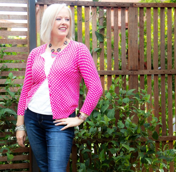
- Fuchsia: Dynamic, vibrant, exciting, bold
- Burgundy: strong, powerful, seductive
- Brown: steady, reliable, non-judgmental, solid, people open up more easily when you’re wearing brown
- Gold: prestige, wealth, flamboyant
- Yellow: optimistic, sunny, happy, fun, vibrant
- Apple Green: growth, abundance, fresh, new, exciting
- Forest Green: Reassuring
- Olive Green: Peace
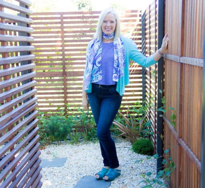
- Light Blue: Friendly, approachable, safe
- Navy: Knowledge, security, authority, power, serious, trustworthy
- Lavender: soft, nostalgic
- Purple: Creative, new age, imagination
- Black: Power, intimidation, death, evil, mystery, authority
- White: Innocence, purity, cleanliness, hygiene, in small quantities: business, in large quantities: vacation/summer
What are your favourite colours? How do they make you feel? Tell me what you love in the comments.
I’d love to know what colours you wear most – you can vote in the poll and see what are the most commonly worn!
How to use colours to communicate for you
Colours that Harmonise with You
Finding a colour palette that harmonises with your personal colouring will make you look so much better than wearing whatever happens to be the latest fashion colour (unless you are lucky enough that the latest trend is one that works for you). Colour is the first place I start when shopping with a client and looking for clothes that suit them, not only because the right colours look more youthful and vibrant, but also because I’ve noticed that when you wear the right colours you feel better, plus it makes for an easy mix and match wardrobe, so coordinating your clothes becomes a much simpler exercise.
With a palette of colours that harmonise with you and with each other, mixing and matching becomes simple and easy, meaning you need fewer clothes and can make more outfits. So if you’re looking at a minimalist wardrobe finding your ideal palette of colours is the first place to start. If you’re not sure which colours suit you and get your ideal palette, you can get a personal colour analysis as part of my 7 Steps to Style program – find out more about it here.
It’s also important to update your colours as you age – as ageing changes your best colours.
9 Ways knowing your best colours will change your life as well as your wardrobe
5 Tips for transitioning colour palettes in your wardrobe
Colour and Contrast
In my years as an image consultant, I’ve discovered that not only wearing the right palette of colours makes a huge difference, but also wearing your colours in the ideal contrast levels (colour and value) that blend with your natural colouring also contributes massively to the success of any outfit. This is why I developed my 3 Step process for finding your contrast so that you can then put your palette of colours together in a way that creates harmony with your colouring.
How to choose prints that work with your colour contrast
Choosing prints and patterns with the right contrast for you
What is the contrast of your outfit telling the world about you?
Value and Contrast – the celebrity version
Ideal Value
Another aspect of wearing your palette that is also integral to creating beautiful outfits is wearing around 60% in your ideal value – this is the value (how light or dark the colour is) of your hair. It’s something I’ve really come to appreciate the impact of after analysing thousands of photos and comparing the same person in many outfits. When the ideal value is right, the whole outfit is always more aesthetically pleasing.
How to build a wardrobe of classic staples when you have a light ideal value
Where celebrities go right and wrong with their outfits
Does it really matter what colour you wear below the waist
More Colour Tips
5 Colour concepts essentials you need to understand to create harmonious outfits
How to wear high colour contrast when your personality prefers to blend-in
How to add colour to your neutral outfits


Thank you Imogen for this important post!
I try to wear colour every day, but often wear it with silver. I can certainly detect a change in people’s reaction from day to day depending on the colours I wear.
Do you have any idea what effect silver has? Is it maybe the same as gold only in a lighter version?
Silver is cooler than gold and relates more to grey with a touch of the sparkle of gold
This post is so interesting! I definitely believe in the power of color. I recently went through a color analysis course that integrated personality traits. It turns out that I am a soft, subtle type and should wear muted colors. Reading the descriptions above, the colors listed that fall into my palette (such as lavender, olive green, and brown) also reflect personality traits similar to mine. I guess it all works together! Before my course, I loved wearing bright colors because they made me feel happy. Now, I find that I enjoy wearing the muted colors more because thay seem to fit my easy-going, peaceful personality. Looking back, I think I was wearing the bright colors and trying to be that bright, animated personality, which I am most certainly not.
I have always admired people who stick to one colour scheme, or even just wear one colour – this often seem to reflect a focused mind and determination that I myself lack, and my wardrobe shows it! It´s a heck of a mix of stuff that doesn´t go together in the least (, and of course, I don´t wear that single green shirt very often, nor that brown one…) and I think colour is the one element that I´m most in conflict with, regarding clothing. But it reflects my personality, I am a dabbler in many things, I´m a person who knows little about everything.
I often wonder if I should, as an experiment, wear only one colour, say blue, for a year, and see if my life changes in any significant way. Perhaps I should blog about it…
The colours I wear most are brown, yellow, turquoise and grass green. If I wear other colours: grey, coral, blue. I’m a Spring and felt relieved to let go of black, my new and all warm colours feel allowing and welcoming. I’ve been particularly fascinated by how grounded and at ease I feel in my brown colours. Turquoise is the other of my two “neutrals” and I noticed it’s not on the list… what does it say about the wearer? Is the message from a dark turquoise different than from a light? I don’t feel anything particular when wearing turquoise, the dark variety is more like the baseline or starting point for my personality; completely neutral. Coral isn’t mentioned in the list either, but maybe it’s a mix between red and orange? Come to think of it, I only wear coral in the summer and as lipstick.
Grass green is what I use for accents whenever I can (pretty much every day), sometimes I think of it as my happy colour… I feel happy when I see it 🙂 Blue is a dramatic colour on me and my other accent colour, it’s very good when I want to bring edge to an outfit (my “step it up” colour), it contrasts nicely with brown and is sharper than grass green.