


Have you ever thought about how colours communicate? What is their mood and how does your mood influence the colours you choose? How about the energy of colours and what that expresses to the world?
This is the topic of this video discussion with Jill Chivers of 16 Style Types.

The Energy of Colour
The energy of colour comes from the psychology of colour and our associations with those colours.
Warmer overtone colours advance – and when we say warmer, we are talking about those colours such as red, orange, yellow etc which remind us of hot things (fire, the sun etc.)
Cooler overtone colours recede – and we associate these colours (blues, greens) with cool and cold things (cold water, the ocean, deep forests etc.)
How can you use this knowledge?
If you want to be more noticed, then wearing warmer overtone colours as it helps you to be seen more quickly and easily. The colours advance and draw you forward.
I use my clothes to do the ‘energy’ work for me, as an introvert I need to conserve my energy for the interaction rather than use it to attract attention or be seen. We also associate these warmer overtone colours with people who are naturally warmer and friendlier than those with cool colouring.
Colours can communicate for us.
As an extrovert, Jill likes to build quick connections and rapport with people and so her oranges and yellows are a great way to do this. When she’s doing her corporate work, she then wears lower contrast and darker colours and cooler colours so as not to be the centre of attention.
As we discussed in this video about how contrast communicates you can use this knowledge depending on how you want to be perceived in different parts of your life.
How We Can Use Colour To Communicate
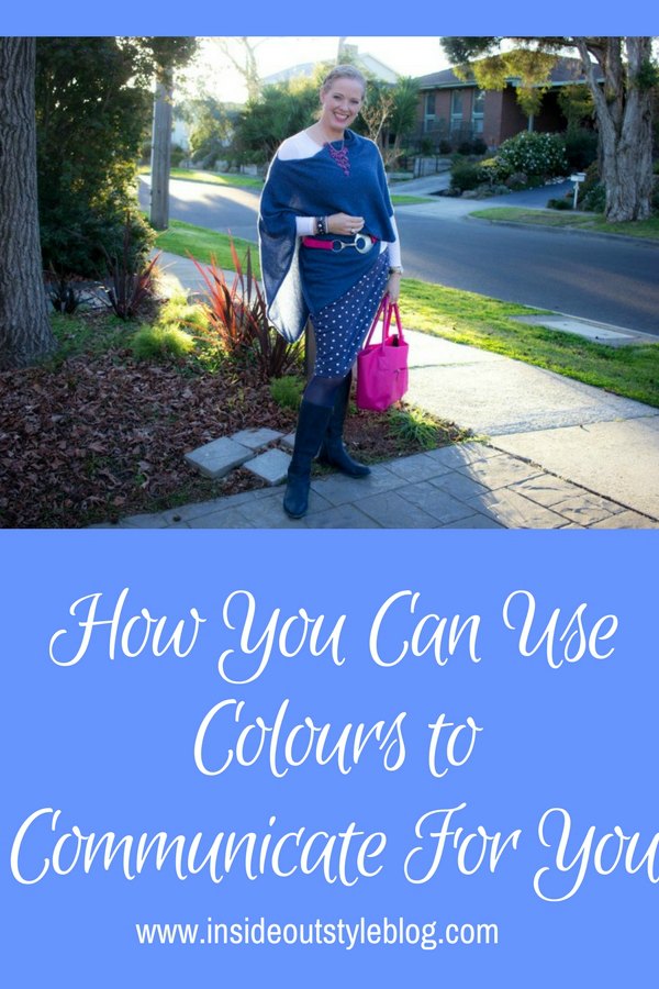
When I need to ensure that I’m the centre of attention (such as in a teaching environment) I use warmer brighter colours (pinks and reds) to help me grab attention easily.
Some bold and dynamic people may need to wear the cooler overtone colours to help them from not overwhelming others. As an extrovert Jill is careful that when she needs to take a back seat she’ll lower her contrast levels so as not to be the focus of attention.
How About Your Mood?
Feeling flat? Think about adding a more vibrant colour in a warmer overtone. This can help give you more energy and lift you out of a less energetic space.
Want to just disappear and conserve energy and nurture yourself, then wear a lower contrast and cooler overtone colours.
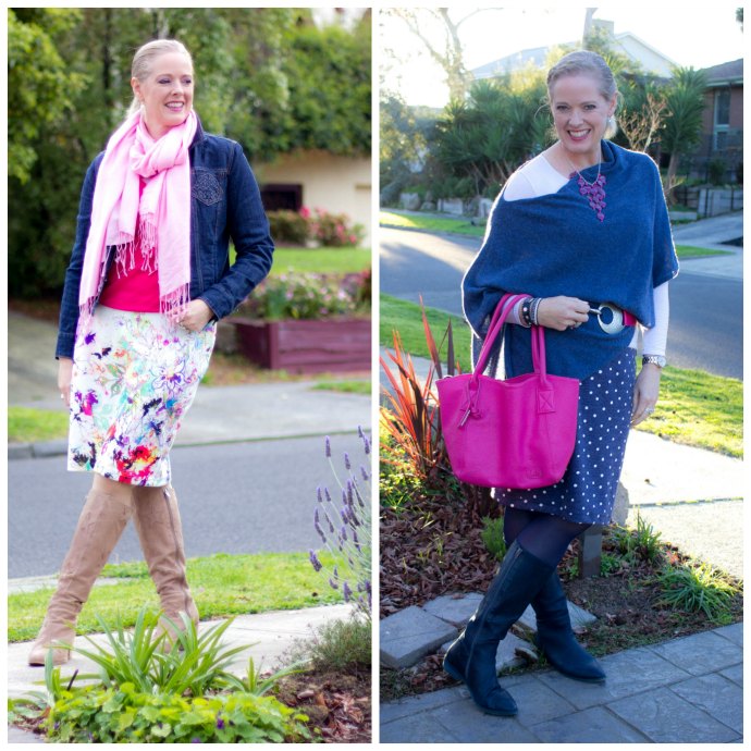
Some days I like to add a warm bright colour to add energy and vibrancy to my outfit which makes me feel more exciting. Other days I’m happy to tone it down into a more neutral palette or with just a small accessory.
So you can see how easy it is to change your mood using colour too.
Further Reading on Colour Communication
What is the Contrast of Your Outfit Telling The World About You?


This is enlightening for me. All my life I’ve had people (strangers) start a conversation with me, even when I’ve been traveling. My 3 daughters would always shrug & say….”oh, Mum, she’s a people person”! I always thought I must have a “generic” face that reminds people of someone they know? I’ve always, mainly, worn bright, warm colours & now I realise…it must have been my colours that made me approachable! Who knew??? I do also mostly smile most of the time as well.
Smiling is such a great thing to do and your lovely warm colouring invites people in!
This was a ‘lightbulb’post for me – thank you! Years ago I was analysed as an ‘Autumn ‘ (mainly due to dyed hair) and dressed in warm colours. Two years ago I decided to let nature take over and I’m happy with the all-over silver highlights. I had my colours done last year and I’m now ‘Sophisticated’ which gave me a very different palette. I’ve been mainly wearing greys and blues which are flattering but I often feel less confident and open than previously and more introverted. I had put this down to now being a ‘senior’ but now I realise perhaps it’s the colours I’ve been wearing! I prefer to stick to a limited palette but might add some pinks.
Yes add some of those warm (cool undertone) colours and see how you feel! It has been harder to find cool pinks in recent years but I believe they are coming back over the next few seasons.
Thanks so much Imogen, You as a cool person, do you really wear warm overtones sometimes? You also say that as a teacher you should wear bright warm colours but what do you do if you are a cool soft?
Thanks a lot for your wonderful blog!
Wear your warm overtone colours – so reds and pinks and red violets – they will make you stand out and still flatter (I wear warm overtones, but never warm undertones).
This was very enlightening to me, too, Imogen and Jill. Like Imogen, I am making the transition from High contrast with pale skin and dark hair to less contrast with pale skin and silver hair this year. People’s reactions to me have been remarkable. Right away I noticed some people treating me as a more friendly and approachable person. My personality is a pretty even split of 51% extravert and 49% introvert, but their perception of me totally changed. Amazing!
I also agree on the concept of color either affirming your mood or changing your mood. I use my lipstick red, magenta, and fuchsia when I’m feeling bubbly, extraverted and attention-grabbing. Then I wear my cobalt, teal, navy and greys when I’m feeling more quiet, observational, introverted. Thanks for a great video. 😀
Thank you Imogen and Jill. This was great information. I’m an introvert but red is one of my go-to colours. I wonder if I started wearing it so as to be noticed a bit more and not end up as a wallflower? The interesting thing is that although I’m a low to medium value contrast I cannot for the life of me give up my red.
It would be interesting for you to start noting when you wear red why you decided to do it and how it makes you feel? No need to give up red no matter your contrast!
I guess I’m the statistical outlier because I don’t apprach people in warm colors more often than cool colors to get questions answered- just the opposite actually if I’m presented with two people of the same approximate age, gender, etc… I do however, approach older people for question answers more often than younger ones, but it’s not because of their coloration. It’s their personalities. The elderly tend to fall into two answer modes- old enough to remember this thing called manners and actually use them and/or old enough to not care about manners but just frank speaking. When looking for answers I find both of those traits much more useful than friendliness. Besides which, many older people have the most fascinating stories and they are generally willing to tell them to you because you remind them of their kids/grandkids/etc…
Then again I’m also a statistical outlier on the personality scales as I’m fairly heavily introverted but almost everyone places me as an extrovert when we’re in a group because my public mannerisms include a great extrovert mask. Not only am I an introvert, I also don’t wear warm or warm undertoned clothing with very few exceptions (bridesmaids’ dresses or gifts one feels obligated to wear at least a few times before a “random” accident strikes) , my coloration is medium to heavy contrast, but people are always approaching me with questions. I think you missed the coordination/put together factor in your article. I’m betting that if you showed a bunch of photos of people where the spectrum covered “their accessories coordinated to they grabed whatever came to hand” you would find that the people would ask questions of the ones who coordinate, regardless of the colors, over the the people who didn’t. The fact that you do that for a profession would automatically make you very questionable. But that’s just my opinion, you’d have to ask more people to get an accurate sample.
So interesting! I’m a high value contrast introvert. As a teen I was analyzed to be a winter or “vibrant summmer.” I do have a caring personality (cultivated) but with a natural tendency to directness and no-nonsense. The idea of appearing “approachable” is anathema to me. I would rather approach than be approached. I have tended to wear very high value contrast in the past, or even all black which really suits my desire to be both edgy/dramatic, at the same time as classic and unnoticeable. Lol how does that work? Red used to be a go-to color, but I find that wearing it saps me. I have moved in the direction of wearing much less black near my face, because it’s seeming dreary now, and no red at all, going to softer colors like grey and burgundy, and smoky shades of lilac, ballet pink, cool olive, etc. These colors are new for me, but feel more comfortable now. I’m wondering if it’s because I’ve been married to a truly kind man who is a partner in every way, and no longer feel like I have to be a warrioress.
You definitely change (and most likely mellow) with age, and also your colouring softens too so these new softer colours will flatter your current colouring more I’m sure. The high contrast is classic – as it says “business” which is why it has a “blend” appearance in a business context.