


Navigating the world of colours, especially in your outfits, can often feel overwhelming. Questions about undertones, overtones, and how to differentiate between them are common concerns. Today, we’ll dive into these concepts, shedding light on how understanding them can elevate your style game.

Overtone vs. Undertone: The Basics
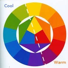
Colour Overtone
To begin with, it’s essential to distinguish between overtone and undertone. The overtone of a colour refers to its most apparent, surface hue—the colour you immediately recognize. For example, reds, oranges, and yellows are typically considered warm overtones, while blues, greens, and violets are categorized as cool overtones. Imagine the warmth of a fiery sunset versus the cool serenity of a deep blue ocean.
On the other hand, the undertone comes from how that colour is made, and it lies beneath the surface colour, influencing how it appears and complements other hues. This undertone can be warm (containing more yellow) or cool (containing more blue).
Identifying Undertones in Colours
Let’s explore some examples to illustrate the difference:
Blues: A warm blue will have hints of yellow, making it appear more turquoise or slightly teal, while a cool blue will have undertones of violet.
Greens: Warm greens lean towards yellow, reminiscent of lime or olive, whereas cool greens have more blue, akin to a lush emerald.
Browns: Warm browns contain yellow or orange, giving them a golden or caramel hue, whereas cool browns may appear more pink or purplish as red or violet have been used to cool down the brown.

Want to see lots of examples of different undertones so you can compare them side by side? Check out these posts:
In fact, I’ve got a great free downloadable guide you can get here.
Practical Application: Choosing the Right Foundation
When it comes to makeup, particularly foundation, understanding your skin’s undertone is crucial. For instance, someone might flush red when embarrassed or sunburnt, but their skin’s undertone and overtone could still be warm, with yellow or peachy hues. This explains why foundations labelled for warm undertones, even if they initially appear too yellow, often blend seamlessly.
Here’s a practical tip: the purpose of foundation is to harmonize with your skin overtone, not to alter its inherent colour. If your skin has a yellow overtone, a foundation with a slight yellow tint will blend more naturally, even if your undertone is cool. Conversely, a foundation with a cool, pinkish base might make you appear perpetually flushed if it clashes with your yellow overtone. When selecting a foundation you’re looking for the colour that appears to disappear in your skin, rather than stand out. This colour no matter the undertone, will make your skin appear smoother and more radiant.
For more tips on choosing your best foundation colour check out this post on the topic.
Harmonizing Your Wardrobe: The Power of a Unified Palette
Applying these principles extends beyond makeup into your wardrobe. Choosing colours that match your undertone ensures a cohesive and flattering look. For instance, pairing cool undertone neutrals with cool-based colours creates harmony, while mixing warm and cool undertones in colours and neutrals can result in a discordant appearance.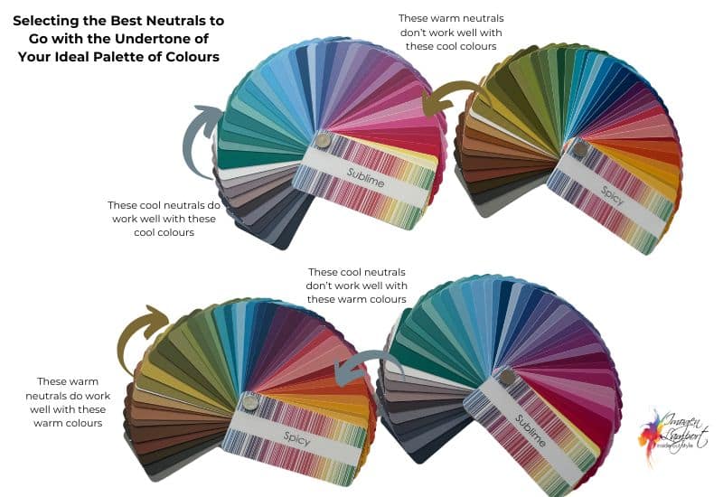
One of the joys of having your ideal colour palette identified is that the colours within it have all the same colour properties (undertone, intensity and value) so that the colours work together so easily. This makes putting outfits together each morning faster and easier as you know that the colours go together.
By understanding these subtleties, you can confidently select colours that enhance your natural beauty and create a balanced, stylish look.
Empowering Your Style Journey
Understanding overtones and undertones isn’t just about aesthetics—it’s about empowerment. By recognizing how these elements interact, you can make informed decisions that reflect your true self. Whether choosing makeup, planning outfits, or even selecting a new piece of jewellery that harmonises with your colour palette, this knowledge is a powerful tool in your style arsenal.
So, the next time you’re faced with a rainbow of choices, remember: it’s not just the colour itself, but the undertone beneath it that can make all the difference. Embrace this insight, and let it guide you towards a more confident, harmonious, and authentic expression of your unique style.
If you’d love to discover your ideal palette of colours, you can get a personal colour analysis with me here (no matter where you live in the world) or if you’d like my complete education in both colour and style to help you build a wardrobe of clothes you love to wear, join my 7 Steps to Style program.


wonderful post, really helped me with my design studies more than the fashion aspect