Colour is a passion of mine, and helping people find the colours that truly make them shine is something I’ve been doing for the past 14 years (or so) and I know just how much wearing colours that harmonise with your natural colouring really makes a massive difference to how you look and feel. The year after I started Inside Out Style, I also co-created my colour system of 18 colour directions, the Absolute Colour System, based on years of experience doing colour analysis and finding the existing systems lacking (I don’t want to have to “make a client fit into a group” I want to have a group that works for them, no matter their colouring). I now love teaching others to do personal colour analysis too – and share the love of colour with a wider community.
If you’ve been reading Inside Out Style since 2009 you’d be all over what I’m about to share with you. But if you’re new here and kind of confused about some of the terminology and concepts I talk about regarding colour, this post is here to step you through the most important things you need to know about choosing and wearing colours. So here I’m going to cover some of the basics that you need to know, so when you read all those other blog posts on colour -they all make sense!
1. Colour Terminology You Must Understand
First things first, you need to understand the language of colour. This really does help, as there is a set of scientific terms and also art terms that are used with regards to colours, which makes it much easier to grasp the different elements of colour and talk about colour when you have the language.
There are a few words you’ll see in many posts here that are specific colour terms. Words such as “value”, “undertone”, “intensity” and “overtone”.

Value = how light or dark the colour is. Simple really. It’s not a monetary value or an emotional or social value – just a description of how light (tinted) or dark (shaded) a colour is.
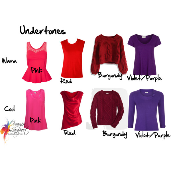
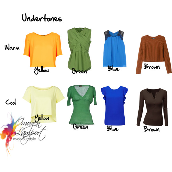
Undertone = how you create the colour -whether it has a warm (yellow) or cool (blue) base to the colour (as if you’re the person mixing the dye to create the colour, what would you use?)
 Intensity = how bright or muted the colour is – there are many words that can describe these colours – bright = clear, pure, intense, saturated. Muted = dusky, soft, smoky, toned, desaturated.
Overtone = whether we ascribe the colour to a feeling of warmth or coolness. Red, yellow, orange = warm – as we associate these colours with hot things – fire, sun etc. Blue, Green, Violet = cool – as we associate these colours with cool things – oceans, shady forests etc.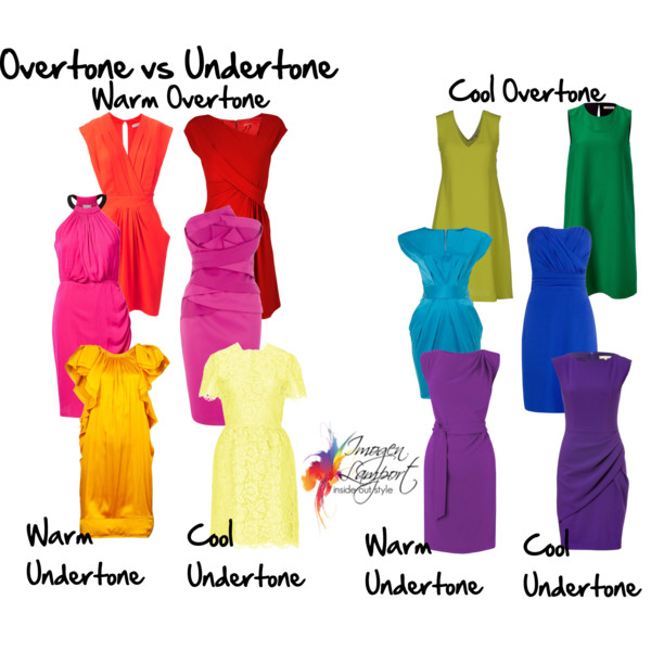
There are more technical terms that are useful to know – read about them here.
2. Ideal Value
Ideal value relates to the overall lightness or darkness of outfits that are the most flattering. Ideal value is a concept that I’ve developed based on my years of experience with personal colour analysis and observation of outfits that really work versus those that not quite as good (even though they are all part of a colour direction).
Your ideal value is a similar value to your hair value. Read more about his concept here.
And wearing around 60% of your outfit is in your ideal value (particularly on your upper body) will always create the most harmonious effect.
You can see that with my hair colour change – that an overall light outfit relates now to my fair hair, whilst when I had dark hair and a deep value (deep is an alternate word for dark – means the same thing though) I needed more of my outfit to be in darker colours.
3. Contrast – Value and Colour
Ahhh contrast, you are a tricky concept to fully grasp at times, but once you’ve seen it, it all falls into place.
There are two sorts of contrast (and contrast is just difference between two colours), value contrast (the difference between the lightness and darkness of a colour) and colour contrast (the difference between the colour relationship – monochromatic, analogous, triadic, complementary etc).
I’ve written so many posts on contrast – you can find them all here. But if you want to figure out your own contrast – try my 3 step process.
Value and Contrast with Darker Skin Tones – the Celebrity Version
4. Your Colour Personality
Yes, personality influences every single thing you wear. And which colours you choose (even if you’ve had a colour analysis and have a palette, you will be drawn more to some colours or colour combinations than others, and this is personality based.
Personality is the number 1 key in creating outfits that feel right to you (even if something looks great but you think to yourself “it just isn’t me” then there is something that doesn’t fit right with your personality).
5. Communicating with Colour
And then you’ll want to think about what you want to communicate – of course, colour is integral in this – which is why the whole field of colour psychology exists (and is totally fascinating – did you know that your feet will feel warmer faster if you wear red socks!).
But of course, it goes deeper than just how we perceive each colour psychologically, there is also the way colours and combinations of colours communicate too.
What is the Contrast of Your Outfit Telling The World About You?
How to Use Colour To Communicate Your Authority or Approachability
There you have it – your resource for understanding the basics of colour and putting together outfits. There is of course way more about colour you may want to learn about. For example mixing colours, finding the colours that work for you (and if you’d like my professional opinion on your colouring – you get a personal colour analysis as part of my 7 Steps to Style program), and creating outfits with colour (remember that wearing colour will bring more joy into your own life as well as those around you – now isn’t that something to strive for?








Another great post! I’m slowly rebuilding my wardrobe, getting rid of all warm undertones and replacing them will cool-based blues, violets/purples and pinks, with bright white, navy and medium grey as my neutrals. I’ve been seeing a lot of forest green garments popping up in the shops recently, just when I started thinking it might be one of my signature colours to match my dark and cool green eyes and medium/medium-high value brown hair with ashy undertone. I’m learning so much from your blog!
However, I’m not entirely sure about mixing clothes of the same colour but different intensity. Can I wear smoky greyed out blue with bright cobalt, for example, as long as I stick to the same cool undertone? It looks off to my eye, but I’d love to know what the theory says.
I wouldn’t! They don’t go together well. Best to wear similar intensity together for total harmony.
See, you’re such a great teacher! I’m also wondering about mixing warm and cool undertones of the same colour that share the same intensity. I see it a lot in prints this season, and to me it looks okay. I have a violet winter coat and would like to pair it with warm purple cashmere hat I’ve just fallen in love with. They are both bright. Would that look OK to your trained eye?
Thanks once again Imogen. I now know why I ‘just don’t feel right’ in the lighter colours in my palette, that, although my skin in pinkish, my hair is quite dark. But in recent months I’ve also been struggling with the concept of undertone. I’ve also read your article about getting cooler as we age. I seem to be getting warmer, not cooler (I’m 62), reaching for the warmer burgundy for example, rather than the cold, cold burgundy for example. Is this possible? Am I just getting ‘softer’? I was catagorized as a winter/possibly summer about 25 years ago and have been working with and developing this palette ever since. Even the veins in my wrist seem to be getting greener, a soft seafoam green, though my legs have been described in the past as ‘blue’ and my arms still have freckles. Have I been working with the wrong palette all these years, or have I just evolved into a soft winter/soft summer kinda gal? Or could I be SOMETHING ELSE altogether!!!!
Hi, this. Is my first comment and I just want to thank you for always adding the links to previous posts about the subject. The idea of capsule wardrobes has captivated me, but I realised I still don’t know how to mix and match items as I have to much and only half of what I have seemed able to mix and match leaving me too afraid to try as I knew it meant I would have to cull a lot of beloved items. My point, this post helped me to recognise I haven’t got the basics of what does and doesn’t suit me as my solid foundation yet. I thought I would have to have two different capsules just to accommodate all 6 colours and various shades of plus the 4 neutrals in my colour range, but that wasn’t a great solution because half those colours mix with the other capsule. I knew I had to cull, but didn’t know where to start as I have already halved my wardrobe since starting your’s and Jill’s blogs 4 mths ago. After reading posts that I had missed the first time round I now have a better understanding of my values and contrast and after a little experimentation I have worked out what compliments and what detracts from my features and can move forward with my wardrobe. I love your blog and thank you so much for sharing your experiences and wisdom to help us learn our individual style when we can not afford a stylist ourselves.
Thanks Melissa – really glad that you commented and the information here is helping you discover what really does work for you so you can get your wardrobe in order!