There are two sorts of contrast – value contrast (how light and dark the colours you put together should be in your outfit – watch the video on that here) and colour contrast – how similar or different the colours that you’re putting together in your outfit need to be.
How about your colour contrast? What are my tips on choosing prints that you wear, rather than the print wearing you?
Colour Contrast and Choosing Patterns
I mentioned that you can find your colour contrast here.
What are the relationships of the colours that work best for you? They relate to your own colouring (see some real-life contrast examples here).
Low Colour Contrast
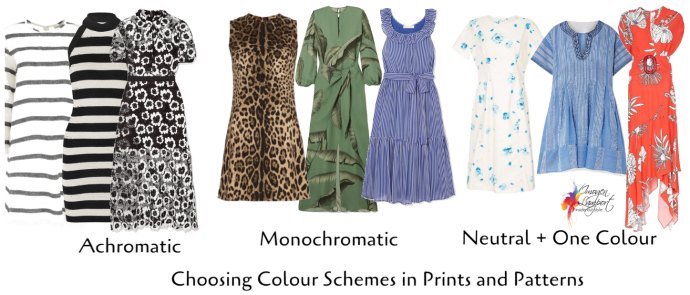
Achromatic – meaning without colour – black, white and grey! This only works if you are high value contrast and lower colour contrast. Think Snow White, not Cinderella!
Monochromatic – one colour at a time – it can be different shades of the same colours, such as light and dark blues, or light and dark greens, or pinks with burgundy.
Example of monochromatic colouring – brown eyes, beige or ivory skin, brown hair.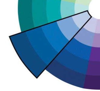
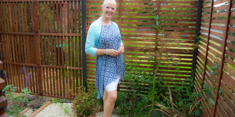
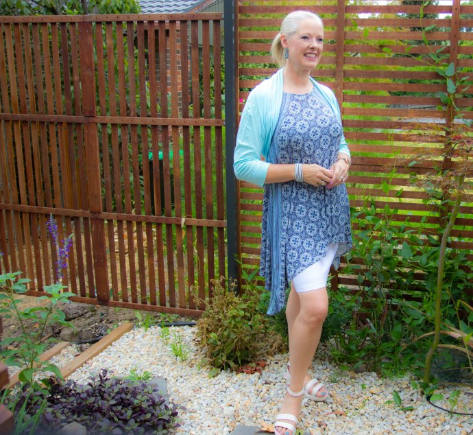
Neutral + 1 colour – choosing a pattern with neutral/s (browns, greys, or black and white) and then including one colour, is easy to wear and won’t overwhelm anyone with a low colour contrast.
Example of Neutral + 1 Colour, Grey hair, ivory skin with blue or green eyes.
Medium Colour Contrast
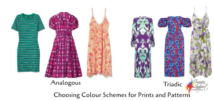
Analogous – 2-3 colours that sit next to each other on the colour wheel – greens with yellow, or blues with teals and greens, or violet with blues, yellows with oranges. These are all analogous schemes and look divine. Anyone can wear an analogous colour scheme as they don’t feel as bright or intense as triads and complementary schemes. Even if you are ideally neutral plus 1 colour at a time, if you want to wear more colours, try an analogous scheme.
Example of analogous colouring – golden blonde hair and green eyes. ivory skin.
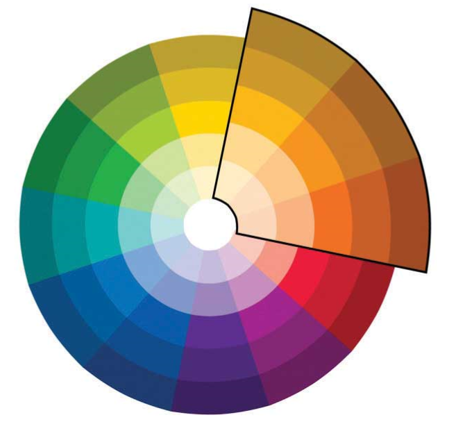
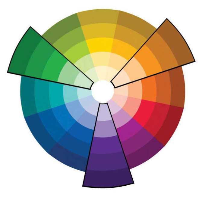
Triadic – two or three of the colours found in a triad (equidistant triangle) on the colour wheel.
Example of triadic colouring, blue eyes, golden blonde hair, pink skin.
Frequently, the easiest way to wear this scheme is to choose 2 of the 3 colours from triad and wear them back with a neutral (or two).
High Contrast Prints and Patterns
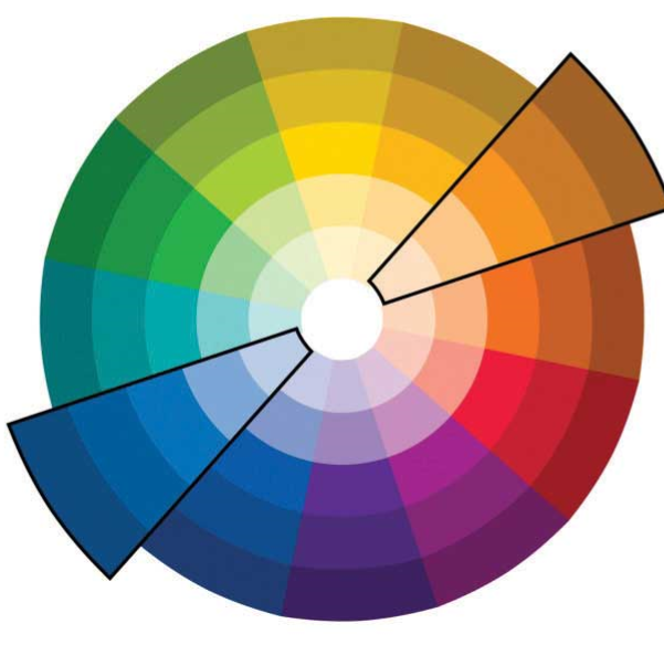
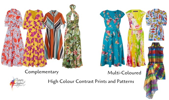
Complementary – This scheme creates the most “pop” and excitement as the colours really make each other look brighter and more vibrant.
Example of complementary colouring: blue eyes and red (orange) hair.
If you have moved from a brighter palette to a more smoky one, and are finding it hard to feel good in your new more muted palette, why not up your colour contrast as this will help to make the colours appear brighter and more vibrant.
Multi-Coloured – when you start adding many colours together – triads, complementary, tetrads, this also creates a high colour contrast.
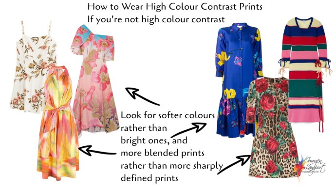
How to Wear High Colour Contrast Prints When You’re Not High Colour Contrast
Softer, smokier colours don’t look as bright and the colours less apparent, when teamed in high colour contrast.
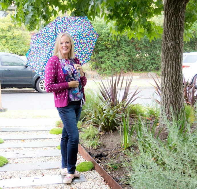
Look for blended prints too, or smaller busy prints, which contrast is not as obvious as a larger scale print or one that is more stark or sharp in its design.
Also, the further away from your face, the easier it is to wear.
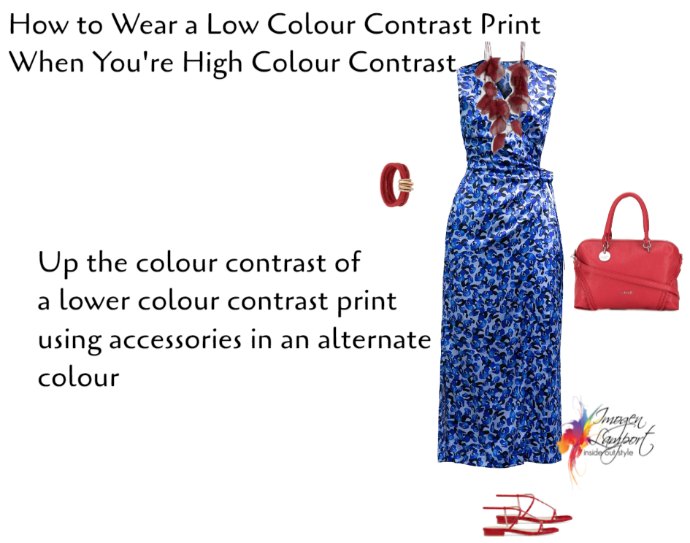
And if you suit a higher colour contrast, you can always up the contrast of your outfit using accessories (or other garments).
More Tips on Colour Contrast and Patterns
Using Simultaneous Contrast to Change the Way a Colour Looks
What to Wear: Prints and Patterns, Getting the Value and Contrast Right
How to Choose Prints and Patterns that Go With Your Colour Palette
Expert Tips for Choosing Prints and Patterns with the Right Colours for You









That is a really useful post. Thank you for all your advice. I have a question/request. I see actor Mindy Kaling in super stylish outfits, with a lot of print on print action. She does not have high colour contrast or value contrast. How is she doing this? And her body shape (I can’t figure out what it is) does seem to be heavier on the lower half, but she still seems to wear bright colours on her bottom. Could you please maybe pick a few celebs like her with varied colouring and more realistic bodies and do a post breaking down their styles.
I used to have high value contrast with charcoal-brown hair and coffee brown eyes but I chose to go gray. I’m about 70% white now and the brown of my eyes has softened. I see fleck of yellow in them now. (I still believe I’m cool coloring because of the white hair.) Am I now medium value contrast? Am I stuck in achromatic land with no color?
Your value contrast may be changing and lowering, you will find that your best neutrals will be changing too as your hair goes lighter and more grey/white instead of darker – everyone can wear one colour with neutrals! You just may not look good in multicoloured outfits.