Do you have a colour palette but are not 100% sure how best to use it?
Maybe you’ve been looking for individual colours in the palette and trying to match garments and accessories to those exact colours and ignoring anything that doesn’t match exactly?
If this is you, then this post is for you, as I want to show you the best way of using your colour palette and how there are way more colours available to you than just the few inside your palette.
Your Palette is a Summary
Rather than thinking that you can only wear exact matches to the colours in your palette. Think of your palette as a summary of all the colours you can wear (you just couldn’t fit a swatch with them all included in your bag). My Absolute Colour System palettes (of which there are 18 different directions) have 50 colours in each palette, it fits neatly into your hand and has enough colours in it to help you find all the colours you can wear. I call it the 50 of 50 000 that works for you.
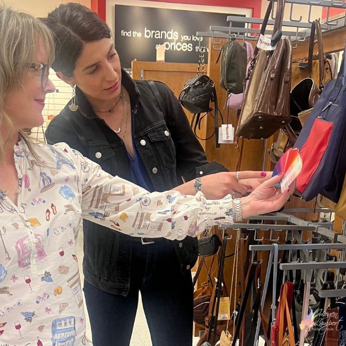
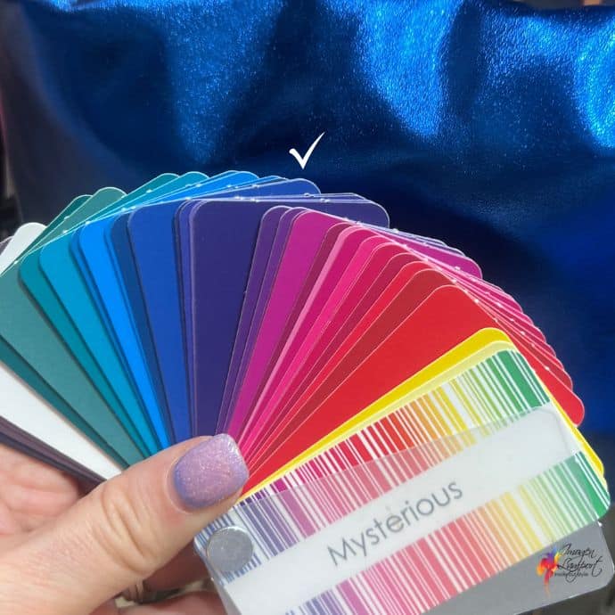
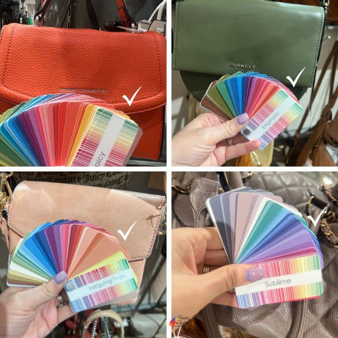
Here are two of my fabulous personal colour analysis graduates using a swatch to find garments and accessories to fit a colour palette. See how it’s just fanned out, rather than trying to look for individual colours?
This is why you want to use your palette to find colours like I’ve done in the photos in this post, where the palettes are fanned out, so you see the range of colours, but you’re not trying to match exactly the colour to one chip.
You can see in this photo that the blue blends with the blues in the palette. It has a similar intensity, undertone and value (aka brightness, cool undertone and darkness) to the blues in the swatch, as well as looking good with the whole swatch.
You want to find colours that look great with the WHOLE swatch, because that’s how you end up with a versatile mix-and-match wardrobe, where everything works seamlessly together. With anything new you bring home, when you use your palette in this way, you’ll find that your new garment or accessory will work with lots of other items you already own. That’s a win!
Here are more examples of handbags matching various palettes.
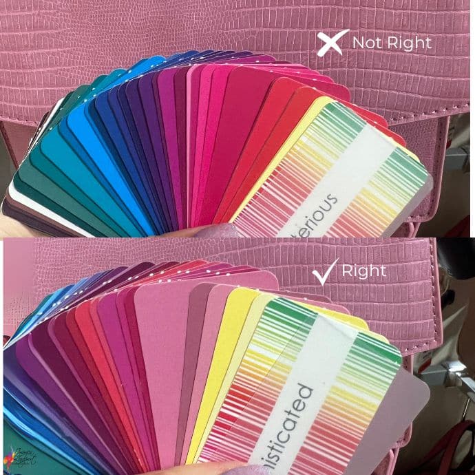
Match the Intensity
Here is an example of a cool pink handbag and two different palettes. The top one is too bright for the bag, so the bag won’t go with outfits. Whilst the bottom one is the same intensity and so will work easily with lots of outfits.
Match the Undertone
This is super important as if the undertone is at odds with the palette, the colours will clash with the rest of your clothes.
The Elegant on the left is too cool and bright for the olive green garment and when you look at the pinks you wouldn’t want to wear those with that green. The Intriguing palette on the right blends with the green and you can see that you could easily team it with many other colours in the palette, and so is a great match and worth taking to the change room (if you like the garment style) to try on.
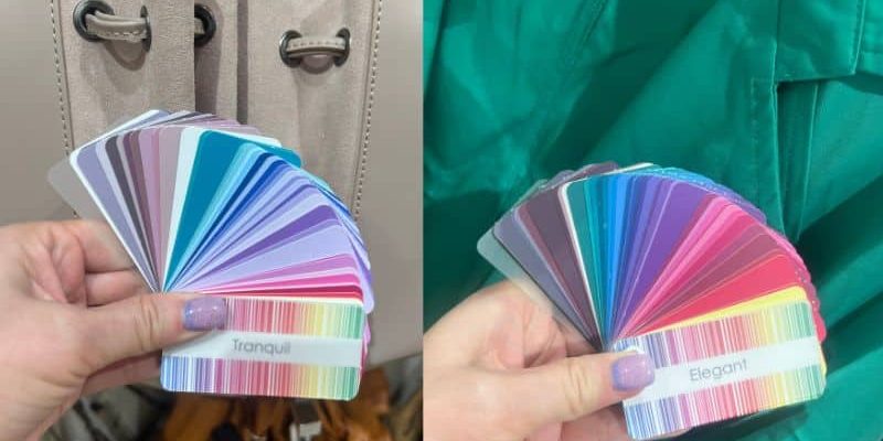
Here’s another green, this is a cool green and you can see that the greens in the Spicy swatch at the top don’t resemble the green of the garment, whilst the greens in the Elegant swatch do match perfectly.
And remember, it’s not just garment, it’s accessories too that you should be using your palette to find in you best colours.
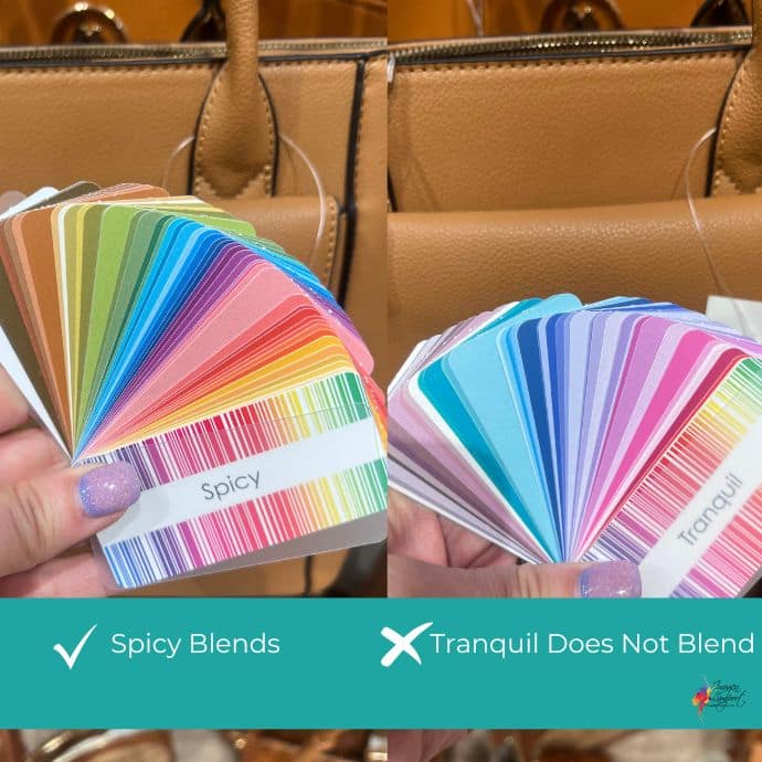
This camel handbag works well with Spicy but looks completely unrelated to the Tranquil swatch. 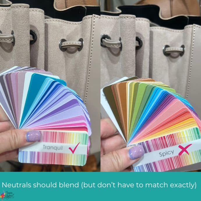
The Tranquil palette looks great with this cooler beige whilst it looks kind of washed out and bland with the Spicy. Just like with colours you don’t have to match the neutral exactly, but it should look like close family rather than being unrelated.
Choosing Glasses with Your Palette
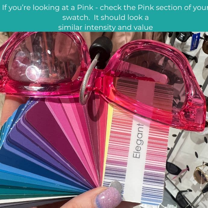
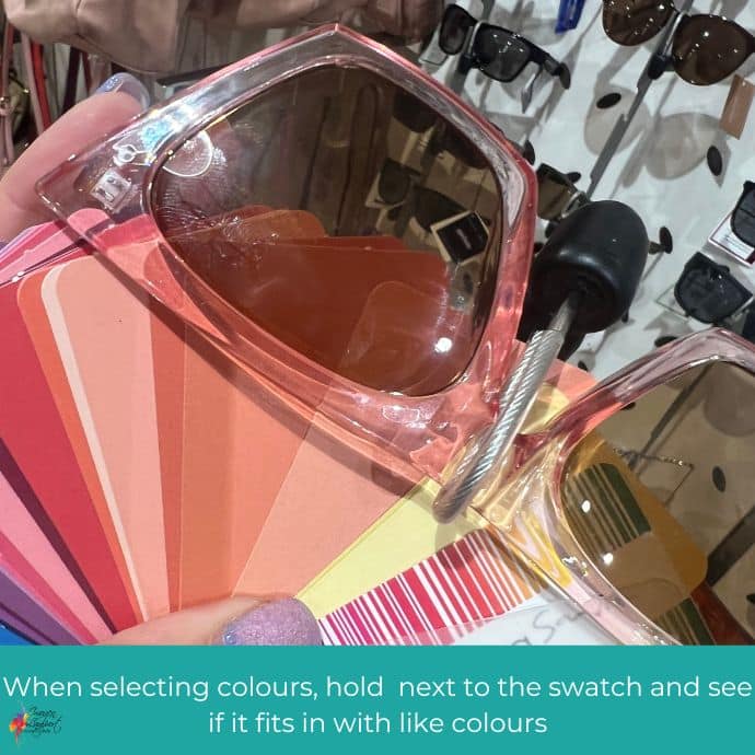
Whether it’s vision correction glasses or sunglasses (or just something for fun), because glasses sit on your face getting the right colour frame is imperative. The wrong colour will create a block between you and others, which makes you feel like you’ve got a barrier up and it impairs communication.
Just like with clothes, use your palette as a guide to find frames in great colours for you.
You’ll discover when you do use your palette that frame shape becomes less obvious when colour is great, whilst when the colour isn’t flattering on you, the frame shape becomes something you really notice.
Whether it’s a solid colour or a pattern, your palette is your best guide to finding colours that make your complexion shine and you look healthier.
When you stick to finding colours that work with it, because they have the same undertone, intensity and value, you’ll end up with a wardrobe that works together easily. You’ll be able to make more outfits from fewer garments
You’ll know too that new garments will be able to be worn with multiple items you already own (which is a must in my books) and won’t end up as wardrobe orphans.
Get Your Ideal Palette of Colours
Your colouring changes with age (and any time you dye your hair a new or different colour from what’s currently growing out of your head at the roots). It’s worth getting a new colour analysis every 5-10 years or if you’ve made a change to your hair colour (such as adding blonde highlights to brown hair, or you’ve decided to embrace your silver foxette). It used to be that people got one colour analysis for life, but that was when there were only 4 seasons and there weren’t the nuanced options that I have available to me. With 18 palette options, you can have a more nuanced palette that really works for you, rather than having to fit yourself into a category or season that’s OK but not quite right. Plus you’ll discover your current signature colours (and these can change as your colouring changes). Get your online colour analysis here, or find one of my amazing personal colour analysis graduates from around the globe here.










Thanks so much this very timely post. Having recently received my intriguing palette I’m learning to use it to select clothes to add to my winter wardrobe. I am astounded at how helpful the colour swatch is. Just today I’ve taken multiple items into the changing room of a number of shops, from op’ shops to outlet and department stores. Only three items came home with me. The clutch purse, jeans and peasant blouse that align beautifully with my palette. What’s more having completed the 80 days of EYS challenges and devoured your body shape info, these items also have the necessary design elements for my H-shape body and ingredients for my style recipe. I’m delighted to have left so many, of what once would have been “it’ll do” items, behind. Instead I purchased 10/10 items which I can’t wait to wear! Thank you again for the massive contribution your blog, EYS style programme and colour analysis has done for my confidence and style.
I loved reading this Linda! Look how far your style has come and how much getting this essential education in colour and style has saved you!