It’s very easy to get stuck in the same colour combination rut. You always put red with white and blue, wear your orange with your brown and then just stick with adding any colour to black as it’s ‘safe’ and you’re really not sure how to mix colours.
So sit tight as it’s time to experiment with colour combinations from the colour wheel.
To understand all about how to choose colours that play well together you need to understand basic colour relationships and terminology.
Colour Relationships
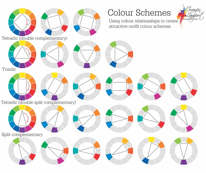
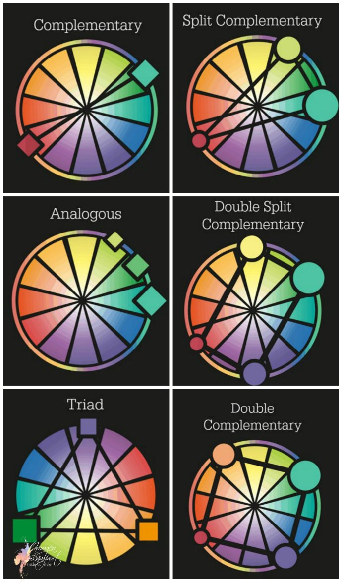 Complementary – colours opposite each other
- Split-Complementary – colours one off the complementary
- Analogous – colours next to each other on the wheel
- Triadic – colours in an equilateral triangle on the wheel
- Tetrad -4 colours – either a rectangle (double split complementary) or in a square (double complementary) on the wheel
When you are thinking about putting multiple colours together, you can spin each shape around the colour wheel and find a myriad of different combinations to try out.

Here’s a great tool to help you find lots and lots of different colour combinations based on these colour relationships. You can move the centre dots so that the colours lighten or darken too.
You’ll find many of these colour schemes in nature. Here is a beautiful rainbow lorikeet who has a Tetradic – double complementary – colour scheme of green, blue, yellow and red.
You can also mix a couple of schemes together or choose 2 of 3 or 3 of 4 in a scheme. You can easily mix red, blue and white – two colours from a triadic relationship along with a neutral (white).
Why not try choosing 2 colours from a relationship and adding them to your neutrals?
How Much of Each Colour?
So once you’ve decided on your scheme how much of each colour should you choose?
Like interior decorating, it’s good to have a dominant colour, a subordinate colour and then an accent colour. Think the 60/30/10 kind of proportion when mixing colours.
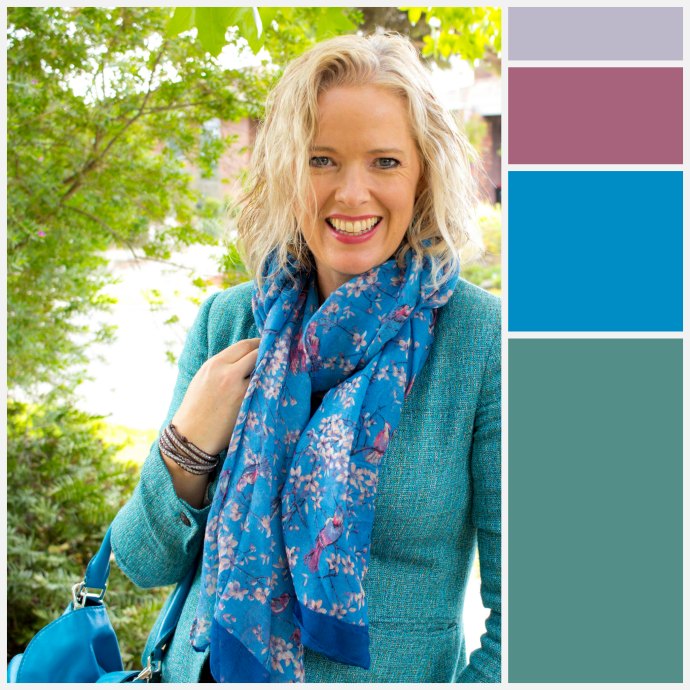
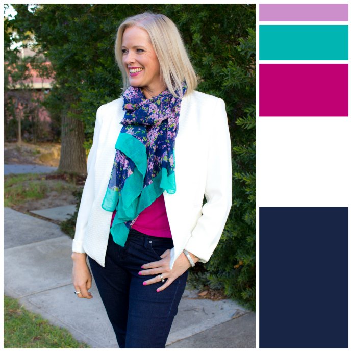
Here I’ve mixed two colours schemes – the main colour scheme is analogous – with the blue and green/teal which sit next to each other on the colour wheel.
Then the scarf has small accents of a pink, which is is triadic to the blue and complementary to green.
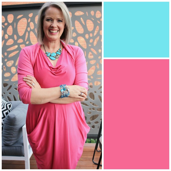
In this outfit I’ve mixed pink with turquoise, which works out to be basically triadic (pink being light red). Notice how the turquoise is used in small proportions as the accent colour, but repeated more than once to make it feel purposeful rather than random. Adding 2-3 pops of colour is a great way to add an alternate colour into a outfit. Just one small accent doesn’t work as well often.
Again mixing blue and green with pink, using the white as a neutral.
This is a similar scheme to the first outfit, but in a brighter, stronger version of these colours.
Colour Mixing Tips
If you don’t want your colours to clash:
- Mix colours of similar intensity – muted or smoky with other softer muted, smoky colours, or bright with bright.
- Mix colours of similar undertone – warm with warm and cool with cool.
- Mix tints with tints, tones with tones, and shades with shades, then create value contrast with neutrals
More Tips on Choosing Colours










This is really useful – maybe I’ll finally try mixing some colors together! Thank you!
Hi Imogen – hoping you could help me with a winter ankle boot indecision! I’m trying to decide on navy leather (to go with jeans and other navy options I have in my wardrobe such as dresses and skirts), or tan to match my hair colour for visual grouping? I’m a strawberry blonde who favours warm, clear colours.
I love both colours but my budget only allows for one pair!
Thanks in advance 🙂
Ok – your decision should be based on what you’d get the most wear out of.
Question 1 to answer – are your legs longer or shorter proportionally? If longer you can go with tan, if shorter go with navy.
Question 2 – will you be wearing them with jeans all the time or skirts as well? If only jeans – go with navy, if skirts go with tan.
Question 3 – of the time you’ll be wearing them – will more of it be with darker bottoms or lighter colours? If darker go with navy, if lighter go with tan.
Thanks Imogen. As usual another fantastic post. Could you also maybe do a post on the color properties of neutrals? Especially colors like navy, which really throws me off. I think I understand value, with respect to neutrals. But intensity and undertones really throw me off. If wearing a neutral can we pair it with colors of different color properties?
Sure I”ll put something together. Ideally you want similar colour properties of your neutrals as your colours, though the neutral can be a little brighter or more muted than the colour, but should be related.