Wouldn’t you love a wardrobe of clothes that are super easy to mix and match and create lots of different outfits together as the colours just naturally go together?
Fortunately, this is not something that is actually tricky when you’re working with a colour palette that has related colour properties. This is why getting a personal colour analysis and working within this palette gives you more outfit options from fewer items, as there is natural harmony between the colours.
Mixing Colours
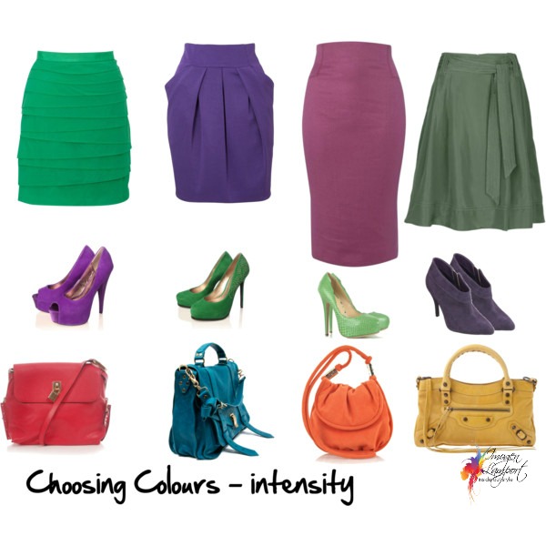
When mixing colours (not talking about mixing a neutral with colours) when dressing, use the concepts discussed here matching undertone and intensity. Below you will notice that the clear, bright colours work well together, whilst the more muted skirts would be jarred by putting a brighter accessory with them.

The overall value you choose is based on your own natural ideal value. So if you have dark eyes and pale skin and light hair, go for a combination of light and dark colours, with more light than dark – as your hair is light so your ideal value (which should be more of your outfit) is light too. If you had dark hair and light skin, go for an overall darker outfit with pops of light to create the right value contrast for you (more on understanding your value contrast here).
If you have light eyes, hair and skin colours, keep the value (lightness or darkness) more similar and preferably on the lighter end of the spectrum. If you are overall darker in hair, eyes and/or skin colours and don’t have really bright teeth or whites of your eyes, then keep your value darker and more similar.
Each of the 18 colour groups in the 18 directional Absolute Colour System has properties in harmony. The groups are named for the feeling of the colours, rather than seasonal (spring, summer etc) or just colour descriptors (warm, cool, light, soft etc.)
Choosing Colours
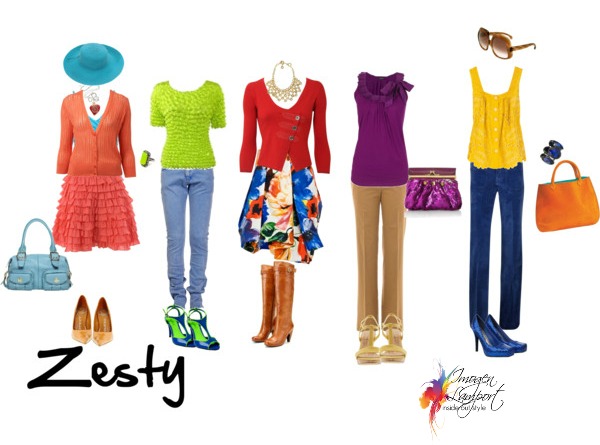
Here in the Zesty palette, the colours are bright and clear, warm and overall lighter.
Here in the Spicy palette the colours are still warm and lighter but are not as bright.
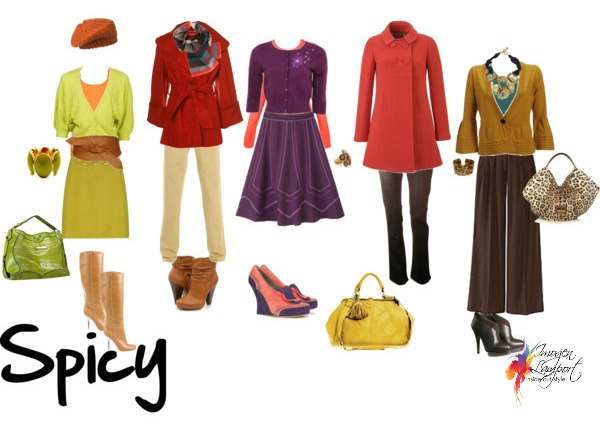
You would not be able to mix the Spicy palette with the Dynamic palette (below), as both the intensity and undertone are different.
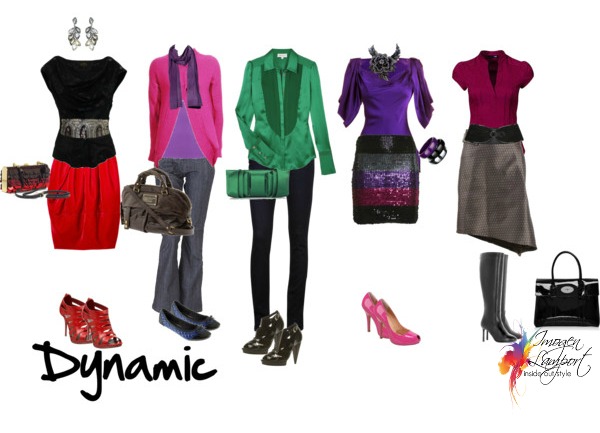
Notice how the colours blend and harmonise easily – mixing and matching works when choosing the same undertone and intensity.
The reason why so many people feel that they have no skill in mixing and matching colours is that they are trying to mix colours that have different colour properties and they naturally clash and so won’t work together, instead of looking to mix colours with similar properties.
As you can see from the image at the top of this post, it’s easy to mix colours when the properties are the same – the mixes may feel more outrageous or adventurous than you’d usually choose, but why not try something a little different using this colour theory to make it work for you.
If you’ve no idea which colours really suit you now (as your colouring changes with your age) then you can get a personal colour analysis as part of my 7 Steps to Style program (and I’ll also give you my professional opinion on your ideal value and both value and colour contrasts too), taking the guesswork out of putting your wardrobe together.
9 Ways Knowing Your Best Colours Will Change Your Life as Well as Your Wardrobe
How to Manage the Transition from One Colour Palette or Season to Another








Great post, Imogen! Just wondering, is the Spicy palette similar to the Exotic colour chart you gave me?
Interesting. My palette is Intriguing. I hope you cover that one too. I see I have a lot of light and a lot of dark colours. Most of the light colours mix in with my skin which is nice.
Tiffany – Exotic is the darker version of Spicy – which is why it looks familiar to you!
This is incredibly helpful, Imogen! I group these colors naturally for the most part, but it's great to see it all laid out.
Very cool. I recently saw a woman in the street who was wearing 4-5 different colours (I tend to do 2-3 so I was impressed) and it worked together – and I noted it was because they all had the same 'intensity', so there looked obvious next to each other. GLad to see this confirmed and elaborated.
Will we see the rest of the 28 palettes?
– tall & slim anon
Thanks a lot! This is really interesting! The colours are amazing!But I always wonder: I am clear skin, eyes, hair. My palette would be spicy I think, but my body shape (A) makes it dificult to wear clear colours on the lower part. I end up wearing dark pants and skirts and keep the clear colours for the upper part…then it makes too much contrast! Soooo I try to wear a mid tone top and keep the clearer brighter colour accent in an acesory( scarf, jewelery) but… Yes: Where should I put my very EVERY best colours if they are clear and bright and my body shapes makes it complicated?
It's difficult to keep your chosen colour intensity in mind when shopping, hence the colour swatches. I think another option is to bring a multi-coloured shawl of the right colours, and just check if whatever you're considering is in the right area. Of course one has to find this shawl in the first place, but that's fun 😉
– tall & slim anon
Oooh! I love that dynamic palette! I have trouble wearing these colours in the country though – so many people wear sludgy colour clothes, which look awful on me!
Thanks Imogen – great to see that the plummy purple I combined with a chartreuse sort of colour is similar to a combination you put together – I must be getting the hang of it! You're very generous with your advice.
Love this! So helpful!!
Very cool. I have colouring close to Amy Adams. I'm guessing the Spicy would be the best palatte for me?
Tall and Slim – there are only 18 palettes and I probably won't show them all! But you may get to see some more. You are also right about having a scarf – it can work well.
Anonymous – you would find (if you had a full palette of colours – the colour swatch) that you have a range of great neutrals that work well with your colours to put on your bottom half, so that you can wear your best 'colours' on your top half.
Anonymous – without seeing your intenstity it would be hard to say – could be spicy, could be zesty.
Great post, everything so colourful 😉
Like the post. It will help me a bit. But it is very difficult to know into what group of colours I fell in to. My hair is dark with a bit of out burn colour, my eyes are dark green blue grey – it’s just a mix of them and the skin is not white or porcelain, but not golden either. When I tan I don/t get burned, but i can see a bit of pinkish tone. I always used to dress with the colours for winter and it did suit me, but know if i wear only black I look. I think navy looks much better on me, but also bright yellow suits me too, then my skin looks more tanned. So I am really confused. And here in UK it is so difficult to find what suits me, specially when they have range of, as I say, dirty warm colours… 🙂
Such a helpful post if I’m understanding right, since I’m medium with 2 colors, even the colors need to be medium?
Joy you need light and medium or medium with dar, or medium light with medium dark – just a medium value contrast.
2 colours can mean that you do this in lighter and darker, or you do 2 colours in a similar value and then use your neutral to create your value contrast.
I suspect these were polyvore images as they can no longer be viewed and it is harder to grasp the concept without being able to view the images.
Fixed – thanks for letting me know!