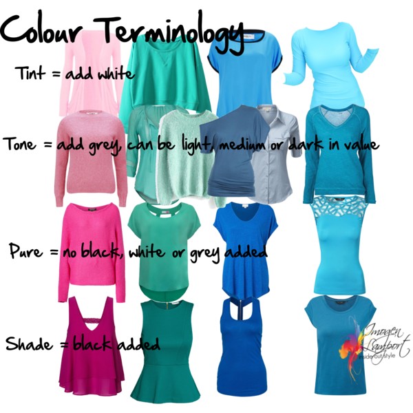
Colour is a subject that fascinates many of you. And I know I’ve written some posts on it before such as this one on understanding colour properties, but here is a picture I’ve put together to help try and explain the basics of tint, tone and shade.
Colour Terminology Basics
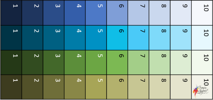
The value of a colour just means how light or dark it is. Think about it being like this on a continuum from light to dark:
Discover more about your value and value contrast here.
Tints are lighter colours that have white added. The more white added the more milky and soft it becomes, as well as getting lighter and lighter.
Tones can be light, medium or deep in value, they are a colour that has been changed by adding grey. You can soften a colour down by adding a little grey, it won’t look grey, but just not as bright. You can add more and more grey to a colour to it becomes smoky and dull, and eventually, you will identify the colour as grey first, then with a hint of the original colour such as a bluey-grey or green-grey etc.
Shades are deep or dark colours. If they are medium deep they will retain brightness, in the way that colours that are tinted a bit, but not too much also can appear quite bright.
More on tints, tones and shades here.
Pure colours are bright, crisp and clear. They have not been changed from their original form. Colour instensity – pure or soft, more on choosing colours, pure or soft can be found here.
Overtone means the warmth or coolness as associated with warm or cool things. So blues and greens are seen as cool because we associate them with cool water and forests etc. red, orange and yellow have warm overtones as we associate them with the sun, fire and heat.
Undertone refers to how the colour has been created and whether or not it has a warm (usually yellow) or cool (usually blue) base when the pigments creating the colour are mixed. You can check out these posts on identifying undertones.
How to pick the undertone of a colour
How to choose colour undertones
Understanding colour properties
Why colour analysis has evolved beyond the seasons
Understanding colour analysis and colour systems









I don’t think I have ever learned about color as much as I have from your website, Imogen. Thanks
so much for all your expertise. Colors really fascinate me and I love learning about the properties of
colors and why some look great on us and others look terrible.
This is really helpful. Thanks, Imogen!
I love your website and find it so helpful. I am putting together a capsule wardrobe for spring summer. I have several pairs of white trousers; skinny white jeans, white 7/8 and long loose legged linen. I have 3 blazers, long sleeve stone (stretchy camel), navy and black (both hip length with 3/4 sleeves). However, to create a column of colour and wear the jeans with a white top and black or navy blazer, it looks a bit bland. What colour tops would add some interest under the blazers? I am in my late 50s, with dark brown hair, eyes and yellow undertone to my skin? I bought some sleeveless tops in black, navy, bright orange, pale pink, white and red, but I stick to the white, to be safe – and boring.
Without seeing you and doing a colour consultation I wouldn’t like to give you advice. My guess is in your late 50s you’ll want softer, more smoky colours rather than really bright ones. You may like pattern too. THere are no hard and fast rules, it comes down to your unique personality and colouring.
Thanks Imogen. It’s funny you should mention soft, smoky colours – I love them, but they never seem to flatter my sallow skin. It’s funny, but whenever I wear coral, orange and even (on a rare occasion) a hot yellow, I receive so many compliments as these colours near my face seem to give it some life. Next time I am in Melbourne I will try and arrange a consultation with you. I am probably quite deluded about my love for bright colours!
Maybe you are a bit brighter still? Maybe you’re looking at the cool smoky colours rather than the warm ones? You can still love colours and enjoy them in your life, you just may not want to wear them all.
i love these posts, too! I was wondering if you would tell us whether the colors above are warm or cool. (Want to see if I guessed right.) My other question, perhaps for another post, is how to decide what value to wear. Forgive me if you have covered this before. I love color but can’t duscern what I’m seeing very well and so also keep forgetting what I think I’ve learned.
These colours are all on the cooler side, though some of the blues are warm blues.
Which color termology (property) does colors mixed with brown/beige such as green-y beige khakis belong to?
Tones are most difficult for me to understand, yet many of them are my best colors. Before this website i only knewed the terms; jeweltones and earthtones apart from brights/pure and pastels/tints, but many blogger refer the earthtones as warm restricted so its a bit misleading. :-/ I find that warm tints (lemon) and cooler earthtones (purple-ish burgundy if worn with lighter colors, its slightly too dark, soft corals works better while rusty colors look horrible unless adding bronzer) work best on my colorings. the cool tints ones can make me look bit pale while the warm earthtone make me “muddy”.
Depends – are they brighter or more smoky and greyed? IF they are brighter, they will have more intensity. If they are greyed they will be tones. Jewel tones just means brighter and often deeper colours. earth tones just means colours that relate to the earth, but that’s not a colour term as such. You may call earth tones neutrals.
Hi Imogen, have you ever heard of another category called a Wash?
Washed just means washed out think watercolour – we don’t see too much of it in fabrics
Great color info here. Thank you!
I have several black & white striped skirts. Looking at this, I see the colours I like to wear with them, all seem to come under “pure”.
Black and white are both pure – which is why the tone best with other pure colours. Similar intensity always works better than mixing intensities of colours.