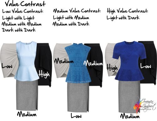
One of the things I’ve discovered tends to confuse people is that they think that they can only wear colours that are the same value as them, so if they are overall lighter in value they can only wear light colours, and if they are deep/dark, they have to wear dark colours only. Ideally we want to base our outfit around colours that relate best to our value, so a light person looks better in an overall lighter outfit, but it doesn’t mean they can’t wear any dark colours, but you will find that their version of a dark colour isn’t as dark as someone with deep value. And it’s true that someone who is overall deep in their colouring tends to look ungrounded if they wear to toe light colours, just as wearing really dark colours all over looks too heavy and dark on someone who has light colouring.
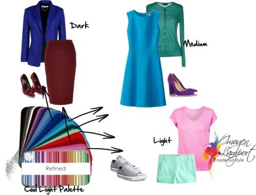
In every colour palette you will find a combination of light, medium and deep/dark colours.

- So Light can wear dark colours
- And Dark have light colours
And of course we need to have a selection of light, medium and dark colours, otherwise we can’t create any value contrast
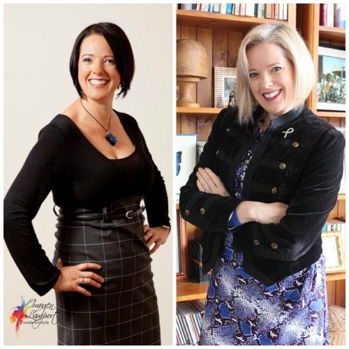
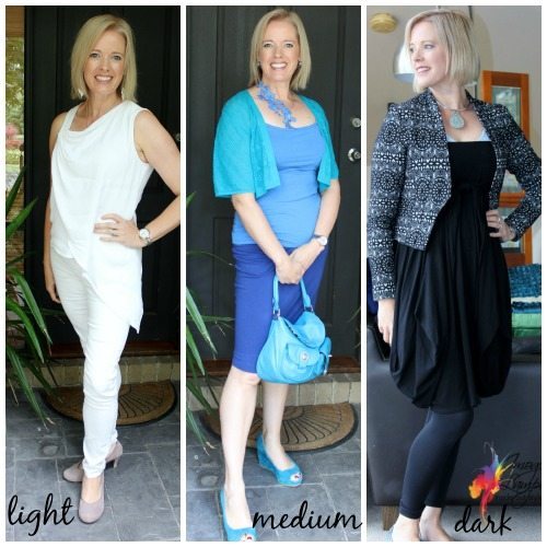
That said, you can see how when I had dark hair (and so dark colouring) I suited the dark colours much better than I do now with my light hair (and now light colouring). I definitely have to wear more eyeliner to be able to carry off black now as I need a deep colour on my face for it to relate to.
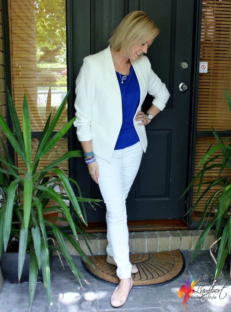
You can see that the overall light or medium value colour suit me so much better now than the deep/dark colours as your eye flows from top to toe and back up more easily when there is not such a contrast with my colouring. In fact when I had the deep colouring I remember trying on white jackets and just never ever liked the look, it was wrong on me then, but works perfectly now I have light colouring.
And I will wear it with a more medium colour, than a dark colour as I have medium blue eyes which makes my value contrast more medium.
More posts on value contrast:









Hi Imogen,
Good post on value for further clarity …
I thought my impression on your outfits was interesting. Right off, I felt you looked stunning in both the all white and the black (darling on you!!) The blue, which is a great color on you and being medium is likely your value, etc … but I didn’t care for that so much … I mean you always look GREAT, but the other two just look WOW !!
Great examples – it always make more sense to me when I see the actual photos rather than reading the descriptions.
Totally agree with Rebecca, I need to see the clothing rather than visualise it.
Hi, Imogen. I agree with the other comments. This is so must easier for me, too. I have always been a “visual” learner, & , being a retired sewing teacher, I think most women are. No matter how many times I print off the instructions & reread them, the drawings / pictures / photos always seem to click instantly!
Great post and you look wonderful in all the photos. If the aim is to see you rather than the clothes then my preference is the all blue outfit. Interestingly you are wearing relatively brighter colors but with medium to light value. In the black outfit the ‘wheely’ nice jacket seems to soften the black around your face. Thank you
Hi Imogen! Thank you so much for such a useful information which could help every single person on this planet.
If you may allow I want to ask you a question which has been troubling me ever since I have read your post!
I have a deep ideal value as my hair is dark and I am medium-high value contrast! Do you think I can wear a light colour shirt and then complement it with trousers and shoes which is deep in value? This is because you have always stressed upon wearing your ideal value near to your face and there are instances where it is not always possible to wear darker colour shirts especially in summer and also layering with a darker colour jacket or blazer is not a possibility because of the same reason that it is summer and also because generally in our office nobody wears a blazer.
I would love to get some advice on this topic from you.
Thanks.
It’s better to have something dark up top near your face – so can you add a scarf or necklace that is dark to create you ideal contrast?
Thank you for the great post. Great explanations as always. BTW, I just can’t get over how great you look as a blonde. I think I actually prefer it to the brunette, though that was nice also.
interesting how much hair colour matters! when you were a brunette, you said you didn’t look that good in a white jacket, even though your skin is rather light, so I’d have thought that adding contrast in some other way – white should still have worked?
Yes even though I needed contrast, I found a white jacket was just too much white – needed the white in a smaller proportion
You certainly look healthy and very pretty and slimmer in the lighter versions of yourself.
So where does Deep, Cool, Soft fit in?
I take my little swatch with me but I am still not sure.
Deep, dark cool brown eyes, olive skin and dark brown hair are pretty boring if you don’t know what you’re doing and then you end up wearing lots of black because its easier than trying to stand there figuring out what’s what
I don’t understand your question Meredith about where does deep cool soft fit in?
Deep means you need overall darker colours rather than all light colours. At least one dark coloured item in your outfit.
Cool – means you want a cool undertone to all your colours
Soft – means that you don’t’ want really bright colours, nor really greyed down and dull colours.
Just grappling with it all after reading numerous posts on colour value and contrast.
Apart from combining light, medium and dark colors…what about combining warm, neutral and cool colors? And what about combining pure, tints, tones and shades? (So pure colors or colors with with, grey or black added)
I’m a little confused about your question – warm colours don’t mix well with cool colours. Neutrals on the whole still have an undertone of either warmth or coolness. have a look at my post on clashing colours http://www.insideoutstyleblog.com/2014/02/what-are-clashing-colours.html
How to mix colours http://www.insideoutstyleblog.com/2014/…/how-to-mix-and-match-colours
I thought greyed down colours would be soft – so not quite sure. Aren’t they just really soft?
Adrienne
Greyed down colours are soft – there are many words you can use to describe these colours – smoky, soft, muted, dusky, toned – they mean the same thing, just variety in the English language.
Great examples, I like visual representation best.
Just a note, I notice you in the light example, the dark appears too dark, and in the medium tones, my eye is jumping around to the different colors and shapes more than seeing your face. Why is that?