


Low Value Contrast refers to colours that are only 1-3 shades apart on the grey scale. This creates a soft, blended look that feels elegant and understated.
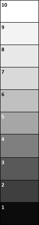
It doesn’t matter where on the grey scale the items sit, just they need to be close to each other in depth of colour.
What it doesn’t mean is that the colours have to be similar to each other (that’s colour contrast).

To find out your ultimate value contrast read this post.
Here are some examples of Low Value Contrast in different values and also different colour contrasts.
Low Value Contrast for Light Value Colouring
If you have overall light value (fair and lighter or blonde hair) and you are low value contrast then work with an overall light palette such as this.
You will see that the top and skirt (and all accessories) are a similar value (that is level of lightness or darkness). This is in a light value (all light colours). This outfit is also an example of 2 neutrals plus one colour.
Low Value Contrast for Medium-Light Value Colouring
Here is a Medium-Light Value (it’s really in between medium and light colours, but not really light). Still in a low value contrast. It looks more contrasted because of the higher colour contrast.
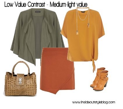
Here is an example of low value contrast in a medium-light value and but with multiple colours (orange and yellow orange being analogous, then the green being triadic from the yellow and split complementary from the orange).
Low Value Contrast for Deep or Dark Value Colouring
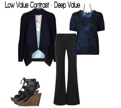
For those with deep or dark value colouring, low value contrast can be achieved by pairing colours like navy and black. This creates a smooth, refined appearance that is effortlessly chic.
With the navy and black both being neutral – you could class this as 2 neutrals. But I would say that in this instance the navy works more in the top as a colour – so it would be neutral plus 1 colour with its colour contrast.
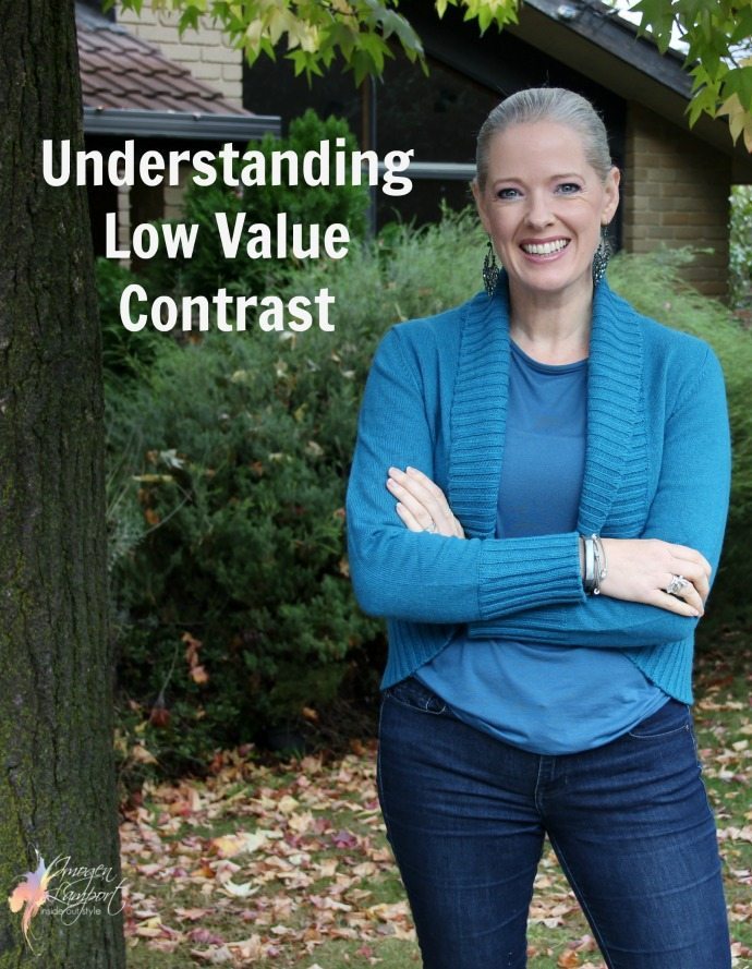
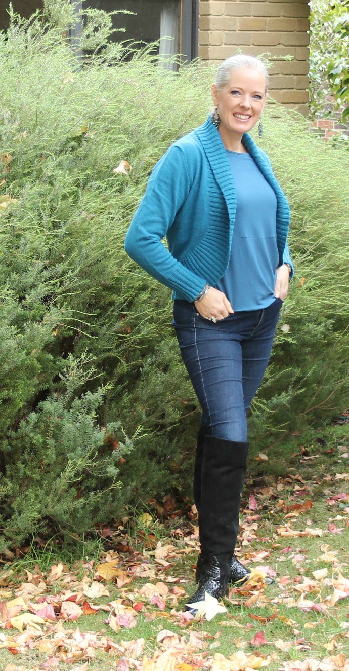
As I’m Medium Value Contrast – low value contrast doesn’t look great on me – it makes me feel a bit bland. To get away with it I had to wear some seriously blingy earrings which reflected light.
Want to refine your wardrobe with colours that truly flatter you? Join my 7 Steps to Style program for expert guidance on mastering value and colour contrast!
Read up more about Value Contrast


Of all the many informative items I learned through your 7 Steps Program, Imogen, discovering that I was very low value contrast was the largest epiphany for me. It was so frustrating for me to have fabric and clothing dye art as a hobby, (so conceivably able to easily have any colour I thought of) and still feel that I just didn’t “get it right” somehow! Thank you again!
So good to get those ah ha moments!
Hi Imogen . I would honestly think you are low contrast as you have very fair hair and skin. I cannot see your eyes. Are they dark or blue? I have noticed when you wear those light outfits in blue you look stunning and elegant… I feel some of those more brighter medium value contrast can overwhelm you but I could be wrong
I have dark blue eyes. Doesn’t show up so much in photos!