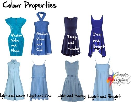
Every colour has 3 unique properties. When you are finding colours that suit you, you are looking for those colours that replicate your natural colour properties.
Value
The lightness to darkness of the colour. You can change a colour from it’s natural pure (rainbow) hue by:’
- Tint – adding white
- Shade – adding black
Some colours are natuarlly light in value – yellow is always light. Some are deep in value – indigo is always deep.

You can change a colour by adding white or black to make it lighter or darker.
Undertone and Overtone
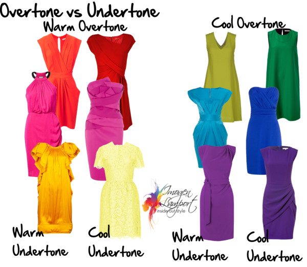
How warm or cool the undertone of the colour appears. Colours have both overtones and undertones.
Overtone – how we describe the colour psychologically – we describe yellow, orange and red as warm (overtone) because they relate to things that make us feel hot – the sun and fire. We describe blue and green as cool (overtone) as they relate to things that make us feel cool – water, cool lush foliage that shades us from the sun.
The Undertone of the colour is how the colour is created – when mixing colours to create that unique hue. Every colour (except orange) can have a warm or cool undertone by adding yellow or blue (or sometimes white or black will cool down a colour, and sometimes red will warm a colour up)
Warmth (yellow base) or coolness (blue base)
Intensity
The intensity of a colour is all about the saturation and brightness of it. It may be pure and bright, with little or no grey added or a tone – adding grey in higher amounts.
The brighter the colour, the more advancing it appears. The more muted/greyed down/toned the colour, the softer and smokier and more receding it appears.
When you’re selecting colours to wear, if you discover your own colour properties and work with them, you’ll find that the colours harmonise with you and create a face focus.
For instance, my colouring is cool, deep and fairly bright – so the colours I wear have these colour properties. It’s not that I can’t wear light colours, but I need to wear something darker with my lighter colours.









Ive never heard about the overtones before! When I studied color theory (self-taught from websites, including yours ;-)), I never heard peopled used the overtones and now the color wheel make more sense.
For some reason, I always thought green was as a warm hue and never understood where you are suppose to split up the color wheel into warm and cool properties because Ive never seen green as a “cool” colors and red I find is in-between cool and warm because its always treated as a neutral/classic colors. (like e.g. people find its okay to be matchy-matchy with red, but not pink or orange and it often goes with so many colors when used as an accessories like red pumps). With green, I always read that people thought it looked best with gold and warm colors…. but guess I was wrong. 😛
Btw, I thought pink was a cool color and often grouped together with people with cool colorings, but I assume thats wrong according to this post?
I often find myself into muted properties, either with light/soft warm colors or deep/bright cool colors, but color property does fuschia/hotpink have, E.g. this dress: http://farm8.staticflickr.com/7441/9370131109_c2d9881556.jpg ?
Also, is it strange if people with more soft colorings looks better in bright colors? I often find that I suits in bright colors over the more soft colors, despite my blue-grey eyes. :S
Your dress is a warmer hot pink – if you compare the two hot pink dresses in my picture, you’ll notice that one has more yellow, the other is slightly purplish (more blue). When I look at your dress, I see the yellow in it.
Your skin is the largest organ, and event though you may have softer eyes, your skin is clear and bright, which is why you suit brighter coloured clothing.
Green is officially “cool” but warm green (yellowish) has a warm undertone – and it will work well with gold. Cool green (bluish) will look better with silver.
True red is neutral in undertone, but warm in overtone. It’s such a classic colour that it’s used many places.
Thanks for Answering! 😀
The hot pink in your picture was too hard to see the difference (same with purples) from so I asked on here to be sure. I thought all bright/light pinks were cool, except for corals and peachy-pinks.
I always thought that I had a medium-dark soft colorings due to my eye color and hair color. When I read about the seasonal color analysis, I couldnt find my eye color in the other seasons, so thats why I assumed I had soft colorings. My skintones goes with both warm and cool colors (golden bronzer doesnt look muddy, nor does cool pinks/plums blush) which make it a bit harder to tell what type of color property my skintone has. Even the makeup artists where I live couldnt tell. :L
But when I wore the soft colors, I always feeled a bit washed out and feel more alive in brights. Like taupe-ish mauve http://farm6.staticflickr.com/5532/9302566944_03676a73df_z.jpg (when I compared the hotpink dress, I notice my skin was more rosy in hotpink and paler in the mauve dress and thats where I start to question that I were “soft”). My relatives also prefer me in brights and pure white for some reason. Now it make more sense!
Hot pink is def. not a favorite color of mine, but I seems draws to colors that looks better on me. I prefer however vampy like burgundy (edgy/girly + classic personal style) and colors that are neither very warm nor cool, like teal, corals, rose and true red. But I also love wearing darker cool colors with warmer accents (rather than wearing same undertone on everything) because its seems yellow/peach/coral/gold warm up grey and black a notch (light and clear spring has these colors combos in their color combos, so I guess Ive a more springy colorings but slightly deeper intensity?)
But there are many warm colors than make my skin look orange – yellow-beige is one of them, I prefer a peachy-pale pink as my “nude” color. I assume its the muddy warm colors and icy cool colors that are the “bad guys”. xD
I think the season analysis is too muddled and confusing. Imogen never uses it, I think you’ve noticed – she has taught us that there are three categories, very well explained above, that are better suited to explain what colours suit us.
I’m intrigued about your colouring! Perhaps I am wrong and photographs can be tricky, but on the basis of the two I’ve seen of you, I would think that you have light, soft (not bright) and warm colouring. Perhaps I am wrong, but that’s what I’d have thought. (The pink dress is too bright so I saw the dress first, not your face; the other dress is cool and I’d have thought you’d have warm colouring.)
I don’t think you can suit both light/soft warm colors and deep/bright cool colors. You either have soft or bright colouring, they are mutually exclusive. Same goes for warm or cool.
Just my thoughts, as I said, I’m no expert, but that’s what I’ve gathered as a very interested amateur enthusiast and Imogen’s avid admirer.
I prefer to use the seasonal analysis and using the ones from Anna Villaruel’s blog thechicfashionista and into-the-mind blog and been “studying” them for about two years before I come across Imogen’s…
Anna’s color analysis is however based on color properties as well but they’re using seasons when refering to the categories: Summer is soft/cool, spring is clear/warm, winter is bright/cool and autumn is earthy/warm in color properties and then devide it further into three more groups based on the intensity. (winter deep, autumn medium to deep, summer light to medium, spring is mainly light). I didnt learn the color anylysis from hair-eye-skintone color, but their properties.
I think Imogen using names like “Spicy”, Zetsy, Dynamic to describe the three color properties (absolute color system?) according to her previous posts, which is very similare to seasonal analysis. Zesty (clear, light and warm http://www.polyvore.com/cgi/img-set/BQcDAAAAAwoDanBnAAAABC5vdXQKFmVvWEdYNkc4M2hHbnJkd3REMGhtV1EAAAACaWQKAWUAAAAEc2l6ZQ.jpg ) is very similare to Clear Spring: http://www.thechicfashionista.com/clear.html 😛
so I guess thats why I find hard to change the color methods and dont find anylysis/properties confusing. I just not that good to tell my own colorings, because its change everytime I dye my hair or wear bronzer and thats why Im stuck to decide my colorings. (for some reason, its easier to judge someone *else* colorings).
The hair color in the links I showed where when my hair were bleached. The third profile pic in this link is my natural hair color, slightly lighter: http://farm8.staticflickr.com/7454/11074080814_0fcdbc13da_c.jpg while these are my “warm dyed” hair color http://farm4.staticflickr.com/3740/11073985205_3cc2727c89_z.jpg (very different colorings, eh?) 😛
Im not sure if people who following Imogen’s method if you take dyed hair and makeup into account? Because for some reason, I feel its a bit wrong to determine your colorings after an hair color (tanner or colored contacts) thats not your natural colors. :L But thats just my take on it!
What a fantastic post, always fascinated by colour.
1. I’d have thought that you, Imogen need to wear dark colours with light colours because you have a high value contrast (dark hair and fair skin)?
Or can Michelle Obama wear light colours? Or the other extreme – how about Amanda Seyfried? Can she ever wear a dark colour and not distract from her face?
2. Another query, please, is there one attribute that is dominant for us? E.g. I also have deep, cool and bright colouring, and the worst was this muted orange pullover I had as a teenager. Worst colour on me. But a warm red, with orange in it, while did distract from my face did not drain me of colour and apparent health. A muted cool blue makes me look dull. So does this mean that brightness is a very important aspect for me, more important than coolness/warmth?! I’ve often wondered when it was that a colour merely distracted from someone’s face as opposed to making them look sick/tired?
Susie – You can create high contrast with light and dark or bright and dark. But you can just do it with some jewellery, doesn’t have to be in clothing.
If you are overall lighter, you need overall lighter clothing. Your dark colours aren’t as dark as someone who has dark colouring.
Yes Michelle Obama can wear some light clothing, but she needs predominantly medium to dark colours. Amanda Seyfried needs overall lighter clothing, her dark colours will only be medium dark rather than really dark.
Yes we all have dominant colour characteristics. Yours may be bright. Mine is Cool first then deep and fairly bright. As long as 2 of the 3 are there then it seems to work pretty well!
You may not be as cool as me, which is why you could wear a warm red. Maybe bright is your number 1 characteristic.
Thanks so much!
I suspect my dominant determinant would be bright before cool!
Amanda Seyfried needs predominantly light, Michelle Obama primarily dark clothing, makes sense. How about you? You say your colouring is deep, I am guessing that’s on account of hair colour, but if you wore predominantly dark colours with no light colours, that would not tally that well with your light-coloured skin and eyes? So you always make sure that you wear a light and a dark colour too, never just dark colours?
Great explanation of colors, how they work and how to select what is right for you. Color is a science and combining colors is and art, it takes a real understanding to put colors together well. Lovely post.
Thanks Lisa! Mixing colours is easy when you understand their properties.
and one more question please! I have a really lovely (and warm) wool purple cardigan that is deep and cool but not very bright in its colour. Muted doesn’t suit me that much as I have bright colouring and all my other clothes are bright too. Besides you always taught us not to mix colours of a different intensity. Is there any way that I could still wear this cardigan?
Wear it with neutrals
Thank you! Albeit my most frequently worn neutral is black (ie bright)!
I think my palette is sophisticated or serene. Two parts of the system are easy to pick definitely soft (number 1) characteristic and defininitely cool. A summer in the old system but I have darkish blue eyes and darkish ash brown hair with pale skin but am certainly not high contrast. I can’t work out if I’m deep or more likely light for the third part. I don’t suit white and charcoal grey is probably the darkest colour I can wear. I think grey navy is one of my signature colours as are plum/ aubergine. Is there a soft, cool medium palette?
Adrienne
Just as there can be cool browns there can also be cool oranges (think dream cicle of years gone by, those vanilla ice cream on a stick dipped in orange). All colors have there cool side and their warm side. Even yellow can be cool, lemons and bananas have a color that is more “cool” compared to the yellow of say a golden doorknob. Purple can also be “warm” (brownish eggplant purple). Green’s cool and warm side are probably best illustrated in the “warm” green leaves of Spring and the “cool” green leaves of summer.
Dee – all oranges are warm – yes those white based oranges are cooler than the more burnt versions, but they are still warm.