


Imogen, I would love an article on how to incorporate medium value colors when one is high contrast, and how to use our bright colors to increase contrast even though they are not necessarily light. I’m medium high contrast and am puzzled by the medium value colors.
How to Use Medium Value Colours with High Contrast
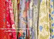
The biggest tip to remember when working with your high value contrast, is that as long as part of the outfit is high value, you can still wear a medium colour as well. So if you are wearing a pattern such as in the illustration below which has a high value contrast (both very light and dark elements in it) then it’s easy to wear a medium value topper such as a jacket or cardigan.

As long as you have a light and dark colour (such as in the pattern of the dress above, adding a medium value colour – like the blue jacket – will still give you the contrast you need. Alternatively you can put a bright colour with a dark colour or light colour to increase the apparent contrast levels.
The more similar the colours (on the colour wheel) the less the brightness of the colour will make the value contrast appear higher.

So you can see here above how the blue top – even though it has a similar value to the other tops, doesn’t look as bright with the darker denim, so it remains medium value contrast. The further away the bright colour is from the other colour (on the colour wheel), then the higher the value contrast appears (example the red and orange tops appear higher value contrast as they are on the other side of the colour wheel to blue).

Now above is an example of similar colours with the same jeans in a medium value contrast, but because the colours are muted and smoky, their perceived value changes less except the blue top which appears lower contrast.
Remember if you want colours to look brighter you can also use colours that are more opposite (complementary) or just further away on the colour wheel from each other. It amplifies their contrast. How colours react to each other is called simultaneous contrast.

Here the pink cardigan – in a medium value – can be part of a low, medium or high value contrast outfit. Again the pattern of both white and dark in the skirt gives you the high contrast you desire, but you can still wear the medium value cardigan with it and maintain the appearance of high value.
In this illustration below, the tops and skirts are of similar value to each other. You can see this with the red “value” tool which I”m holding over the picture.

But when you look at the two outfits, the blue top makes the contrast look higher value contrast (rather than medium) as it is brighter.


- Brighter colours are more advancing – so come forward. Therefore look more apparent and obvious. More noticeable.
- Muted colours are more receding – so go backwards. Therefore look less apparent and noticeable (which can lower the perceived value)
This is why brighter colours which advance give the perception of a higher value contrast, which is what is happening in the blue top/black skirt outfit in the illustration above.

Not sure what your value contrast is?
Then download my 3 Step Process to finding your ultimate contrast.

11 Real Life Examples of Dressing to Your Contrast
Want to see more real life examples of dressing to contrast? Then download 11 examples in this printable PDF for your reference.


Excellent post, Imogen.
Brilliant! Thanks for this lesson Imogen. You are a wealth of knowledge when it comes to colour.
Thanks Bron – it’s a passion that I’ve been studying for over a decade
Thanks for linking up to Top of the World Style
superb post, thank you!
what about muted with light colours? i think that creates a rather high contrast.
Whether you are muted or bright, you wear the intensity of colour that suits. I’m not quite sure of your question.
My question was about the illustration called “muted colours make colour contrast less apparent” which shows muted colours with dark denim. i wonder if it were, say, light blue denim, would colour contrast be more obvious even with muted pairing? In other words, dark with muted hides colour contrast but what about light with muted? I think less so.
thanks!
K
Depends on the colours.