Imogen: I am so excited you will be talking more about color. Years ago, I was color typed as a vivid summer (light in value and cool). I remember I was very disappointed because I loved all the colors in the winter palette. As I’ve learned more about me, I realize that I enjoy the winter palette because I have a dramatic flare, I don’t care for dramatic styles or prints, but I bring this aspect of my style personality out by wearing bright contrasting colors. Usually black and/or white, with bright turquoise or shocking pink etc. Can you give me an idea of some ways to bring out the best in my coloring (blah cool pastels) and make them pop with drama. Without using other dramatic techniques just with the use of color in my palette?
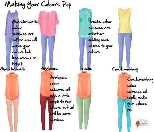
Yes, black and a light or bright colour will add lots of drama to your look, but if these aren’t the colours that flatter you, if you’re lighter and cooler and softer, or warm in your colouring, then how do you create the same excitement with colours if you don’t have the natural drama of the winter (cool deep) palette?
To make your colours pop, go back to the colour wheel and use the colour schemes of Triads and Complementary to create that drama. You can see in the polyvore above that even though I’ve used Cool and Light colours (top row) and warm and light colours (bottom row), when the colour is put with something more different, more opposite or part of a triad, then it looks brighter and more exciting.
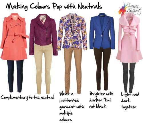
The other way to add that drama is to create contrast with the light and dark colours of your palette. You can do this with your light and dark colours, or lighter colours and dark neutrals (or vice versa).
Why not use a pattern to create the drama? Often patterns such as the purple floral jacket above, will have multiple colours that create a higher contrast, or they can have light and dark colours which work the same way.
If you think about your neutrals as quasi colours – Navy (blue), Beige (yellow), Camel (orange), Brown (orange) – and then wear them with colours that are complementary this will also make them pop more.
Even a softer mid-tone colour will look brighter when put back with a dark tone from your colour palette.









I am finding this challenge so much fun, as it is encouraging me to try different colour schemes. The triadic colours I used was a combination that I would never have thought of. I love the idea of a colour pop too! Thank you so much for your helpful posts, Imogen.
I too love the drama of color but thought this was no longer possible when dressing in my palette. I’m so happy to see this great answer to my unspoken question! Thanks, Imogen and original mystery question poser!