


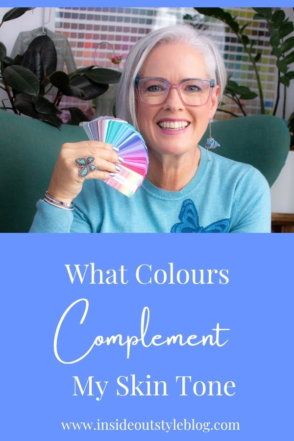
Colour Is Not a Matter of Opinion. It’s a Matter of Science
In the top 10 Google searches on personal style, colour is a hot topic, and searches by people wanting to know which colours match their skin tone have risen exponentially over the past few years. With the rise of AI tools, people have also been attempting to do an analysis using AI tools, yet currently, I’ve not seen any that give an accurate result consistently (you may get lucky, or it can be way off base).
The Compliment You’ve Probably Received Without Understanding
When you’re wearing colours that are in harmony with your skin, hair and eye colours, they will help to make you look more vibrant, alive and balanced. You may get more compliments on “looking well” rather than compliments on the specific colour of a garment.
That is not a coincidence. That is colour doing what colour does when it is working properly, which is to say, when it is working in harmony with your specific, individual colouring rather than against it.
Colour is the single most powerful tool in the styling toolkit. It is also the most misunderstood, the most oversimplified, and the most frequently reduced to a set of rules so generic that they help almost no one and occasionally make things considerably worse.
This post is an attempt to give you something more useful than rules. It is an attempt to give you understanding.

Why Colour Is Not Just a Matter of Personal Preference
We tend to talk about colour in clothing the way we talk about colour in interior design: as a matter of personal taste. I like blue. You like green. She has always worn red. These are preferences, and preferences are subjective, and subjective things are, by implication, beyond analysis.
But the interaction between colour and the human face is not subjective. It is governed by the physics of light and the biology of human perception, and it produces results that are observable, consistent, and explicable.
When a colour harmonises with your natural colouring, several things happen simultaneously. The colour reflects light upward toward your face, enhancing your skin’s natural tone and reducing the appearance of shadows, unevenness, and lines. Your eye colour appears more vivid and defined. Skin looks more even and healthy. Your overall appearance has a quality that is difficult to name precisely but easy to recognise: a kind of aliveness, a coherence, a sense that everything is in the right relationship with everything else.
When a colour does not harmonise with your natural colouring, the opposite occurs. The colour absorbs or reflects light in ways that cast shadows, emphasise unevenness, and drain vitality from the face. Features that are normally clear appear muddy. Lines that are normally unremarkable become more prominent. The overall impression is of someone who looks slightly unwell, or slightly tired, or slightly less than their best, without any obvious explanation for why. Plus, the colour, when unrelated to your natural colouring, will draw attention to itself, thus creating a body focus, rather than a face focus.
This is not vanity. It is optics. And optics are not a matter of opinion. Those light waves that have a similar frequency to those colours in you will just work.
View this post on Instagram
Within every palette, there will be reds, blues, greens, browns, greys, purples, pinks, etc. It’s just the properties of colour that vary. Now your preferences matter, but they matter at the end stage of a colour consultation, when we’re choosing between two similar palettes that have nuanced differences rather than completely different palettes, one which may look terrible and the other great. As I tell my clients, it’s not apples and oranges, nor is it a red apple versus a green apple; it’s between two very similar red apples, a kind of difference.
The Science of Colour
Colour is light rays made visible as they reflect off surfaces. So when you look at a red apple, for instance, the red ray is reflecting off that apple skin whilst all the other colour rays are absorbed.
Undertone
At the foundation of all colour analysis is the concept of undertone: the underlying hue that sits beneath the surface colour of your skin, regardless of whether that skin is fair, medium, deep, or any of the infinite gradations between.
Undertone is broadly categorised as warm or cool. I’ve yet to see someone who is truly neutral in over two decades of doing thousands of personal colour analyses. Warm undertones tend toward yellow, golden, peach, and olive. Cool undertones tend toward pink, red, blue, and rose beige.
View this post on Instagram
The physics of why undertone matters lies in the concept of colour temperature. Warm colours, those with yellow base reflect warm light. Cool colours, have a blue base, reflect cool light. When the temperature of a colour aligns with the temperature of your undertone, the light they reflect is complementary, and the result is harmony. When they conflict, the result is the visual equivalent of two instruments playing in different keys simultaneously.
This is why the same shade of red can look extraordinary on one woman and thoroughly wrong on another. The colour itself has not changed. What has changed is the relationship between the colour’s temperature and the wearer’s undertone. A warm, tomato red will harmonise with warm undertones and clash with cool ones. A cool, blue-based red will do the opposite.
When you look at a colour like green, there is a neutral green that has neither more yellow nor more blue in it (green is made by mixing both yellow and blue together).
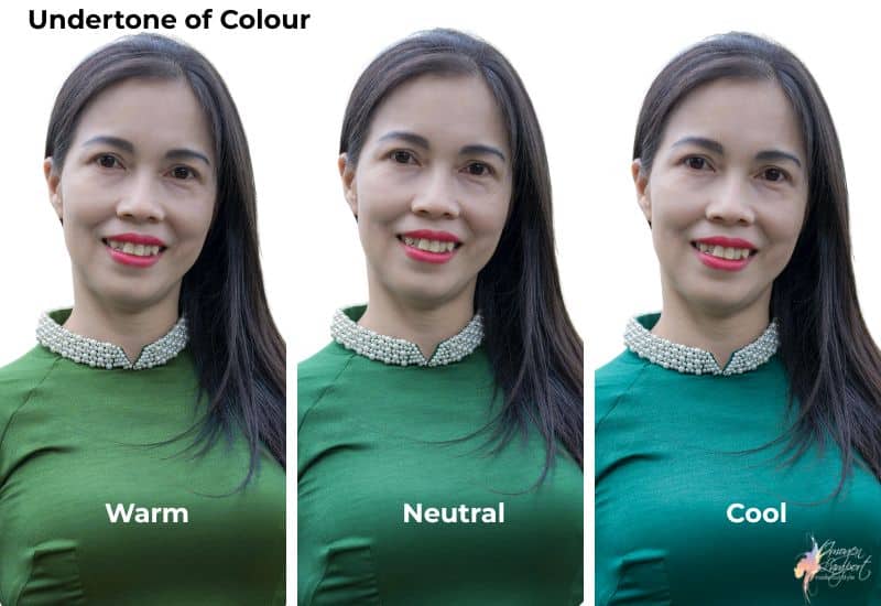
What are you looking for? The colour feels related to your colouring and creates a face-focused look, rather than drawing attention to your body. The colour looks like it’s a part of you. Here, the warmer green is grabbing attention and taking your focus away from her face. The neutral and cooler greens look more related to her as she has a cool undertone.
Understanding your undertone is the beginning of understanding colour. It is not, however, the end.
Colour Value
Value is the technical word for how light or dark a colour is. From white to black and everything in between. Every colour not only has an undertone, but also a value. Which is the best for you is based on hair value – so light-haired people look better in lighter colours, whilst dark-haired people look better in darker colours. Medium-haired? Best in medium value colours. Of course, we are talking about the right value and the right undertone simultaneously.
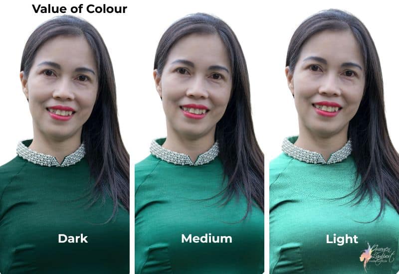
You will notice that the lighter version of the green (even though it’s not particularly light like a pastel, which is very light) grabs attention, whilst the medium and darker greens look more related to the woman as she is overall darker because she has dark hair.
Intensity or Saturation
The final property of colour that a great colour analysis takes into account is the intensity or saturation of the colour. We have highly saturated colours that are very bright and intense all the way down by increments to very smoky, muted colours that appear quite greyed out. There are a myriad of points along this spectrum too, not just at the extreme ends.
The right intensity of colour for you will feel balanced, it neither dulling or draining your skin of life, nor overwhelming it and drawing all the attention to itself.
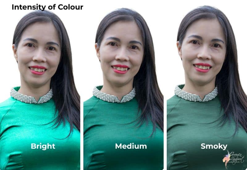
Here the bright intensity grabs attention, whilst the smoky one makes her look dull and drab. She has a more medium intensity.
Why the Four and even 12 Season Systems are an Oversimplification
Colour analysis as a formalised discipline has existed since the early twentieth century, with roots in the colour theory of Johannes Itten, who observed that his students at the Bauhaus tended to choose colours for their artwork that harmonised with their own personal colouring. The system was developed further by various practitioners through the mid-century, and achieved widespread popular recognition with Carole Jackson’s 1980 book “Colour Me Beautiful,” which introduced the now-familiar four-season framework: Spring, Summer, Autumn, Winter.
The seasonal system has considerable appeal. It is memorable, it is broadly intuitive if you live in an environment (Northern Europe, Northern America, where it was developed, and winter is snowy, and summer is more dusky), and it offers a clear palette of recommended colours for each type. For many women, being “typed” into a season provided the first useful framework they had ever had for thinking about colour in relation to their appearance.
But the system has significant limitations that become apparent the moment you try to apply it with any precision.
The first limitation is categorical. Dividing the entire spectrum of human colouring into four categories is a radical simplification of a genuinely complex continuum. Human skin, hair, and eye colour exist across an almost infinite range of variation, and many people sit ambiguously between seasons, displaying characteristics of two or more categories without clearly belonging to any.
Even with the 12 seasonal systems, they take two of your three colour properties into account – deciding whether it’s value and intensity that matter most, and even if you’re warm you might end up with a dark winter palette (see the example here), or undertone and intensity (and you may end up as a soft summer, even though you have dark hair), but rarely do you get all three colour properties in alignment. Plus, there are no equivalents in value, intensity, and undertone for each of the palettes, unlike my 18-palette Absolute Colour System, which offers greater variety and nuance and takes all your colour characteristics into account.
The second limitation is cultural. The seasonal system was developed primarily with reference to light-skinned, European colouring, and applies less cleanly and less consistently to the full range of global skin tones. Women of African, Asian, South Asian, Middle Eastern, and mixed heritage have frequently found that the seasonal categories do not accurately describe their colouring or provide useful guidance for their specific situations.
The third limitation is precision. Because the seasonal systems have been developed by multiple people over the years, there are huge variations in them. I’ve seen warm greens in supposedly cool “winter” palettes, and cool blues in warm “spring” palettes. There are seasons like a “Brown Summer” and a “Blue Spring to name a couple. What I notice with a lot of seasonal analysis information is that they try to combine both colour palette – intensity, undertone and value – with value and colour contrast, rather than taking these as separate entities that can be applied over every palette.
The Case for a More Nuanced System
This is why, in my practice, I work with my 18-palette Absolute colour system based on Munsell’s science of colour rather than the traditional four seasons, which came from the world of art. Eighteen palettes allow for a level of specificity that four simply cannot achieve, capturing the genuine complexity of human colouring with enough nuance to produce recommendations that are actually useful rather than merely directional.
The additional dimensions that an expanded system captures include contrast level, the degree of difference between your skin tone, hair colour, and eye colour, which determines how much contrast your outfits can carry before they overwhelm or underwhelm you. They include chroma, the saturation and intensity of colour that harmonises with your colouring, which determines whether you look best in clear, bright colours or softer, more muted ones. They include depth, the overall lightness or darkness of your colouring, which influences how light or dark your best colours tend to be.
These dimensions interact in ways that make the simplified seasonal framework insufficient. A woman with cool undertones might have clear skin, hair and eyes, but her value may be dark, so she calls for a darker overall palette of colours, or if she has light hair, she needs a lighter version of those same cool colours. Two women with identical undertone assessments might require quite different colour strategies in how to wear their colours. When you start layering on top, the value contrast or colour contrast (read about how these really do impact how you put outfits together here) which are separate from the palette, but still important factors when using your palette to make outfit decisions.
The goal of a more nuanced colour analysis is not complexity for its own sake. It is precision. Precision that produces recommendations specific enough to be actually useful, that translate into real decisions about real garments in real fitting rooms.
The Psychological and Social Effects of Wearing Your Best Colours
The research on the effects of colour on perception and psychological state is extensive and spans multiple disciplines.
In terms of social perception, studies have consistently found that colour affects how others evaluate us before any other information is processed. Research by Adam and Galinsky, whose enclothed cognition work we explored previously here on the topic of what your clothing says about you , has been extended by subsequent researchers to include colour specifically. The colours we wear influence how competent, how warm, how credible, and how attractive we are perceived to be, with effects that are measurable and consistent across observers.
Frank and Gilovich’s research on colour and perceived aggression found that teams wearing black uniforms were penalised more frequently by referees than teams wearing lighter colours, suggesting that colour influences not just conscious evaluation but implicit response. While the professional implications of this are complex, it is worth knowing that colour is doing work on the people around you, whether you are aware of it or not.
In terms of self-perception, the enclothed cognition research predicts, and clinical observation confirms, that wearing colours that harmonise with your natural colouring affects how you feel about yourself. Women who have had their colours professionally assessed frequently report not just that they receive more compliments, though they do, but that they feel more confident, more settled in their skin, and more authentically themselves when dressed within their palette.
This is not a trivial effect. Colour is one of the most immediate and accessible levers available to us for shifting how we feel when we get dressed. Unlike fit, which may require alterations, or silhouette, which may require shopping, colour is a variable you can begin exploring today with what you already own.
How Your Colouring Changes With Age
One of the dimensions of colour analysis that receives insufficient attention in mainstream style advice is the way personal colouring evolves over time, and the implications of that evolution for colour strategy.
The most visible change, and the one that generates the most anxiety, is the shift that occurs when hair begins to grey or whiten. For many women, this change is experienced as a loss, a dimming of the contrast and vibrancy that characterised their earlier colouring. Style advice frequently responds to this with suggestions to “brighten up” with bolder colours, which are well-intentioned but not universally correct.
What actually happens when hair lightens and greys is that the overall contrast level of your colouring shifts, often quite dramatically. Dark-haired colouring becomes medium- and then light in value. And because value level is a key determinant of the colours that work best, the palette that suited you at thirty-five may need meaningful revision by fifty-five, not because you are less, but because your colouring has genuinely changed. Along with the obvious loss of pigment in hair, your skin changes too, it may become less clear than in your youth, meaning you need softer colours as well as lighter ones as you age through the years.
For many women, the colours that work best after greying or whitening are softer, lighter, and more delicate than those that worked previously, reflecting the new, lighter value reality of their colouring. For others, particularly those whose hair whitens to a bright, clear white rather than a soft grey, contrast can actually increase, opening up new colour possibilities rather than narrowing them.
The key is to reassess rather than assume. The colour palette that worked for you a decade ago may still be largely correct, or it may require revision. The only way to know is to look, with fresh eyes and an updated understanding of your current colouring, rather than dressing for a version of yourself that no longer exists.
The Difference Between Colours You Love and Colours That Love You Back
This is perhaps the most important distinction in all of colour analysis, and it is worth sitting with honestly.
There will be colours you are drawn to, perhaps deeply and consistently drawn to, that do not harmonise with your colouring. Colours that, when you wear them near your face, work against you in the ways described earlier in this post. This can feel like an unfair limitation, as though colour analysis is telling you that you cannot wear what you love.
That is not what I am saying.
There are colours that will make you glow, and others that will drain you of life. You may love those colours, even though they don’t love you back, and it doesn’t mean you can’t enjoy them, I’d just advise not wearing them. Enjoy them in your home, decorate your house in them, get your fill of them in other ways than in your outfits.
There are ways of wearing colours that aren’t great for you, but unless you already own them, I’d advise against purchasing anything new that doesn’t make you shine in a healthy way, as when you become attuned to the colours that really work for you, you’ll avoid those other colours, and so will realise what a waste of money the garments were.
If you have colours that aren’t great for your complexion, think about these three possibilities:
- Dye them into a great colour
- Wear a fabulous coloured scarf next to your face so that’s what reflects onto your skin (but remember the unrelated colour will draw attention to itself and if you don’t want your body to be the focus of your outfit, then best avoided)
- Wear more makeup to give you the look of health and vibrancy you desire
The goal is never restriction. The goal is understanding, because understanding gives you choices that ignorance does not.
Colour Comes First
When people ask me what I look for when shopping for clothes, my answer is always that colour comes first. It doesn’t matter how great the style of the garment is, if the colour isn’t also gorgeous on you, you will never look as great as you could, and in fact, it could make you look ill.
Colour is the first thing people see and the last thing most women understand about their own appearance. We are taught to think of it as a preference, a trend, a mood, rather than as the precise and powerful tool it actually is.
When you know your colours, getting dressed in the morning becomes more of a conversation than a guessing game. You reach for things you know will work. You wear them with the quiet confidence of someone who understands why. And people look at you across rooms and say: “You look wonderful today.” Plus, one of the biggest positives my clients tell me about (and I have experienced this myself) is that it becomes so easy to mix and match items in your wardrobe as the colours naturally work together as they have the same colour properties, making more outfits from fewer garments.
Discover The Colours That Complement Your Skin Tone
Don’t rely on AI to get it right, instead, I’ve spent over a decade doing online personal colour analysis with women from around the world, and I can tell you it’s not able to be done with just one photo, if you want it to be accurate (if someone tells you that it is, then I’d not trust the result). If you’d like to discover your best palette and how to wear it, you can find out more here.
Finding Your Perfect Palette: The Evolution of Personal Colour Analysis
9 Ways Knowing Your Best Colours Will Change Your Life as Well as Your Wardrobe


Another brilliant article! You are correct, many people see what color to wear as a preference (which certainly it can be), but there is truly a science of what colors look best on each person, based on the properties you mentioned. It’s as inescapable as why the best colors chosen for an interior of a house will depend on how many windows there are, what direction the natural light is entering from, if the natural light is morning vs evening, etc. And I’m with you that AI cannot replace working with an actual human being for getting an accurate analysis. Having a professional color and style analysis with a woman local to my area was the best investment I’ve ever made for my wardrobe. Although she used the seasonal system, it worked well for me. My three properties – warm undertone, medium-dark value, fairly saturated – revealed my best colors are what I’d call “Autumn jewel tones”, like deep brick red or deep teal blue. I try to convince the women I know to invest in this kind of analysis. Some have been willing, but many still want to be “on trend” with whatever the fashion industry offers. But the ones who have taken my advice, have seen the wisdom of it! Bookmarking this post, and will forward it onto anyone who I know who needs it.