


It’s been announced that Living Coral is the colour of 2019. It’s interesting that this colour has been in fashion for a number of years here in Australia – maybe the rest of the world is just catching on?
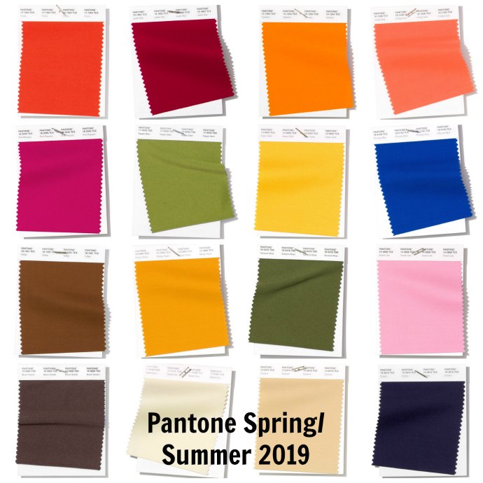
So what are Pantone’s colour trend forecasters telling us we’ll be seeing in stores? Here they are! How to put them together you ask?
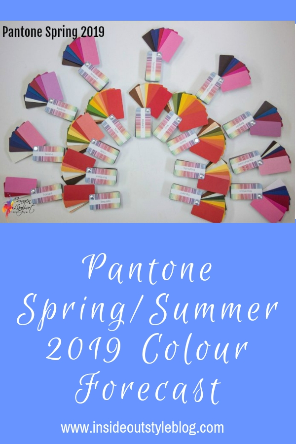
Well, that’s easy – all you need to know is which are warm and which are cool in their undertone – so I split them out for you.

Pantone Spring/Summer 2019 Colours – Warm Undertone
One thing I hear all the time is that I’m constantly told you can’t find warm colours in stores – particularly for spring and summer – so if this is you then you’ll be happy to know that the forecast for the upcoming spring/summer 2019 colours means that the stores should be full of warm colours for you to choose from.
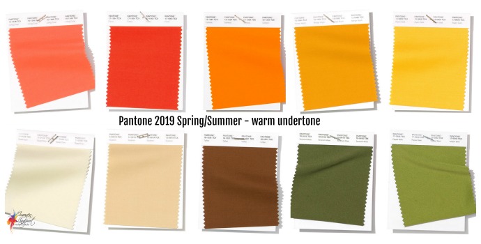
See how these colours go well together – you really can mix and match them without having to fuss or worry you’ll be making a mistake. When you stick with the same undertone you take a lot of the guesswork out of mixing colours as you’re choosing colours that have one colour property in common (find out more about mixing colours here – and what are clashing colours).
Living Coral (pictured top left) is the 2019 colour of the year – and it’s a great colour as it suits most warm complexions – so often it’s a skin enhancer – making you look healthy and bright.
Pantone Spring/Summer 2019 Colours – Cool Undertone
There are actually less cool colours than warm in this forecast – with all those yellow tones remaining popular and the olive and asparagus greens too. If you’re cool look for a lighter lemon version of Aspen Gold (top row right in the image above) which is the coolest of these yellows (though still got lots of warmth).
The cool selection is smaller than the warms, though it makes my heart happy to see some of my favourite pinks and blues.
Fortunately, it also includes a common skin enhancer for cool undertones – with the two pinks in Sweet Lilac (top left) and next door -Pink Peacock.
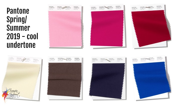
The Process Blue (bottom right) is one that you may find a variation of and there could end up being warmer versions that could be worn as well.
What’s interesting is that navy (though a cooler version than has been around over previous seasons) is still one of the major neutrals that we’ll be seeing (so you don’t have to buy black) and there is a cool brown along with the warm brown (though this tends to come very slowly into fashion, sadly).
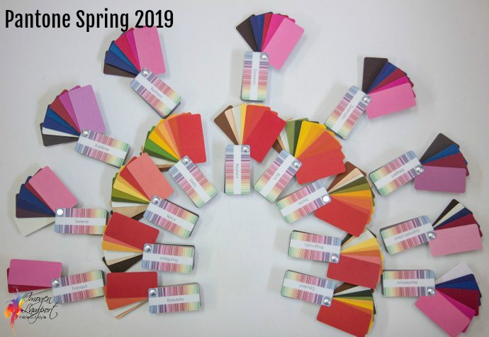
Having fanned through my collection of colour swatches – most of these colours (and variations of them – which you always see in stores) are in each of the pallets.
You can see how easy it is to blend these colours together – provided that you stick with the same undertone – the colours just go!


Very helpful post – thanks!
Thanks, Imogen! I love coral and coral loves me….any suggestions for wearing this beautiful color during winter months?
Wishing you a very Merry Christmas ?
a faithful fan,
Pat
It would look fabulous as a soft warm sweater or cardigan!
I am glad I am a winter, the cool undertone colours are gorgeous!!!
Lots of lovely hot pinks and reds with some gorgeous blue and navy!
Is it possible to by just the color swatches without the whole 7 steps to style program? I think that later I would be interested in your course but for now I really just want the color samples. I have cool undertones.
Thank you
As part of a colour consultation which you can find more details about at http://www.bespokeimage.com.au
Funny to hear you say that your clients can’t find warm colours in the stores, I can rarely find cool colours! Maybe we are all correct. Stores seem to be full of drab, muted colours rather than lovely bright ones.
Thank you so much for another very informative and practical article. So if I am sophisticated, coral is out for me? Should I just do coral accessories?
Coral is warm and you are cool – so avoid Coral (even though it’s everywhere in fashion right now). If you really want to add in a colour that isn’t great – an accessory is the way to do it, or a very small amount in a pattern that is otherwise at least 90% great colours.