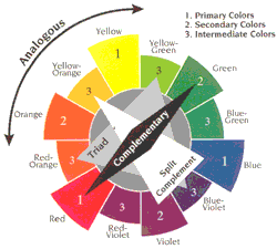
An easy way to mix colours is to mix 2 neutrals with 1 colour, this is pretty fail safe, especially if both your neutrals are either warm or cool in their undertone.
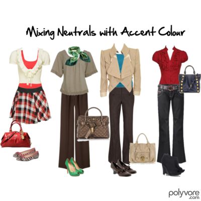
Another option is to go for 2/3 of a triad.
A triad is three colours equidistant on the colour wheel, if you choose two of them together, they work really well. It’s then great to mix these two back with a neutral. This is why red and blue are such perennial favourites, and look great mixed back with the neutral white.

Other great choices include green and purple, and orange and purple. You can of course choose to start with the tertiary colours and use them, so it could be a blue-green with a blue-violet, or a yellow orange, with a red-violet.
Once you’ve decided on your two colours, mix them with a neutral colour so you don’t overpower with too much colour all at once.
What is your favourite colour combination?









For safety’s sake I tend to stick to neutrals with a tiny bit of color added (which I am trying to change), but I have to admit my eyes are really drawn to the green and orange combination.
Modest Mum – give it a go – what is the worst thing that can happen? It’s interesting that you mention safety, when it’s not like wearing a bit of colour is likely to make the difference between life and death (unless of course, it’s a safety vest!).
Great formulas to remember!!!I tend to do the two neutrals with one color combination!
I’ve gotta start playing around with the color wheel more … I do everything through guesswork!
This past winter, I’ve been loving the combination of red and purple. In your combinations here, I’m really liking that green and purple. I don’t have anything in that green, but I’m imagining a teal-and-purple combination that I think I could do. Thanks for the inspiration!
I love color, and my favorite book on this is Showing Your Colors by Jeanne Allen.
I actually like mixing colors that are close on the color wheel… teal with mint or navy with olive and stuff like that. Otherwise I’d say the neutrals with a pop of color is the most fool-proof for me.
At the moment I love purple and green, any green but a fresh lime green makes me feel spring-y.
Last year it was purple and orange. Mostly a neutral appears in the shape of my shoes.
Christina Lee – this is an easy hard-to-miss formula!
Sal – gives you something new to think about.
Mater – you sound like you go for the 2/3 split complementary – will do another post with these options.
Gina – I’ll have a look at that book.
ranksubjugation – this is an analogous mix – which is yet another great option.
Another informative post, Imogen! Blue and orange is one of my favorite color combos but I never wear it. I was thinking I could pair a denim skirt with a plain white blouse and use the orange as an accent. I’m in the mood for spring and your post made me think of ways that I could make my boring neutrals more fun! I’m going to dig out my color wheel this weekend–should make shopping for accessories more fruitful!
I’m loving mixing red with camels and browns at the moment. They look so good together.
It’s really hard to get away from black and white though living in Melbourne – I was interested to see that Trinny and Susannah who are in Australia at the moment hate that combination and are huge fans of wearing colour instead.
I’m also a big fan of the blue and greens – they look awesome together!
I adore green and purple together, though I don’t wear them. Also pink and green, which I guess are a variation of red/green complementary combination?
Pink and brown, blue and brown.
I have been loving fushia and green together lately with denim or black.
Great post friend.Thanks for sharing it to us.Hope to see you on my blog too..;D Have a nice day.
Kellygirl – blue and orange are complementary colours – which creates a very high colour contrast.
Zizzy – I know what you mean about Melbourne and black and white. The reason T & S hate b&w is that it doesn't suit them, so they don't like it for anyone. It does suit some people, but it's a very lazy way of choosing colours and dressing.
I too love blue and green (why should they never be seen?)
Sallymandy – yes pink and green are a variation of red/ green complementary colours.
blue and brown with a touch of yellow is another great combo.
La Belette – I love that you're wearing colour and not just black!
I went to my blog list to get over to your blog today and realized you were not on it!! oops, I’m adding you now, also I am including a different URL that will update my blog on yours, here it is;
http://feeds2.feedburner.com/colourmehappyblog
Love your colour lesson today by the way, I love it when I get a new idea on something to wear that I already have!!
I just tried to add you and it said “could not detect a feed for this URL”, do you have one for me? That is very odd. Never seen that happen before.
I totally love analgous schemes with a pop of a complementary color!
The colours I like best are odd ones that don’t show up here; I like taupe with pale blue. Violet and dove gray.
cinnamon and celery green.
I also love navy and black together, and clothes in primary colours actually make me feel nauseous. Why is that, Imogen?
Current faves:
Brown & light gray w/ pink
Brown & cream w/ teal
Brown & cream w/ green
I've really gone for brown in a big way this past season – I'm trying to get away from all the black I used to wear; I have medium brown/gray hair, fair skin and hazel eyes. (I still wear black, but I try to avoid having it near my face.)
I have a lot of sewing projects in lighter neutrals for spring/summer. Just today I was finishing a pink & off-white floral sundress that I'll wear with nude color fishnets and a light natural color shoe – ones that I bought after reading your recent shoe vamp post, I might add! – very cute.
(I actually ended up buying two pair of nude color shoes last weekend thanks to your advice. I can't wait for the weather to warm up a bit more so I can wear them!)
Duchesse – sound like you’re a neutral with colour lover!
Christine B – hope you get lots of wear out of your new shoes! Brown is a great neutral and so much more flattering for so many people than black. Those combos sound lovely.
I just tried your URL again and you are now on my blog watch! Your book looks very interesting. Something I’m sure I need.
Duchesse – primary colours are those that are easiest to dye. They are also the colours used for childrens clothes/toys etc.
They are also the colours of many cheap/poor quality clothes as those colours don’t have to be mixed like the more muted colours.
Interestingly I read somewhere that the Japanese have a word for the dusky/softened colours and it equates to Sophisticated.
Does your dislike of primaries and love of more sophisticated colours say something about you?
Imogen, it does indeed. I avoid primaries in decor as well as clothes. Too harsh, and not interesting to me. I’m preparing a post on one colour and already know you’ll have lots to add!
Okay, I took your advice and tried it. My husband actually likes the outfit. I like the colors because they make me feel alive. I was surprised because I thought I would be uncomfortable in them.
I posted the photo on my blog, but I don’t know if the link will work in a comment.
http://dressforthebest.blogspot.com/2009/03/color-mixing.html
I’m with Duchesse – primary colors do nothing for me. In fact, the 2/3 combinations you showed (while I “get them”) in the Polyvore seemed a bit too “harsh” for me. Don ‘t get me wrong – I love color – but the high contrast combinations just make me feel too…I dunno, exposed? On display?
your mix and match are fun…… I like that colour…….. nice to read your articles…..
Imogen, I received the following question from a reader that I couldn’t answer, then I send you an email (I responded to your email last week too and it bounced back) and it didn’t go through. So if you can answer this question, I’ll email her back and i’m curious too.
I know you aren’t a makeup consultant, but since I found your blog this week and read about the pink/yellow clash, I keep thinking about skin tones and makeup colors!!
Even if people have green and blue tones (undertones?) in their skin, often times the skin has an overall pink appearance, and make up colors always seem to have a yellow cast?? I have seen a couple of items that use green to correct under eye circles, but do you have any idea why this is a pink-yellow combination that seems to endure??
Imogen: I’d like to tell you that I’ve used ideas from your blog several days in the last week, and they’re helping me have a lot more fun with my clothes. Today I wore a rose colored top with gray and khaki. It was nice. I’ve learned what to do with stripes and I love them! I also discovered a way to wear a cute but oddly patterned jacket by mixing it with another pattern with similar colors.
Thank you! I learn so much here.
Modest Mum – great stepping out of your comfort zone!
Christine B – these were just some examples, but you can do the same mix with softer more muted colours (I will do a post to show you).
Edi – thanks so much for coming by and commenting.
Maria – see next post, and am doing another on foundations – hope this makes sense to your reader.
Sallymandy – I think it’s really great that you take the theory and put it into real life practice!
I have been very attracted to the color combinations in the Boden catalog. I am a plus size so I can rarely order anything from the catalog but I look to them for inspiration. I didn’t like primary colors at all until Boden — but there’s are slightly off and more interesting. I wonder if you might comment on the Boden look.
I am drawn to unusual shades and patterns with a vintage feel.