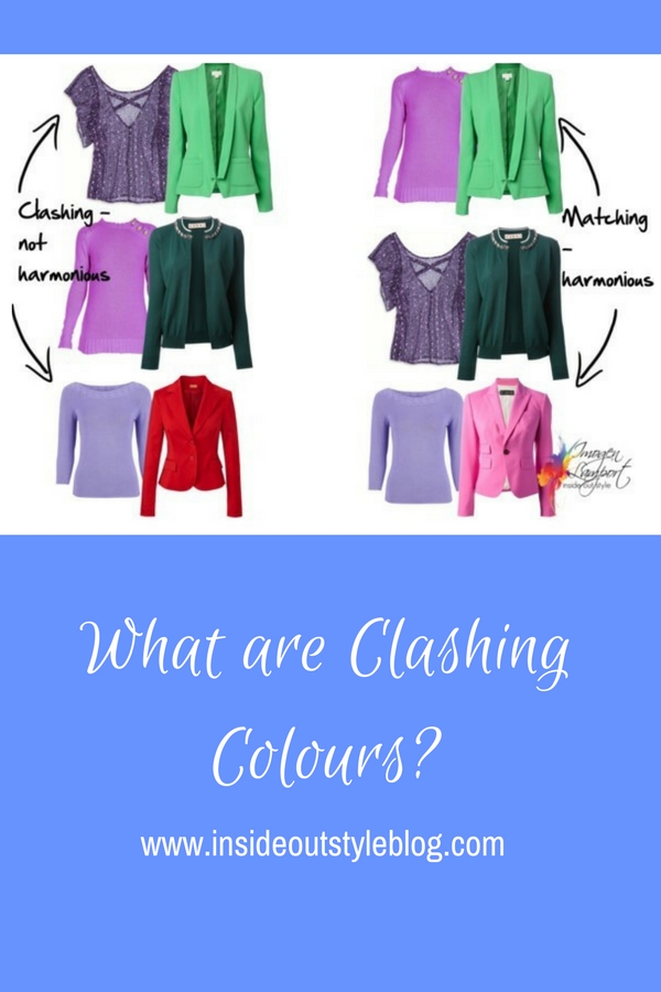
Hi Imogen, I have a question about clashing colours. I have seen many blog posts recently wear the bloggers claim they are clashing and yet the colours are either complimentary, triadic or analogues so they do mix well. I’ve also googled “what colours clash” and everyone answered the same, “opposite” colours, however we know they’re complimentary and do go together. So I’m confused, what makes colours clash? Is it shades, tones (cool/warm), balance of colour or none of the above?

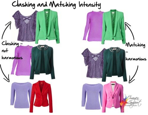
You’re right – those aren’t really clashing colours – when they are colours with similar intensity or value (like I illustrated here) even when they are complementary (opposite), analogous (next to each other) or some other colour scheme (triadic, tetradic, split complementary etc.) they they are not clashing.
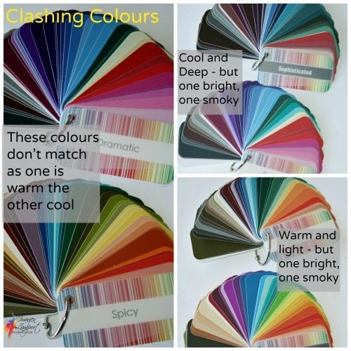
Colours that do clash are those that have unrelated colour properties (or resonance).
Intensity – smoky muted colours with bright colours
Undertone – warm with cool
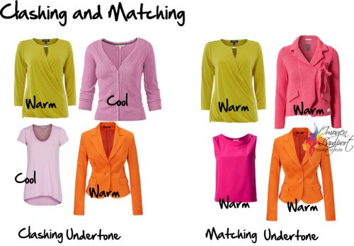
As you can see from these pictures, colours need to have similar properties to really go together and not clash.









Not often, but once in awhile I find I actually like a colour combination that clashes. Maybe it’s the rebel in me.
What colours do you put together Shawna that makes them clash?
Oh I didn’t see this question but I have stumbled upon it as I tend to binge read your blog. Now I am wondering what colours I was talking about. Probably it was orange. I am definitely a ‘winter’ and wear cool colours though I have an attraction to some warm greens and to dark orange. If we are assuming that dark orange is warm and navy blue is cool, and that warm and cool clash then I guess that is my clashing combo.
Some navy blues are warmer and some cooler – so wearing orange with a warm navy (marine navy, like a deep blue/teal navy) won’t clash at all!
yes girl i love that confidence sis
Just a little help with the development of my color knowledge in the example on top above on the right…both the lavendar and green are warm bright colors??? and on the pink and lavendar jacket on the right are both cool???
Yes – on the top right – the bright violet and green are both warm, whilst the bottom of that picture the lavendar top and pink jacket are both cool.
Personally, I don’t believe there are any “clashing” colors when it comes to our own outfits, rather its a matter of personal preference. Alot of people think red and orange clash or mixing warm red with a cool icy color, but as for me, I LOVE Lavendel with Red and Deeper red with orange, especially when the brightest color is worn as an accent. Like a lavendel top with a red necklace.
The same thing about the cliché advices some blogs has about navy + black and brown and grey/black – that you shouldnt wear those together. I love black with a deeper blue, black with tan and taupe-grey with khaki-brown. Its little bit like food preferences, not all people like coffee and here some people even eat rice with meet and sweet JAM. In an asia culture, that would be absurd. haha
What I dont like is matching the intensity of two colors like bright green with bright teal, but doesnt mean it doesnt goes together. 😛
Well, those colors DO clash, you just still like them together. So Imogen and all these color analysts are right. However, personal style trumps all – if you like to wear clashing colors, go for it! It is better to be happy in your clothes than feel like you have to wear something you don’t truly like. This advice is just given to people who want to look like one, whole being without their clothes drawing the main attention.
Would a smokey muted work with a bright if they were both the same colour and the same temperature? For example both were cool blues.
IS that smoky muted working as a neutral or as a colour – how much grey is in that smoky colour? Is it more grey than blue? If so, happily wear them together, but otherwise they may look a bit odd together.
That’s why I asked the question, there’s too much confusion amongst people especially who don’t really know about colours, so thanks for clarifying Imogen.
When I googled, people were adamant that opposite colours clashed, that meant black and white, red and green, blue and orange, yellow and purple. Yet we know those as complimentary.
So in simple terms it comes down to intensity and undertone. I believe my outfit today should have clashed as my pants were a cool pink and my top was a warm pink, which I didn’t realise when I dressed, but I think they still went together because they were both darker shades of pink and then I wore gold multi coloured jewellery.
What about balance, as Lina mentioned above, the brightest colour worn as the accent? Does the balance of colour matter? So a purple/blue jumpsuit with a narrow green belt, yellow bag and multi coloured shoes in the same colours. The main colour is the largest, the complimentary and triadic colours are the accessories of different sizes, all cool undertone, to me personally doesn’t clash but the wearer believed they all did.
Imogen’s illustrations are manly showing how the color looks together side by side and sometimes when wearing a bold colored top and a colored blazer together can be seen as “color blocking”, which means blocks of color. What I wrote “as an accent”, I was refering to my own preference about the structure of the outfit, because personally, I find 2-3 block of color of similar intensity or shade/tint a bit too overwhelmed for my own personal style. If you notice some of imogens outfit when she is wearing several colors, she is wearing them similare to color blocking. Like this post: about green and blue: https://insideoutstyleblog.com/2013/12/blue-and-green-should-never-be-seen.html
If I were to wear these color, I wouldnt combine them based on the intensity/undertone, rather I prefer to base them about their “role” in the outfit. What piece you want to wear as a focal point, an accent color that add that little extra “pop” and then using low key colors or neutrals to tone down the overall color scheme. E.g. if the green top were my focal point,I would rather tone down the top by wearing a more darker shade on the jacket and or wearing neutrals with it and then add another bright color (like the bright blue) for jewelry to accent.
I think this is just another way to build your outfit from. Adding too many accents could be seen as matchy-matchy. (eg. black dress with red lips/nails and heels, adding both clutch and jewelry, wouldnt that look a bit *too* matchy-matchy?) I think imogen use something called “visual grouping”, its similare to what Im doing. (Im using different methods that I adapt to) https://insideoutstyleblog.com/2013/12/a-guide-to-visual-grouping.html
and sorry Imogen and Jewel Diva if I answered the question regarding accents! Im still a noob with Color Theory and has my own methods (but many of Imogens posts has been useful because she wrote about terms Ive never heard before about!). 😛
Perhaps Imogen will clarify, but as I understand it, a cool pink and a warm pink will always clash. And a more muted colour and a brighter one will also not be pleasing to the eye.
What you want is harmony, what you want is to avoid a mismatch. If your own colouring is bright, you should go for bright colours and bright neutrals. E.g. I am cool and bright and I wear navy, black and crisp white as a neutral and if I want a pop of colour, which would be an accent colour, I’ll put in bright red or bright green or bright cool pink. But they will all be bright and cool. If you have a softer colouring, you would have to go for a more toned down neutral, say a smoky grey and then add a splash of colour but that colour should not be so bright but needs to be a more muted colour. Imogen should correct me if I’m wrong but this is pretty much what I’ve gathered from her posts and I think you should rely on her expertise.
If you wear a bright colour while you have a softer colouring, people will notice the clothes, the colour and not you… You yourself summarised it well enough, colours should match in undertone and intensity. You should not combine brighter and muted colours.
Love this Susie – you’re really getting a great grasp on colour!
I learn from the best!! 🙂
You can wear in different proportions. Unless you’re purposefully colour blocking, I prefer to have different proportions of each colour – like decorating a room – a bit of a 60%/30%/10% split of colours works well, rather than any sort of 30/30/30 or 50/50. The pics are just showing colours, not proportions of them.
Useful post as usual Imogen – thanks!
A question/clarification: Today I am wearing a dark olive tank dress with a light+warm minty/aqua cardigan. Am I clashing because they don’t have the same intensity/value OR as the olive is a neutral is it adding contrast rather than a competing colour to the outfit? I was wearing with a scarf with mustard accents the same intensity as the cardigan. Personally I like the combo but I could be clashing for all I know. Thanks!
Again Imogen will hopefully answer this when she gets the chance, but as far as I understand it a neutral can be both softer and brighter. Intensity is how bright a colour is. Compare a smoky charcoal and black! Both neutrals but black is brighter than charcoal. The colours in your outfit were less bright? If your neutral was also less bright then it harmonised with the rest of the outfit. I believe…
Great reply Susie!
The olive is a neutral and is adding contrast, while the aqua is the feature colour. They are both warm. Neutrals don’t have to be quite the same intensity as colours when mixing (you can get away with mixing a smokier neutral with a brighter colour).
Imogen, I’d have one query about bright warm and bright cool colours. Orange and black do not match in undertone. Yet there are many dresses out there that are orange and black, combined. Why do they even exist? Theoretically noone could wear them, right?!
http://www.bill-faison.org/images/Red-Black-Karen-Millen-Shift-Dress-CT102021.jpg
http://images3.chictopia.com/photos/nikiadams/7679780601/orange-forever21-dress-black-hat-black-wal-mart-tights-black-forever21-sho_400.jpg
They are both bright colours – so have intensity in common, and I think part of the reason why so many put a colour with black is just sheer laziness and how we are ‘used’ to seeing any colour with black, even though some look better with black, and others don’t.
Dear Imogen,
May I just confirm in respect of the top picture – the left picture are not harmonious in terms of a conflict in intensity so that the purple patterned top is too muted and best with the cardigan (both are cool?). The plain lavender top clashes with the intensity of the red jacket but goes better with the pink seems still quiet bright – maybe medium intensity- what would you put with the red jacket ?
The green jacket is warm and bright, the purple top at the top left is cool and muted.
The red jacket would look great with a cobalt blue or a medium violet, not a pastel.
Dear Imogen,
Thank you
The cardigan is also cool and muted?
Yes – that’s why it’s in the harmonious category with the cool, muted purple top.
why is that? Red and purple are right next to each other on the color wheel, if they are analogous colors and I guess maybe i’m blind, but they seem to be off the same color value…medium/bright shouldn’t they match? I feel like i am missing something here.
Yes red and violet are next to each other on the colour wheel – but they clash when they are not in the same INTENSITY and VALUE (brightness, and light or darkness). So the light pastel violet doesn’t sit well with the bright medium red. If the violet was a bright medium violet it would work well with the red.
great post. So, how does someone wear a light color with a darker color then? a monochromatic look. Like deep purple with what type of lighter purple family top? Would it be a tint?
This is so timely- I just had the conversation with my husband re decorating and choosing curtains, as I am drawn to colours I like but I just can’t see ‘clash’ or even understand the concept. Having read this post and comments several times I am beginning to understand, I think! It’s all down to the ‘brightness’ ‘depth’ or ‘intensity’ of the colour that makes it clash rather than the named colour itself?
Yes – both the intensity – so bright colours with bright colours, or muted colours with muted colours. And then the undertone – warm with warm and cool with cool
My mind now is completely boggled! The more I read it the more confused I become. Anyway, people compliment me most when I wear dark purple or navy or coral shades. Doesn’t coral clash with dark purple or navy because it is warm with a cool? I wear that color a lot. I recently bought blue jeans that are a light blue and also a darkish green jean. What should I wear with those?
Coral and purple can work well together if they are both warm. Navy can also be warm or cool, so if you have warm navy, then coral works perfectly. Your navy is a neutral too, which will tie easily with more colours.
This morning I accidentally dressed my daughter in pink, with Red tights, they clashed, and didn’t look right together, (two different Colours Clashing)
In Football if two teams come out onto the field wearing the same colour (example Manchester United and Liverpool in home shirts ) it is known as a kit Clash (two of the same colours clashing)
Do these to types of Clashing have Different names?
The teams clash because nobody can tell the difference when the players are moving at speed – too hard to distinguish – the colours don’t “clash” in the sense of clashing colours (red and pink)
Thank’s! I have a dark purple cowboy shirt and union blue 501 Levi’s( dark greenish blue) and from what I see they are very similar to the matching color’s in your second picture down on the right, so I should be fine tonight and not look stupid. Thank’s again!
Would you consider very light-washed jeans and a white shirt clashing?
Firstly…sorry but it’s WHERE in the reader’s original question, not wear. Otherwise it seems that the generation one was raised in determines what color pairings clash, harmonize or might be daring but acceptable. I grew up in the ’80s and would never have left the house in red paired with purple, yellow (hello, Ronald McDonald) green (=Christmas!) or pink (=Valentine’s Day). I learned the difference between pink-purples and blue-purples and that never the twain should meet. Conversely, I never heard that blue and green were “never to be seen” until I was grown, presumably because this outdated “rule” was a relic of the ’60s and ’70s. As for the guidelines above, I’d have to give these some thought as it seems in many cases that opposing qualities have complementary rather than clashing effects. I love pairing orange with green (or even a soft aqua or teal) and would have thought that an intensely warm color like orange needs the balance of both a “cooling” color and something less intense so as not to overload the senses. However pairings also depend on season imo as a burnt orange could be paired with a deep forest green in the fall. I would consider navy a deep, cool color (or even a neutral) but like to pair it with teal/turquoise, thistle pink, a soft orange/peach or a mint green – all of which are either analogous or complimentary but less intense. Purple I typically wear only with neutrals, either browns or grays (or their love-child, taupe) but I would wear lavendeR with a dark, forest green (same undertones but different intensities). Similarly I limit red to pairings with neutrals (tan or gray but not brown) but make exceptions with turquoise (preferably softer shades) and maybe red-orange with lots of neutrals for balance. Greens I could almost mix and match (as in nature) but I wouldn’t wear it head-to-toe and typically pair either cool or warm shades, again with varying intensity such as mint with forest (=blue undertones). Then there’s “muddy” vs. clear…some colors look much better with ivory than a stark white, for example.
I do love color and have become more daring and experimental in my ensembles, but some combinations simply aren’t my taste, even if there’s no “rule” against them and I see them worn in popular styles – purple with blue or pink with yellow, for example.