


We don’t just see colours – we feel them. And surprisingly, what we call a colour can have just as much impact as the colour itself. Colour names and perception are deeply intertwined. Just like the difference between “camel” and “caramel,” the words we associate with a hue shape whether we find it appealing, wearable, or even flattering.
This isn’t simply marketing fluff. It’s backed by psychology, perception science, and decades of experience helping real women connect with their true colours.
Colour Names and Perception: Camel vs. Caramel
In this article on styling a caramel jacket, I explore why caramel feels so much more inviting than camel. While technically close in hue (they can basically be interchangeable names as colour naming is pretty arbitrary), caramel suggests warmth, richness, and a sense of indulgence. Camel, on the other hand, can feel utilitarian, dusty, and frankly – a bit dull. Another delicious name for a similar shade is honey – doesn’t it just ooze yumminess? A honey blonde is a much more attractive name than a dark blonde.
This subtle name change can make a world of difference in whether someone embraces a colour or avoids it. Especially for those who shy away from neutrals, calling it caramel makes it feel like a delicious part of your style menu rather than a bland afterthought.

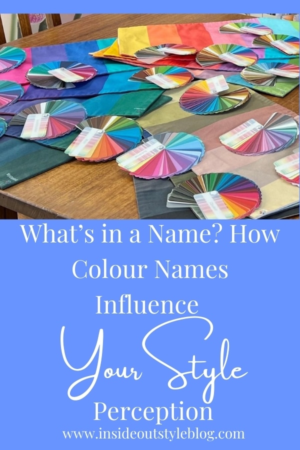
Why I Named Every Colour in the Absolute Colour System
When I developed the Absolute Colour System with 18 unique colour directions, I faced the delightful challenge of naming every single colour in each palette. Why?
Not only because it makes the colours easily identifiable (particularly when you want to match a colour or find something that goes with one of the colours in your palette – it’s easy to remember a name). Because colour names and perception matter. They’re memory anchors. They’re mood triggers. And most importantly, they create emotional resonance.
Rather than “light blue” or “dark pink,” I named shades things like Teal Ocean, Sparkling Grape, Tuscan Peach, and Honey. These names don’t just describe colour – they tell a story, evoke a feeling, and build a deeper connection between a woman and her wardrobe.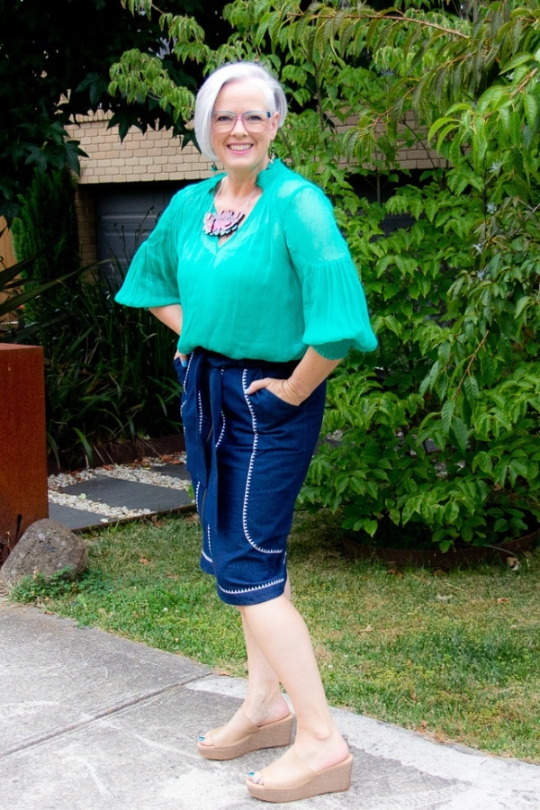
For example, you could look at this top and call it green – but you could also call it emerald or tropical sea, which both evoke different emotions and are more descriptive than green.
I won’t lie – it was hard to name every single colour in the Absolute Colour System, and while many names are poetic or evocative, some had to be a little more literal. So yes, you’ll find colours like Asparagus, Wheat, and Cement in there too! Sometimes the colour simply told me its name, and other times, it was a serious case of creative thinking.
Personality, Preference, and Colour Names
Here’s where it gets even more fascinating: different personality types are drawn to different types of colour names and perception.
- A Classic dresser may prefer navy or grey – no fuss, straightforward and traditional.
- A Romantic personality might be more enticed by rose, lavender, or blush.
- A Dramatic dresser might gravitate toward oxblood, graphite, or scarlet.
- A Creative personality might be drawn to more unusual or whimsical names like peacock, stormcloud, or Tuscan peach.
It’s not just the hue that resonates – it’s the language that shapes how that colour fits into their personal style story.
Take these examples:
- Pink vs. Rose: Pink can sound girly or childlike; rose feels more elegant and grown-up.
- Light Purple vs. Lavender: Light purple sounds clinical, lavender feels soft, botanical, and serene.
- Oxblood vs. Red: Red is primary and bold, but oxblood has depth, maturity, and an edge.
- Grey vs. Graphite: Grey may read as flat or boring; graphite feels strong, sleek, and sophisticated.
- Even if the colour itself doesn’t change, the name shapes how we emotionally experience it.
How to Use Colour Names and Perception in Your Wardrobe
- Reframe your colour blocks. If you’ve been telling yourself, “I don’t like beige,” try thinking of it as almond, sand, or latte. Sometimes it’s the name that’s the problem, not the colour.
- Personalise your palette. After identifying your best colours (through something like 7 Steps to Style), give the colours names that make you feel excited to wear them.
- Honour your personality. Choose colour names that align with your style essence. If blush feels better than pale pink, go with that. The words you use should uplift you.
Words carry energy. And in the world of style, they can be the bridge between a colour that feels “meh” and one that makes you feel magnetic. Naming isn’t just semantics – it’s style psychology in action.
Want to see this in action? Join the 7 Steps to Style program and receive your personal colour palette – complete with colour names that make your wardrobe feel more like you.
For daily inspiration using your existing wardrobe, the Evolve Your Style Challenge (which comes free with 7 Steps to Style) is the perfect way to reconnect with the colours you already love – and name them in a way that inspires joy.
Further Reading
5 Colour Concept Essentials You Need to Understand To Create Harmonious Outfits
Finding Your Perfect Palette: The Evolution of Personal Colour Analysis


Great post, Imogen!