When it comes to what you wear, colour is a potent tool for self-expression. It has the power to influence mood, evoke emotions, and make a memorable statement. Colour subconsciously changes how we feel and behave, without us realising it.
While classic colour combinations such as red, white and blue, are timeless, there’s something enchanting about experimenting with unusual colour palettes. So how can you use unexpected and unique combinations to elevate your wardrobe and make your outfits truly stand out.
Unusual Colour Combinations as a Fashion Statement
Unusual colour palettes offer a refreshing departure from the ordinary. They allow you to break free from traditional style conventions and create outfits that are daring and unique. Here are some ways in which unusual colour combinations can elevate your wardrobe:
- Express individuality – Unusual colour pairings are an excellent way to showcase your individuality and set yourself apart from the crowd. Using colour in your outfits says to the world that you have confidence and creativity.
- Evoke emotions – Unconventional colors can trigger specific emotions or associations. For example, vibrant contrasting colors can create excitement, while serene smoky colours may convey tranquillity. Choose colour combinations that resonate with the mood you want to convey.
- Add visual interest – Unusual colour palettes add depth and visual interest to your outfits. They draw the eye and encourage others to take notice of your style, making your wardrobe more captivating.
How to Experiment with Unusual Colour Palettes
- Start with a base colour – Begin by selecting one central colour that you love or that suits your skin tone. A signature colour is a great option and this will serve as the foundation of your outfit. It could be a neutral – one that relates to your eye color is ideal, think navy, deep olive, khaki, deep burgundy, bronze or brown, which can all act as neutrals in your wardrobe due the low level of perceived colour are great places to start.

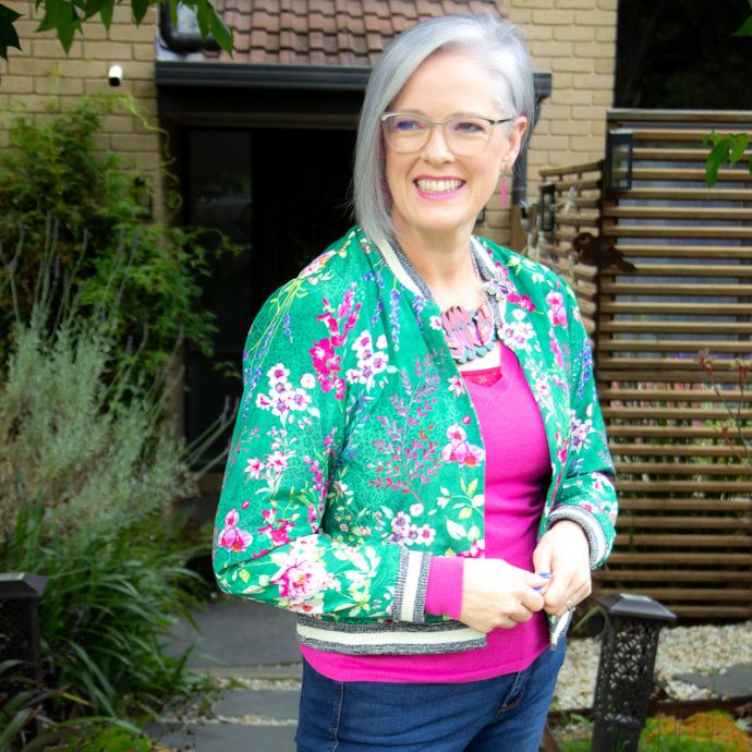
This cool pink is a signature colour for me (I always get compliments when I wear it as it makes my skin look really healthy as it’s a skin enhancer) and I love some violets which work well with my grey hair. - Consider the colour wheel – Familiarize yourself with the colour wheel to understand complementary, analogous, and triadic colour schemes. Experiment with these concepts to create harmonious yet unconventional combinations. There are some great online tools you can play with to find colour combinations, have fun playing with this one.

Here’s an analogous scheme that works well together – violet with magenta – which sit next to each other on the colour wheel. - Use other signature colours, whatever your signature colours are, they will work together easily as they are already in harmony as they are inherent in you. It may be adding orange, pink or red, or alternatively it may be a shade of violet, blue or green, or even a combination of these.
- Embrace patterns – Patterns often incorporate unusual colour combinations. Floral prints, stripes, and geometric patterns can inspire your colour choices. Read Expert Tips for Choosing Prints and Patterns with the Right Colours for You for more insights.
- Accessories and accents – If you’re not ready to dive into an entirely unusual palette, start with accessories or accent pieces in unconventional colors. Scarves, shoes, handbags, or jewellery can be a subtle entry point.
Examples of Unusual Colour Combinations

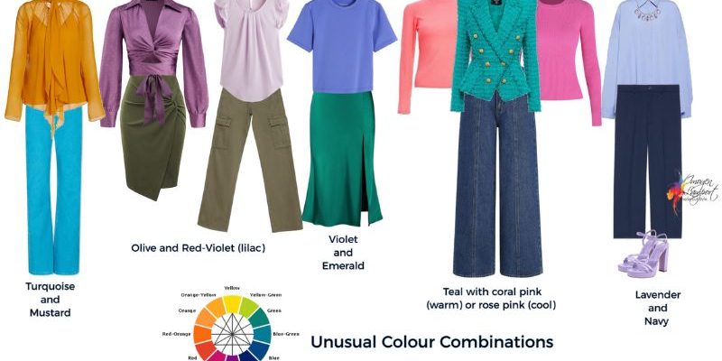
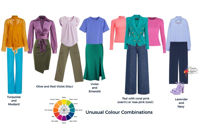
Turquoise and Mustard – The bright and invigorating qualities of turquoise contrast beautifully with the warmth of mustard yellow, creating an energetic yet balanced look. Turquoise and mustard are complementary colours. Complementary colors are located directly across from each other on the colour wheel. When paired together, turquoise and mustard create a dynamic and eye-catching contrast.
Lilac and Olive – The softness of lilac (a red-violet) combines harmoniously with the earthy tones of olive green, resulting in a sophisticated and refreshing combination. Lilac and olive green are also complementary colors. Lilac falls into the purple spectrum, and olive green is a shade of yellow-green. These complementary colors create a harmonious balance, whilst making each other pop, as they are opposite each other on the colour wheel. This is why lilac eyeshadow makes a pair of olive-green eyes more brilliant.
Violet and Emerald – If you have cool colouring, then why not try violet and emerald shades which both have cool undertones and really look fabulous together. If you want to add in a neutral, try charcoal or grey.
Pink and Teal – The vibrant contrast between pink and teal is eye-catching and exudes a summery vibe. Their vibrancy and the contrast between them make this combination eye-catching and visually appealing, which is why it exudes a summery vibe. This combination works perfectly with navy as a neutral backdrop. You can choose a warm or cool pink in this combination, both work well as teal is a universal colour.
Navy and Lavender: Navy combined with light lavender offers a sophisticated and modern look. The dark and light contrast is striking. They are an analogous colour combination that looks stunning together. This is a more subdued combination because analogous colours don’t jump in the way that complementary colour combinations do.
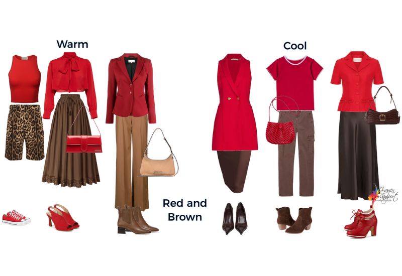
Red and Brown – Red is frequently paired with either black or navy, yet brown is another neutral that it works really well with. If you want to add a third colour, try some yellow for a vibrant look. It goes without saying that you want to combine warm browns with warm reds, and cool with cool.
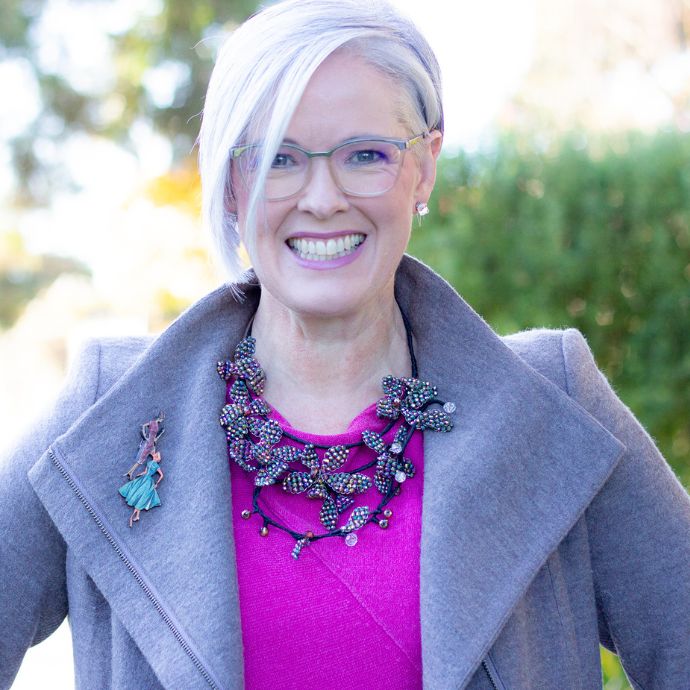
Don’t love red but love pink? It also works well with brown, as pink is red with white in it, basically just “light red” though we give it a different name. Here’s a pink and brown combo I wore.
 Confidence in Unusual Colour Pairings
Feeling confused or wishing you knew which were your best colours? Then get a personal colour analysis – it can be done in-person or online as a stand-alone service, or as part of my full image program 7 Steps to Style.
What I love about knowing my best colours, other than that they make me look my best, is that it makes it so easy to curate a cohesive wardrobe that’s versatile with heaps of outfit options as everything mixes and matches because the colours naturally play well together and makes packing for travel so much easier as you naturally can create wardrobe capsules super quickly.
Experimenting with unusual colour palettes can be both fun and empowering. While these combinations may initially seem unconventional, they have the potential to become your signature style. As you venture into the world of unusual colour pairings, you’ll discover the versatility and vibrancy they bring to your wardrobe. So, don’t be afraid to embrace the unexpected and let your fashion choices tell a unique and memorable story.
Further Reading
9 Ways Knowing Your Best Colours Will Change Your Life as Well as Your Wardrobe








Hi Imogen,
This is a fun post! I love to combine colors. I wear colors from an Autumnal palette as they look best on me. I love many of the combinations you showed above (olive and red violet, brown and red, coral and teal, and I will do heliotrope with marine navy as my lavender and navy) and wear them quite often. I’d love to wear mustard and turquoise, but mustard is one of the few Autumnal colors that doesn’t look great on me. I do a pumpkin orange and teal instead.
Not every colour in your palette will be your best, so it’s great that you’ve figured out what works for you and are having fun playing with colour combinations!
I love the combination of brown with slate or indigo blue. My hair is mid-brown, so my browns range close to that, sometimes lighter but usually darker. My eyes are hazel, with a distinct slate blue ring around the outside. Obviously, denim goes well with them. In fact, my favorite outfit is jeans with a brown top. The two colors together are similar in tone, therefore creating a column of color/shade. This is such a beautiful combination to me, and I am amazed that it is not seen everywhere.
A pet peeve of mine is that so few prints combine denim blue with another color. Since we all wear blue denim so much, doesn’t it make sense to include it in most patterns?