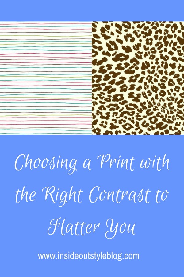
When you’re choosing a print, how do you know what contrast it is and how to choose the right value and colour contrast prints to flatter you?
Jill Chivers of 16 Style Types do a show and tell inside my wardrobe with a bunch of patterned clothing items.
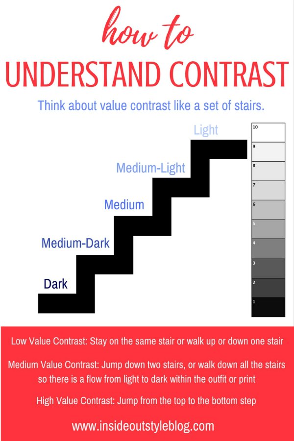
In the video I talk about my “stair” concept of value contrast. When thinking about value contrast, you can think about them like a set of stairs.
High-value contrast – jump from top to bottom step (the easiest example of high value contrast person is Snow White, white skin, black hair, she has the extreme from the light to dark – the top to bottom step).
Medium-High value contrast – jump from the top step to the 2nd bottom step, or from the bottom step to the 2nd top step (so dark to medium light or light to medium dark).
Medium value contrast – jump from the top to the middle step, or middle to bottom. OR step all the way up or down, but no more than 2 steps at a time.
Medium-low value contrast – jump just 1 step away from your starting step
Low value contrast – stay on the step.
How to Break Contrast Rules
I show you how to break your contrast guidelines based on your ideal value and the overall value of the print. Also how to break your colour contrast guidelines based on the intensity of colour.
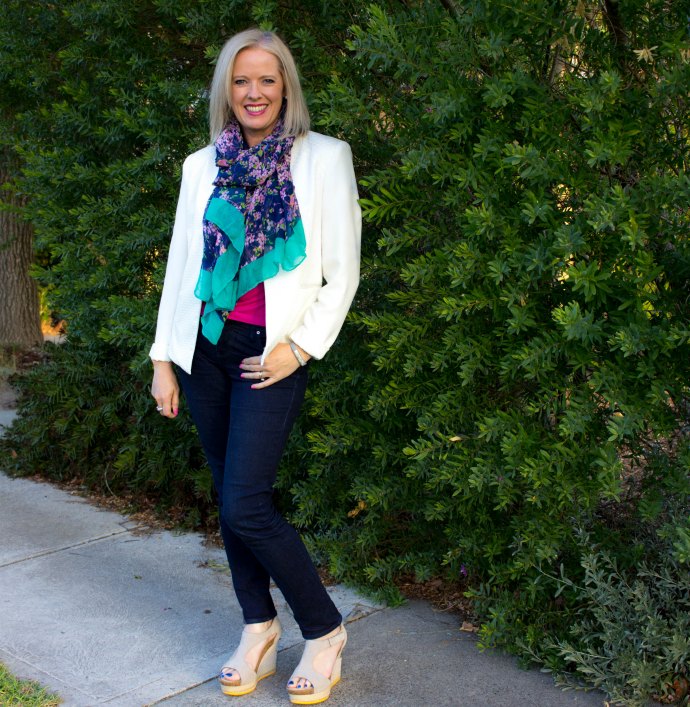
Here is an example of how I’ve used the pink of my tee and pink pattern with green edges in my scarf to create a medium value contrast with the dark jeans and white jacket providing a high value contrast. It’s easy to break the contrast rules when you know how!
Let us know what you’ve learned about the prints that you love and the ones that you don’t like so much on you.








I have read your posts on colour/value contrast a number of times trying to grasp the concept, not easy despite the great job you do on these posts. This video has helped explain pattern contrast, l think l understand it but find it hard to translate this knowledge to myself. As l have aged l have lost some sort of contrast, now have cool blonde hair, brows and lashes not as dark unless made up, grey blue eyes, and medium fair skin, yet l am always drawn to more high contrast patterns based on black or navy. Is this a fallback from my ” darker” days.
Most likely. It’s often harder as we get older to adjust to our new colouring. Learning to lower the contrast can take some time!
This video is really helpful. Your other posts on this subject helped me realise that my contrast changes over the year. I get a golden tone to both skin and hair in the summer and more of a neutral tone in late winter. Any suggestions on how to adjust my clothes without having two different wardrobes?
You may want to add accessories in colour in summer, but less colours in winter.
Great post, just what I needed. I am medium-low value contrast and have just bougth a pair of trousers in dark blue with small white polkadots. I really love them. Afterwards I realised that it is high contrast. So I have been wondering what to do…. so it is really nice to find out that I can just put a medium value top on, and it will work. Thanks for a great blog, I am a big fan.
Thanks Lene – glad that you’ve worked out how to make them work for you!
I have been reading as much add possible one your blog. It’s so fascinating it’s kept me up till 3am!
After years of solids, I was excited about all the prints that came out. I find myself drawn to them and recently realized I don’t own any solids colored tops at all. I’ve been trying to add some back to my wardrobe since i have an extensive scarf collection.
Like some of your other ladies, I find myself rethinking my contrast because of age and a change in hair color. I have naturally darkest brown hair, light skin and dark blue green eyes. I have also been told I am a winter, a summer, an autumn and a spring! Your ideas on overcast and undercoat made so much sense to me. I realized I am a warm finally! Looking forward to your next posts with delight!
I hope you have a good rest Jerian! Overtone and Undertone are useful in understanding more about how colours work together!
This video was soooo helpful. I have a much better understanding of value and color contrast now. When you held up the 2 butterfly pattern shirts, it suddenly clicked with me. I knew I would look better in the darker of the two, but would need to put it with a medium neutral so as not to overpower me. I am medium contrast, but have darker hair.
I’m really glad this has helped Sherilyn!
Whew! This is heavy stuff! But I think as I have aged, adding brown to black and white has softened my high contrast.
Yes softening with slightly lighter and softer neutrals is a good way to go with age.
Thank you for the video deconstruction the various types of contrast. I had all of the same “aha” moments as Jill Chivers, which I needed. I just loved both of those butterfly tops, and could easily wear either of them. Being high contrast, I’d wear the more muted one under a darker layer in plum, and the bolder butterfly top I’d wear alone. I loved the funky, high contrast, medium color contrast top that followed, but from experience, I know it “would wear me” and now I know why!
Glad that you’ve had an ‘ah ha’ moment! they are so useful and you see the new information in a new way.
Hi Imogen!
Just when I think I’ve figured out value contrast I read another one of your fabulous posts and I’m confused. I thought I was medium value contrast, but then I read no more than 2 steps at a time and I think I’m high value contrast. Hoping you can clear things up… My hair is medium brown, it’s a 3 on the the scale (I use a mixture of Redken level 5N and 6NA permanent haircolor but it reads darker of the gray scale for depth of color in my opinion), eyes (blue) are a 5 ,and my skin is a 9. Is that medium, medium dark or high on the value contrast scale as there is a total of 6 between the lightest and darkest on the scale? Also, you- your coloring. You say that you are medium value contrast, and I thought you were light with your light skin, eyes and hair. I’m taking it that your skin is 9, your hair a 7 and your eyes a 5 which is no more than 2 steps at a time, making you medium value contrast? Can you maybe post a picture of yourself explaining your value contrast?
-Holly
Hi Holly, I’d think if your hair is about a 5N and skin is light then you’d probably read as medium-high contrast. The steps are not the total grey scale of 10, just 5 steps (like in the image). Hope this helps. Have a look at this post https://insideoutstyleblog.com/2016/10/colour-scheme.html
This was very helpful! I am medium color contrast, and low value contrast. I am naturally drawn to the “blendy” patterns, but didn’t know why they worked for me! I will remember “blendy” while shopping.
Glad that you’ve now got a new tip to help you find the right kinds of patterns for you.
This whole concept is so very different from anything I’ve read about here in the USA. Here it seems it’s all about the right colors and whether they’re clear and bright or soft and muted.
I was a dark ash blonde with fair skin and dark blue eyes. i was “read” as a summer 40 years ago. Now, I’m more like a baby blonde natural color. My hair didn’t turn grey or silver. I guess that’s good but so many people think I color my hair!
Navy and taupe were my neutrals but now I’m lost. I think the taupe is still OK but perhaps the navy is too much contact by itself so I use softer color scarves with iota a softer color top if it’s a jacket. I’m sort of lost as to what really looks good on me anymore.
Marlette