


Mixing patterns is one of the bigger trends on the catwalk at present. It’s not something for everyone and tends to be something that is only for those with more creative or dramatic personality styles.
These images are from the Marc Jacobs Spring 2016 and Gucci Spring 2016 catwalk shows and show examples of successful pattern mixing.
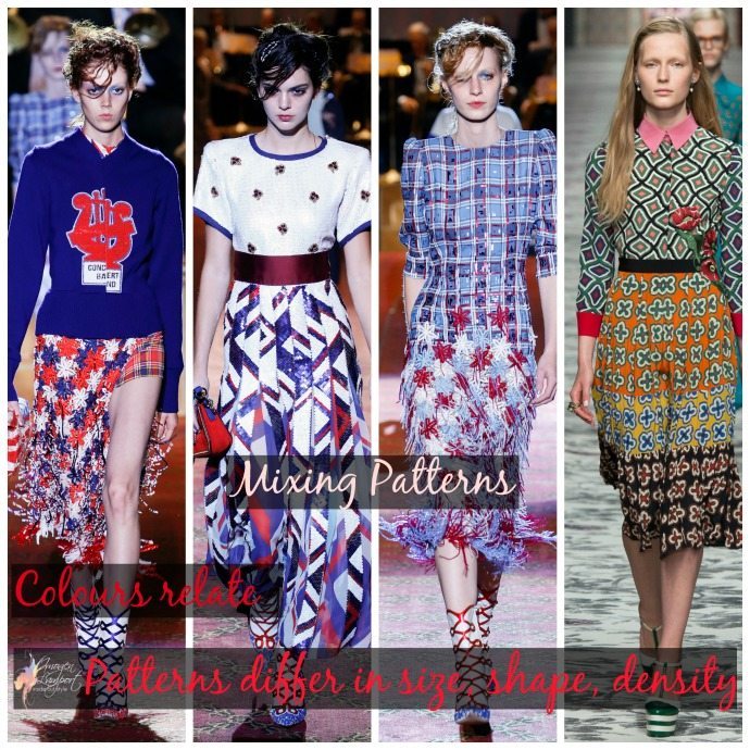

The rules to successful pattern mixing are:
- Relate the colours – pick two or three of the colours in a pattern and ensure they are in both patterns.
- Shapes should be different from each other
- Size of the pattern ideally should differ from each other
- Density of the patterns should be different too – one more sparse, one more dense (particularly if the shapes are more similar).
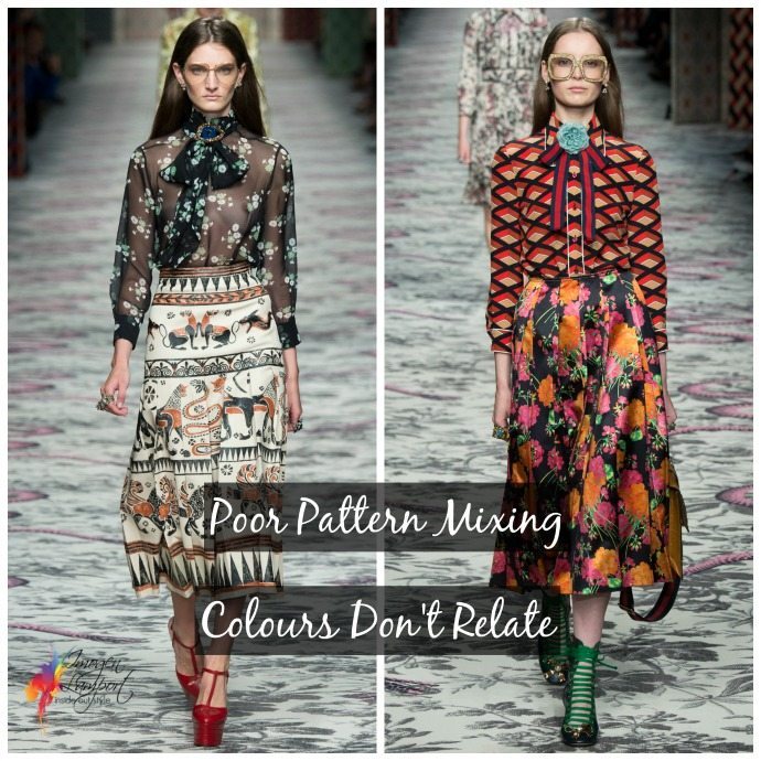
Here above, are a couple of examples of poor pattern mixing from the Gucci Spring 2016 catwalk. Both have the issue that the colours don’t relate from one pattern to the next.
In this example below I’m wearing a floral pattern with a geometric pattern, both have the black and white. One print is more sparse than the other, one geometric and one curved.
Linking to Not Dressed as Lamb’s weekly linkup
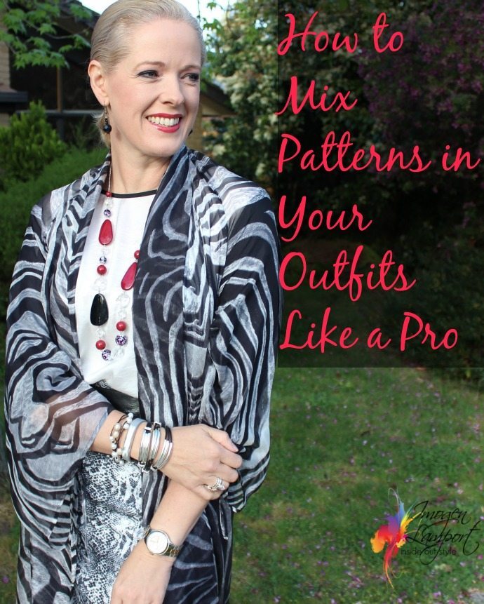
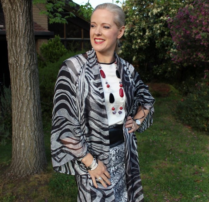
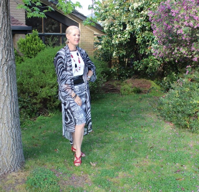
In this example both patterns are black and white. The skirt is a dense snakeskin print, while the kimono jacket is a more sparse zebra print.
The easiest patterns to mix are a stripe with any other pattern. Your Breton top will work with so many patterns, from florals to checks to animal prints.
Want more pattern mixing inspiration? Then check out these posts:
3 Easy Rules on How to Mix Animal Prints and Floral Patterns


I have a hard time pattern mixing so I stick to the very basics: polka dots, flowers and stripes.
Dear Imogen,
In the first example of poor pattern mixing (the skirt with the Egypt-inspired print plus a sheer blouse), could the picture be improved with a different colour brooch (probably soft orange like the skirt) and warm-toned shoes? Both garments have charcoal and off-white, and I don’t think the blue-green of the blouse and the orange of the skirt really clash (they seem to be the same value and intensity), so the patten-mixing in itself doesn’t strike me as horrible, but the whole picture definitely seems wrong colourwise.
I also have a request – could you do a post on the most common everyday makeup mistakes? I loved your video on using the concealer correctly (never thought we should also apply it on the bridges of the nose next to our eyes, which totally makes sense as we get shadows there too). I also realize I don’t know how to choose the eybrow pencil shade (I chose the one that is similar to my individual eybrow hair colour, but the result is too harsh), and there are probably a lot of small things like these that are really important.
Thanks for another great post! I love your website.
I’m curious about the “shapes should be different from each other” pattern-mixing guideline; does this also hold true for wearing polka dots + polka dots if they have the dot color (but not background color/size) in common?
I’d also like to second Olga’s request for more makeup help posts.
With gratitude for all you do for us!
If you were to mix dots with dots they need to be of different sizes
The pattern mix outfits you made/wore look amazing btw — elegant, sophiscated, creative, energizing.
i’m not a person who likes much pattern. I will do a few (small stripes and maybe an abstract with 3 colors from time to time).
I don’t know who told the runway “professionals” that these patterns were cute. I think they look absolutely horrid. I like the way you paired your pattern in the last outfit but those runway outfits….no
Runway outfits are more artworks than everyday clothes – they are often more ‘concept’ than streetwear.