
I have a question about how to pull a wardrobe together that is well coordinated, but not too matchy. I had never heard the term “matchy” before at first I thought it was someone’s excuse for not having a good eye for color but I am hearing a lot about it. Are there some guide lines you can give on when someones wardrobe is too matchy vs. when it is well coordinated.
Matchy Matchy, to me, means coordinated in an uninspiring way, it’s the “set of jewellery” or the “twin set of cardigan and knit top (when not worn in an 1950s vintage inspired way. It tends to lack creativity or a personal style element, your unique twist, rather than a manufacturer has told you that you should wear these items together and everyone becomes a clone.
A coordinated wardrobe has a cohesive feel. The personal style of the owner is fairly definable, there may also be a range of signature style elements too. There is a relationship of colour properties within the colour palette so that garments are easy to mix and match.
You can see in the following pictures how when colours have similar colour properties, they coordinate easily together.
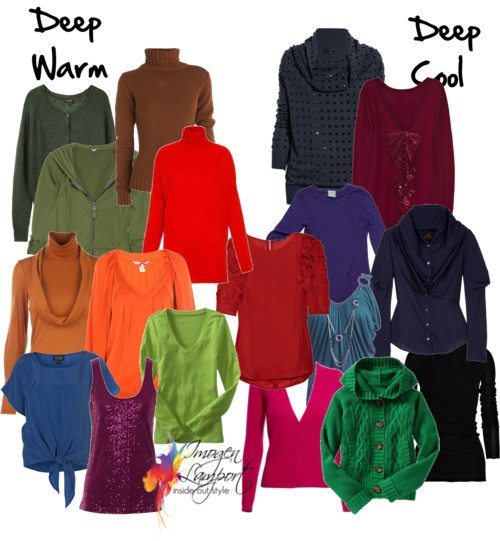
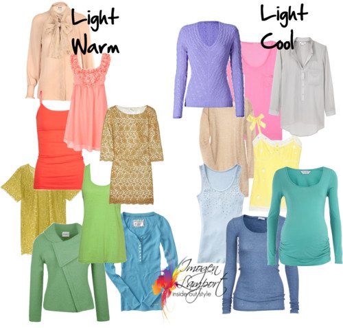
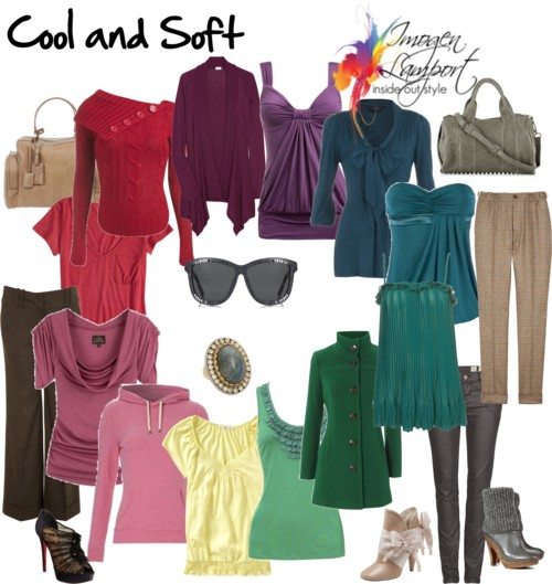
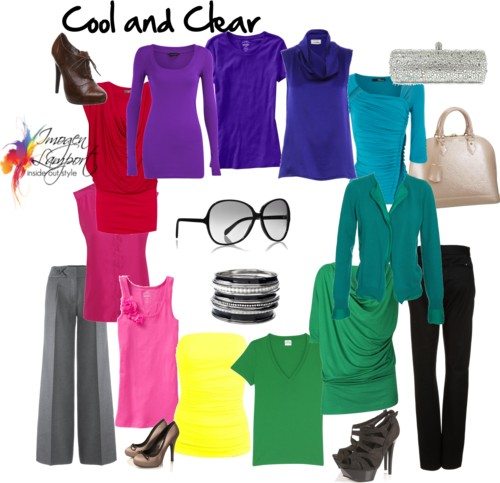
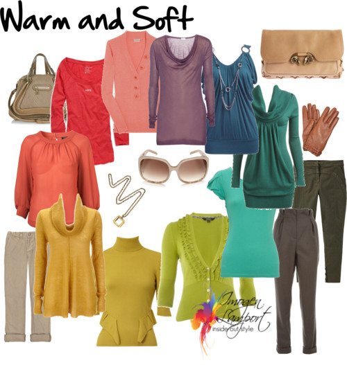
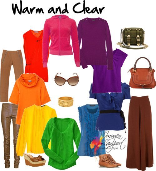
A wardrobe capsule (or series of wardrobe capsules) will help you create a coordinated wardrobe. (if you haven’t signed up for my Newsletter you can do so by clicking here, also download my free ebook 5 Step Formula for a Fabulous Wardrobe).
Defining your signature style will allow you to find elements that you love that you put into each outfit and will create a sense of cohesion too.
Look at the types of fabrics in your wardrobe. One of the issues I often see in an uncoordinated wardrobe is that the fabrics don’t work together. You may have some lovely smart printed skirts, but all your knit tops are made of a cheap ribbed cotton (which tends not to hold its shape well). Those t-shirts were fine with casual shorts, but really didn’t work when you want to look smart. So the solution is to buy some tops in a higher quality knit that could be dressed up with skirts and dress pants.
Consider the principle of volume. Wearing slim with volume looks best. I remember working with a client and finding in her wardrobe that all her clothes had volume, so nothing really worked together. We had to go and find slim bottoms to pair with her voluminous tops, and more fitted tops to work with her more voluminous bottoms. Then we had a coordinated wardrobe.
Also, remember to look for the relationship of accessories to other elements of your patterns and necklines to ensure that they work together.









What a great and comprehensive post. I see many examples whose colouring is ‘cool and clear’ or ‘warm and soft’. Can you please link me some models or better still, give me the names of some actresses/celebrities who would have a. ‘warm and clear’ colouring and b. ‘cool and soft’ colouring?
Fantastic Imogen!
Love all the different color palettes, but when you refer to the title of each grouping, example: Light Warm, that is indeed referring to the color collaboration title, not the skin tone of the person to wear it, correct?
Yes I’m talking about the colours in relationship to each other – but also that will relate to the colours of the person that suit them best. A Light Warm person will have fair skin and hair but a warm undertone.
I’d be interested in a post about vintage-inspired especially the cardigan/knit top combination. I have a cardigan pin that belonged to my great grandmother that I love but have no idea how to wear. Since it’s probably from the 40’s/50’s matching it with something vintage would be perfect.
This is such a helpful post – thanks, Imogen! One question though: are there any neutrals that would work well for all cool colours and similarly neutrals for all warm colours?
The universal neutrals are charcoal, taupe, marine navy and soft white – have a look at this post https://insideoutstyleblog.com/2009/05/finding-your-neutrals.html
The cool neutrals that work for all cool people would be a medium blue grey, soft navy, just off white, rose beige.
The warm neutrals that work for all warm people would be taupe, mid-brown, beige, warm white, khaki, oyster.
Thank you Imogen for such a helpful post! I am sure that I have warm coloring, but I was always confused why certain definitely warm colours still don’t look that good on me. I was aware that there are brigher and more muted colours, but still… I think it finally clicked, I need deep warm colors! why is the red pullover in the middle, do you mean that it is kind of a link between cool and warm?
Since I live on the other side of the globe and being a broke student, I can’t come to a color consultation 🙂 If you want I can send you a picture of me and my sister for illustrating purposes, she is a “winter” clear, bright cool colours work fantastic for her. not for me, for sure 🙂 Maybe you want to make a picture galerie one day, for all uf us who aren’t able to afford a consultation. oh and btw, are you still interested in real life body shape pictures?
Thank you again for helping us all to look, and more importantely feel, our best.
Are these color properties categorizes after contrast or value? I understand light and deep properties, but are Soft and Clear (Warm/Cool) in general, low, medium or high contrast value?
Because on some seasonal analysises, soft summer has a lot of “light colors” coloring but they are the only ones from cool/soft that wash me out so thats why Im wondering if your color methods has anything to contrast and values?
These pics are just demonstrating the really basic differences in colour – not a guide to colour analysis. But if you have light and soft colouring, then you will need lighter and more soft neutrals too – but with neutrals we can also wear darker colours – just not the really dark ones.
Each colour has 3 properties:
Undertone – warmth or coolness
Intensity – brightness to mutedness
Value – lightness or darkness
All I was illustrating in this post is two of the 3 – in the light and deep – just that, but not intensity – in the clear and soft, the value is not considered.
Ah, that made more sense, because when you answered another comment “e colours in relationship to each other – but also that will relate to the colours of the person that suit them best. ” it made it sounds like the pics were like those color analysis. ^^;;
What I sometimes wonder is the brightness/softness of a colour. Esp problematic for neutrals. Pretty much the best neutral for me (who suits bright colours better) is still black, as all the other cool neutrals just seem too muted and make me look washed out!
But colours can be similarly beguiling… In the light cool pic, is that purple and that pink (next to each other) clear or muted?
SUsie – how about a French Navy? Or a Deep Dark Chocolate?
Susie – the pink and purple are highly tinted (lots of white added) so they are softened by white – but not muted with grey, and they are not clear as they have had a lot of white added to them (white washed in a way).
Many thanks Imogen! I take it muted and soft are synonyms, just as bright and clear are?!
I have clear and cool colouring, I can easily tell if a purple or turqouise is bright, but often struggle with red and green, sometimes even pink! (The bright reds I most often see in shops tend to have an orange-y glow, ie they are not cool but warm – no good on me.)
Please also, in case you just overlooked it, do reply to my first post on this thread, I’m intrigued!
‘What a great and comprehensive post. I see many examples whose colouring is ‘cool and clear’ or ‘warm and soft’. Can you please link me some models or better still, give me the names of some actresses/celebrities who would have a. ‘warm and clear’ colouring and b. ‘cool and soft’ colouring?’
Are soft and clear what you now refer to as smoky and bright?
They are alternate words – there are many words you can use – bright – pure – clear – vibrant all mean the same thing. Muted, dusky, smoky, soft are also all in the same wheelhouse!
Thank you very much. That clarifies things greatly.
This is so helpful, thanks so much for sharing such valuable information. I’m feeling very motivated to get into my wardrobe with your info close at hand to see exactly what I’ve got so I can figure out what goes with what and how I might fill the gaps.