


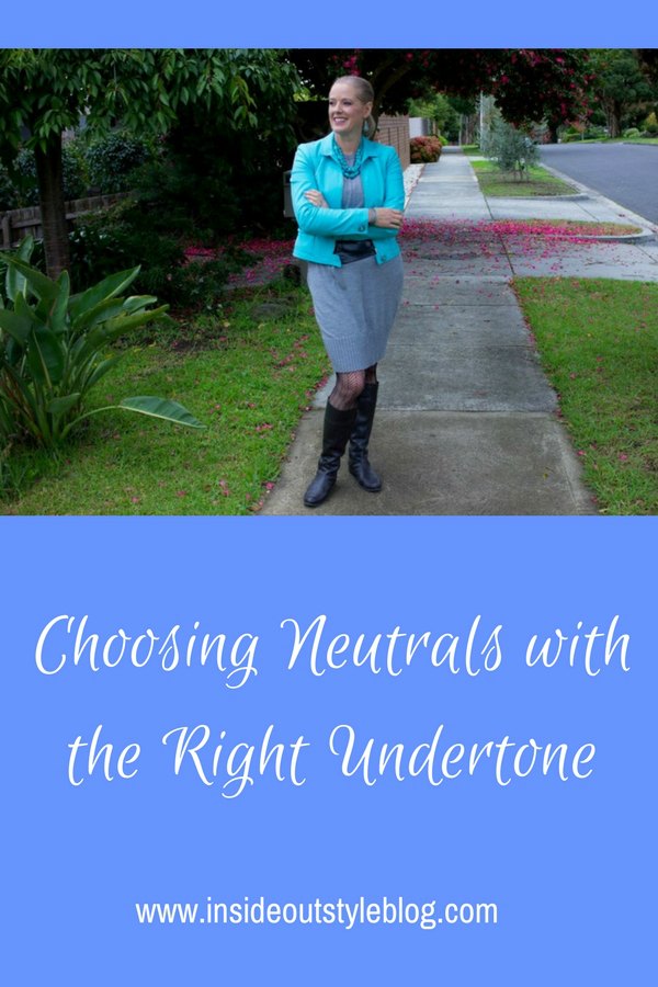
You may have already seen my post about Black not being the be all and end all of neutrals. So if you cut black out what are your options?
When I went from brunette to blonde, my go to neutral of black changed to white (find out more about that here) because my natural value changed (find out more about that here). I also now find that grey is good neutral but dark brown which was good when I had dark brown hair isn’t as good anymore.

Fortunately there are a myriad of other neutrals to choose from. Neutrals are like colours, and you can test them to see if they work for you, as you would a colour.
Some universal neutrals that everyone can wear include:
- Marine Navy (a very deep teal blue)
- Taupe (a brown/grey)
- Charcoal
- Soft white (just off white)
Other neutral options you might try:
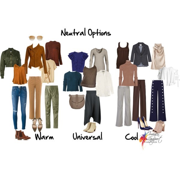
Warm Complexion: Warm brown, tan, camel, khaki, deep olive green, cream
Cool Complexion: Dark Chocolate, rose beige, pure white, blue grey, French navy(dark navy), charcoal blue grey
Hold them up and see which are most flattering on your complexion. You will also find that the neutrals that are most flattering for you will mix and match most easily with the colours that suit you best.
More tips on finding the right neutrals
Want to really nail down the neutrals and colours that suit you best? Then discover more with my professional opinion and colour analysis as part of my 7 Steps to Style program.


Dark chocolate (brown with a lot of black in it) is a favourite neutral but terrifically hard to find. Most browns I find are more milk chocolate.
“French navy” is a colour term complicated by the fact that ‘navy’ in France is usually what is sometimes called ‘true navy’ in North America: the navy so dark you have to sometimes hold it against black to figure it out.
I appreciate your breakdown of neutrals and complexion tones, in so many stores, salespeople just push “It’s neutral!” as if anyone could wear say, camel for rose beige.
Duchesse – I love dark chocolate too – a really good one can have tones of aubergine in it.
I think of French Navy as a very dark almost black navy (midnight blue). Colour naming is quite arbitary unfortunately!
Camel and rose beige are so different! I look atrocious in camel – though I do still wear some great camel ankle boots that I picked up in Rome and are the softest leather!
I’ve been very into brown and navy for several years now and I (sort of) have capsule basics in black, brown and navy. I accent with lots of green, teal, brick red and sometimes orange. I have no idea if it is working for me but I like it.
Recently, I’ve noticed that I have been wearing a lot less black and tending toward charcoal and gray shades as neutrals. I went back to read your “Black not being …” post, and now I see why (less flattering as one ages)!. Thanks for listing some other neutrals I can incorporate into my wardrobe. I’ve slowly started adding pieces in dark chocolate.
Tessa – I’m sure it works pretty well for you!
Cciele – greys are great neutrals.
I thought because I was a summer I couldn’t wear charcoal. Although I’ll never give up brown and black and white (well I do admit I look better in white in the summer though).
This is an interesting exercise, Imogen. I think that cool neutrals (marine or French navy – I actually didn’t know the name of the shades before, thanks! – cream, or white) look best next to my face. I love brown (especially since I have red hair) and gray as well, but I have to pair them with white or bright colors in order to work with my complexion.
I look really terrible in taupe, khaki, and beige. I’m not sure if I have any clothes in those shades anymore.
About 80% of the time, I keep my neutrals confined to the bottom half of my outfit and wear colors next to my face. I’ve only just become aware of this after photographing my outfits. Maybe I should challenge myself to switch it up (although I hardly have any non-neutral colored bottoms.)
I actually commented a week or two ago that I had all but replaced black with navy as my neutral of choice. I also love charcoal. I feel like most of my brights are a lost softer against the grey and navy then they would be against black, if that makes sense.
LOT softer, not LOST softer. Hello.
Thanks for this post! I’ve been trying to limit the amount of black in my wardrobe – and this is giving me some great ideas for other neutrals to replace it with.
I might be wrong, but I think purple is a neutral, ’cause it goes with everything. Can anyone think of a color that doesn’t go with purple? I sure goes nicely with brown eyes.
Maria – charcoal isn’t the best neutral for you as it’s so dark, but it’s a better alternative to black!
Kari – colours can really enliven, but neutrals make a great base to start from.
Taylor – sounds like your colours are working for you!
Simple Elegance – have a play and see how you go.
Glove Slap – yes purple goes with lots, but it has too much colour in it to be classed as a neutral – neutrals we just don’t notice in the same way as colours.
These are helpful, Imogen, in that they confirm my choices over the last few years, as I’ve jettisoned the black and gone dark brown instead. The grays and pinky browns and dark blues also work well for me, which means I’m obviously a cool tone.
Fun comments about camel. The very first cashmere sweater I had was a gift from a friend who’d had her “colors” done, and found it was wrong for her. Despite knowing it was also wrong for me, I tried for way too long to make it work. It was a beautiful, old-style cashmere, by which I mean it never pilled and was thick and luxurious. Finally gave up.
It’s been fun to follow your trip accounts, and I’m thrilled that you met up with some fellow bloggers. I wish I’d been there!
Hello,
I’ve been reading your blog for some time and I am very gratefull for all the lessons about body type and porportions because although I don’t dress that fab at least I’m begining to get some idea of what I’m doing wrong.
One thing that really I cannot understand is what kind of complexion am I.Can you do a post about that? I know that having your colors done is the best but it is expensive and besides I would like to learn how to figure it out because I really find the subject interesting.
Thank you again for all the ‘lessons’ you have given. 🙂
Sallymandy – it was great to meet the other bloggers!
Nurmisur – personal colour analysis is difficult to do accurately without actually draping someone – you can try draping yourself in a variety of colour and try and see which is best, but it’s often more obvious to an observer than to see it in ourselves. It might be worthwhile to find an image consultant trainer near you and find out if you can be a model for a training program and have your colours done that way.
Thank you for the advice, it’s both pratical and seems fun 🙂
When my baby goes to school I think I’ll go have training because I really find the whole subject interesting.
I wished you had more online books that I could buy 🙂
If the purple is deep enough, on the right person, it looks as neutral as navy or brown. At least in my experience. (I read somewhere that “bright” people seem to “absorb” color, so maybe that’s it. 😉 )
I can’t seem to find a picture of marine navy. Can you point me in the right direction?
Thanks!
Rachel – yes a deep aubergine is a neutral too. And the brighter the person the less a more muted colour appears as coloured on them !
Discovered your website yesterday and spent far too many sunny spring hours in front of the computer reading it all!!! Here in the northeast USA black clothes are the default – it goes with the dour disposition, I think – but it really does not suit most people at all; we just get used to seeing it.
I’m one that gets completely washed out by black even with a summer tan. I love following style and color and discovered one theory of finding one’s neutrals that I think hits it right on, from David Zyla, theater/tv stylist in NYC (from his book The Color of Style). He suggests taking the color from the ring around one’s iris: that will be your ‘formal’ neutral, and it might be aubergine or chocolate or gold or navy or in fact black. In my case it’s a deep teal.
(There are other ideas in there as well that make it a very useful book; other neutrals and core colors taken from hair/skin/blush/eye colors that people can find themselves, if they aren’t close enough to you to have their colors properly done).
Thanks for all that you share on your blog! I will probably fill up all of today reading more……
Robin – thanks so much for your lovely comment. Black is way too harsh for most people to wear – and I’ve read that book and like his way of finding great neutrals – I tend to recommend when doing colour consultations that people work with their eyes to find great neutrals for them.
Hi Imogen, hope you are enjoying Mexico.Your pictures make it look like a really interesting place to visit.Can you clarify something for me? If your colouring is light value .Low or medium low contrast and cool .Alot like your colouring but my eyes are more teal. Is navy / charcoal too deep a value colour to wear. I think that navy looks very nice on you so I find this rather confusing.
Hi Imogen, this is a really good post. I like the fact you have shown universal neutrals as well as those for warm or cool colouring. I used to have brown as my basic neutral instead of black, but now I have gone grey, I find I choose softer shades, when I can find them!
I avoid the warmer shades I used to wear, Your suggestion of white or off white as a neutral is brilliant as it looks very nice with grey but hopefully not too summery when worn in the winter.
A lot of the navy I see in the shops is so dark it might as well be black, they call it “true navy”, the colour of my girls’ school uniform of years ago.
Your information on choosing hats is brilliant, it is getting colder and wet here in the UK, so a flattering hat is a must.
I have a round face, so beanies and berets don’t have the height in the crown which is needed for this face shape so the hunt for a flattering hat continues.
Margaret
Thanks Margaret! Having gone grey, grey will now be a brilliant neutral for you as well as the off whites and the lighter navy colours.