




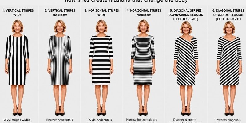




You have seen the graphic. Five dresses in a row, a tidy little caption underneath, and a confident promise that vertical stripes will make you look taller and horizontal stripes will make you look wider. It gets shared thousands of times. It looks authoritative. It is also, in the most important way, wrong.
Not wrong because the opposite is true. Wrong because the direction of the stripe was never the deciding factor.
I have been teaching line and illusion to clients and to trainee stylists for over twenty years, and the same thing happens every time. Someone arrives convinced that horizontal stripes are the enemy, tries on a fine Breton tee under an open cardigan, and cannot work out why she looks longer and leaner than she did in the plain top she walked in wearing.
So let’s settle this properly.

 The Question Almost Everyone Asks Is the Wrong One
“Are horizontal stripes slimming or widening?” has no answer, in the same way that “is salt good in food?” has no answer. It depends entirely on how much, where, and what else is going on.
What actually decides whether a stripe flatters you is a small set of variables:
- How wide the stripe is
- How much contrast there is between the stripes
- How the stripe relates to your scale
- Where on your body it sits
- What the rest of the garment is doing
Direction matters. It just matters far less than width, and it never operates on its own.
Wide Stripes Widen, No Matter Which Way They Run
Here is the single most useful thing on this page.
When your eye can easily focus on a line, it slows down and lingers there. When the eye lingers, the area looks bigger. When the lines are too fine to lock onto individually, your eye skims across them, and an area your eye moves quickly over looks smaller.
That is the whole mechanism. It is not about up and down versus side to side. It is about whether your eye stops or travels.
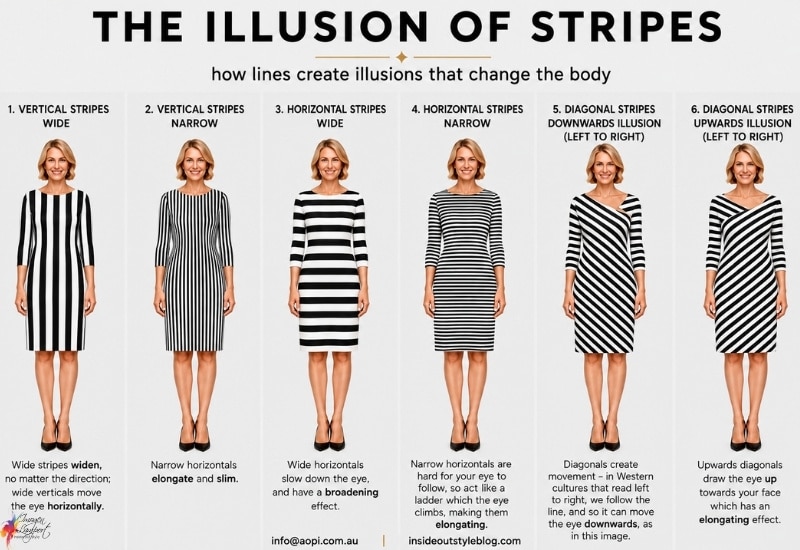
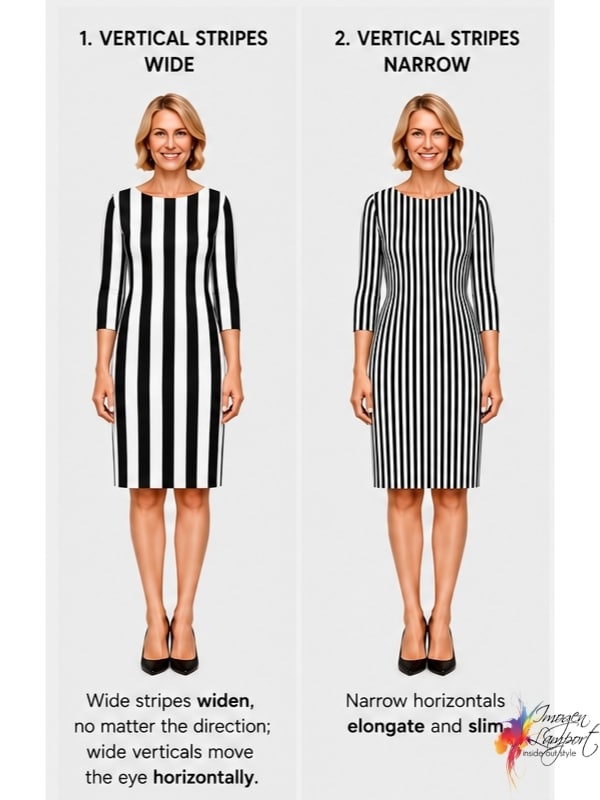
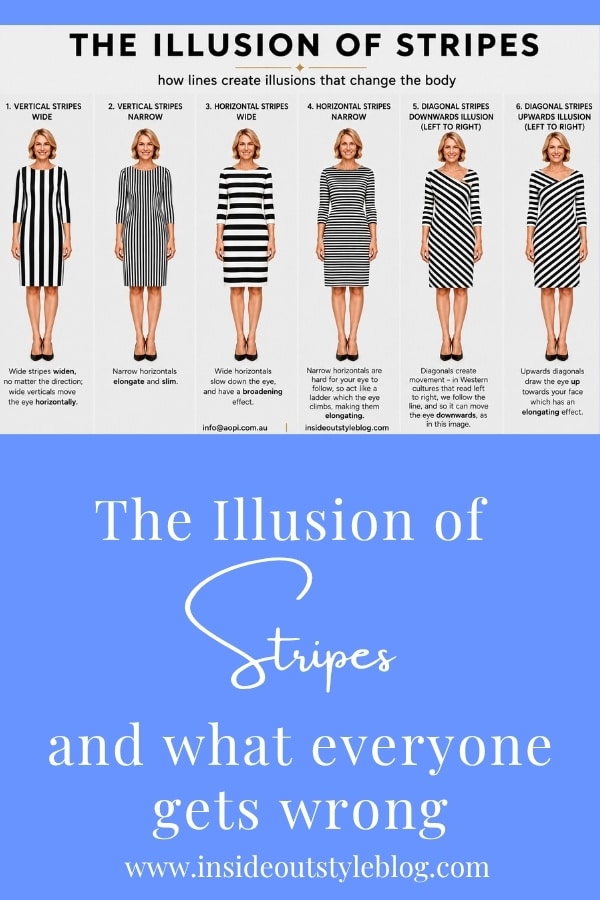
This is why a wide vertical stripe, which everyone assumes is a safe bet, can widen you. Your eye does not run neatly up and down a bold wide vertical. It hops sideways from one stripe to the next, particularly when there is a change in colour, and off you go, travelling horizontally across a garment full of vertical lines. Panels one and two of my graphic above show exactly this. Same direction, opposite effect, and the only thing that changed was the width.
 There is good support for the eye-movement explanation. A 2023 study in Attention, Perception, & Psychophysics tested the classic striped-square illusion directly and found that it is tied to how spatial attention is distributed across the pattern rather than to anything intrinsic about horizontal or vertical lines (Kirsch & Kunde, 2023). Where your attention goes, the apparent size follows.
Fences and Ladders
I have used this analogy with clients for years because it sticks.
Fences run sideways (even though they may be made from many verticals). You follow along them, and you read the width.
Ladders invite your eye to climb. You look up them, and you read the height.
The trick is that horizontal stripes can be either. A wide horizontal is a fence. A narrow horizontal is a ladder, because your eye cannot settle on any single rung, so it starts climbing instead.
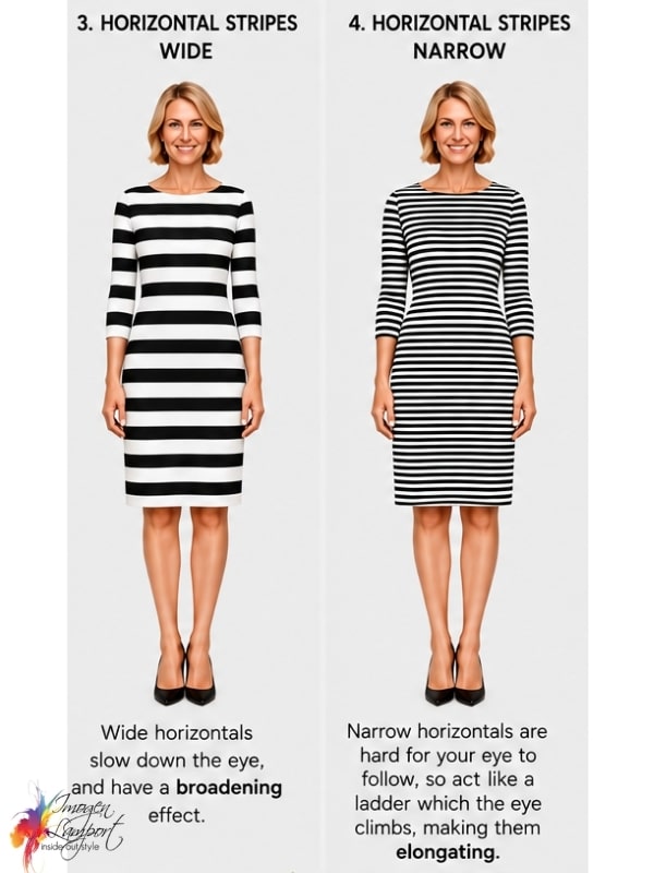 This is also why narrow horizontal stripes are at their most flattering under an open jacket or cardigan. The vertical opening narrows the visible stripes even further, and the ladder gets steeper. It is one of the most reliably slimming optical illusions, and it is made of horizontal lines.

In fact, what’s really great, is that even slightly wider horizontals act like a ladder when worn under an open jacket.
What the Research Actually Says
This is where it gets interesting, because the science has been quietly disagreeing with the popular advice for over 150 years.
Hermann von Helmholtz noticed in his 1867 Treatise on Physiological Optics that a square filled with horizontal lines looks taller and narrower than an identical square filled with vertical lines. He even noted that ladies’ frocks with horizontal stripes made the figure look taller. But I’m not sure what width those stripes were (as noted above).
Peter Thompson and Kyriaki Mikellidou at the University of York put numbers on it. A rectangle of vertical stripes has to be stretched 7.1% taller to look the same height as a square of horizontal stripes, and a rectangle of horizontal stripes has to be made 4.5% wider to look as wide as a square of vertical stripes (Thompson & Mikellidou, 2011, i-Perception). Now, I think that their study was biased, as they used an illustration of a very slim woman in a long dress – there were lots of horizontals and only a few verticals. So visually it was easier to look at the few verticals (thus slowing down the eye and adding visual weight) whilst treating the horizontal example like a ladder that the eye quickly skimmed over, making it appear more slimming. In the next section of this post, you’ll understand why as I explain another study done on “fit” people vs “non-fit” people and how that impacted how the stripes really looked.
So on a flat square, horizontals win. You are not a flat square.
Three things complicate it beautifully:
1. Your starting shape changes the outcome. Ashida, Kuraguchi and Miyoshi found the effect was stronger on a thin figure than a fuller one, with a possible reversal on the fuller figure, plus large variation between individual observers (Ashida et al., 2013, i-Perception). Their title says it best: the illusion makes you look fit only when you are already fit, and not for everyone. So if you are a model, wear whatever you like and you’ll still look slim. If you are curvier, those wide stripes aren’t doing you any favours.
2. Contrast and lightness do their own separate work. When researchers photographed a real model in real dresses and controlled for how light or dark the fabric was overall, horizontal stripes had a small to moderate slimming effect, and lower luminance had a slimming effect too, independently (Koutsoumpis, Economou & van der Burg, 2021, Perception). Two levers, not one, and I’ve talked about contrast and its impact on scale before here.
3. What you believe changes what you see. A large cross-cultural study across Greece and the Netherlands confirmed that people firmly believe horizontal stripes widen, while their eyes reported the striped dress as slimmer than the plain one. And the more strongly someone believed stripes were slimming, the more slimming they perceived them to be (Koutsoumpis et al., 2026, PLOS One). Now I believe this is because a solid colour can often show up lumps and bumps more easily, whilst a busy pattern (that a stripe may be) means our brains can’t be bothered (literally our brains are lazy) to focus too much, thus making it appear more slimming.
That last one deserves a moment. Your expectation is part of the illusion.
If you would like a sense of how deep this myth runs, it appears in a Japanese beauty handbook from 1813, Miyako Fuzoku Kewai Den, which means we have been passing this advice around for more than two centuries without checking it (Miyazaki & Ishibashi, 2022, i-Perception).
 Why I Never Trusted That Viral Comparison Image
Years ago, a study on stripes did the rounds in the press, illustrated with two drawn dresses side by side, and readers were asked which looked slimmer. The horizontal one won.
Look closely at that image and the comparison falls apart. The horizontal dress had lower contrast between its stripes, which makes the pattern less obvious. It also had a pale vertical highlight running down the centre front, which draws your eye inward and up. That is not a test of direction. That is a test of three things at once.
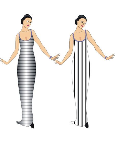 This is exactly the problem with the graphics circulating now. They change the stripe width, the contrast, the colours, the neckline, the silhouette and the hem length between panels, then present the result as proof about direction. I’m not going to share more poor examples here, but I’ve come across quite a few on social media that purport to explain how lines work, but they don’t take all the nuance into account.. The minute you see different colours from one image to the next, different contrast or different widths of stripes, assume that they are using more than one lever (not just the one that they claim they are explaining).
Diagonals Are the Forgotten Third Option
Almost nobody talks about diagonals, which is a shame, because they are the most useful lines in a wardrobe. They also have the most interesting research behind them.
A diagonal creates movement, and the direction of that movement is not neutral. It is trained into you by the fact that you read from left to right.
Your reading habit sets where your eye starts and which way it travels. This is well established. Left-to-right readers land first on the left of an image and scan rightwards, while right-to-left readers do the reverse. It is not innate either. When bilingual participants were given a passage to read in one direction and then shown ordinary photographs, their scanning bias shifted to match whichever script they had just read (Afsari, Ossandón & König, 2016, Journal of Vision). Your eyes are following a habit, not a hardwired rule.
That habit shapes how you read movement, not just position. Psychologists call this the spatial agency bias. Asked to draw a sentence like “the girl pushes the boy,” Italian speakers put the one doing the pushing on the left and the action flowing rightwards. Arabic speakers reversed it (Maass & Russo, 2003, Psychological Science). We read left to right as forwards.
And ascending diagonals genuinely read as more energetic than descending ones. Across four experiments and a content analysis, researchers found that a diagonal rising from lower left to upper right conveys more activity and effort, while one falling from upper left to lower right reads as more passive and restful (Schlosser, Rikhi & Dagogo-Jack, 2016, Journal of Consumer Psychology).
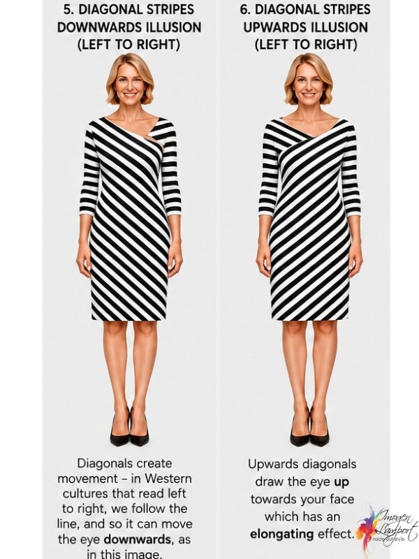
Put those three together, and you have the explanation for panels five and six. A diagonal that falls away to the right takes your eye down with it, towards the hem and the floor. A diagonal that rises to the right lifts your eye up towards your face, which is where you want people looking. Same dress, same stripe width, opposite result.
The honest caveat: none of these studies was run on clothing. They tested images, sentences and product packaging. What they establish is the mechanism, and the mechanism is exactly the one at work when someone looks at you. Nobody has yet pointed an eye tracker at a striped wrap dress, which is a study I would very much like to see.
Diagonals have a second advantage. They break up the body without either fencing you in or building a ladder, and they follow the natural curves of a figure rather than fighting them. A wrap dress, an asymmetric hem, a chevron knit and a diagonally draped skirt are all doing this work. Notice how many of them wrap upwards.
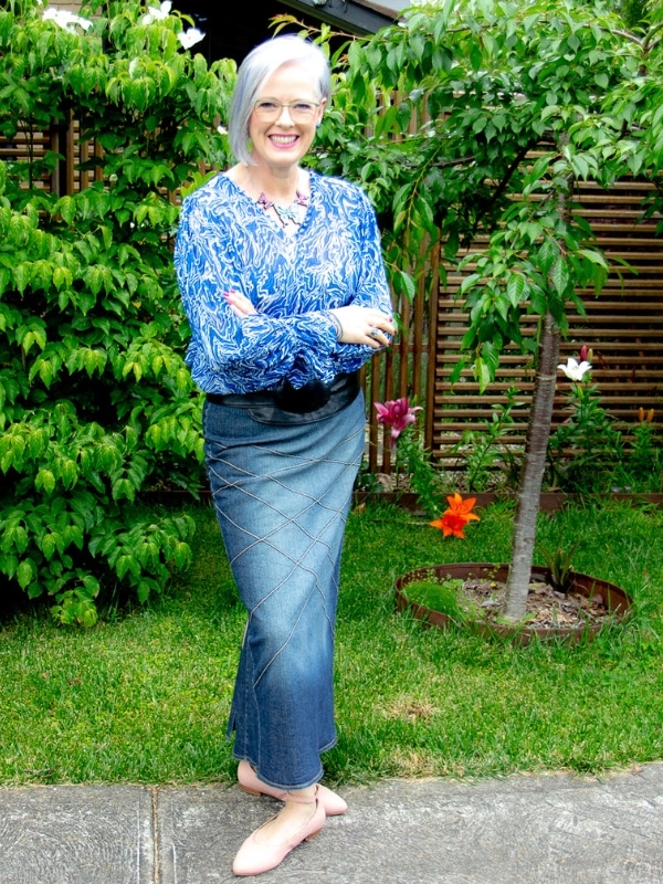
One of the reasons we love a V-neck top is that it moves the eye upwards and out (elongating) and it’s the diagonals on the front of this denim skirt that has made it a favourite of mine – all that crisscrossing moves the eye, rather than letting it rest and focus on my hips and thighs.
The Bits the Graphics Never Mention
Every colour is a stripe. If you have a white shirt with narrow orange stripes spaced widely apart, you do not own a narrow-striped shirt. You own a wide white stripe with a fine orange one between. Look at the gaps, not just the marks.
Match the stripe to your scale. If you are petite, a medium or large stripe will swamp you and look like it is wearing you. Medium scale, medium stripe. Tall and naturally slim, you can carry the big graphic ones. Larger scale but curvy, a medium stripe will serve you better than a large one.
Contrast is a volume dial. A wide stripe in two close shades, say terracotta and burgundy, behaves nothing like a wide stripe in black and white. Turn the contrast down and you can wear a much bolder stripe than you think.
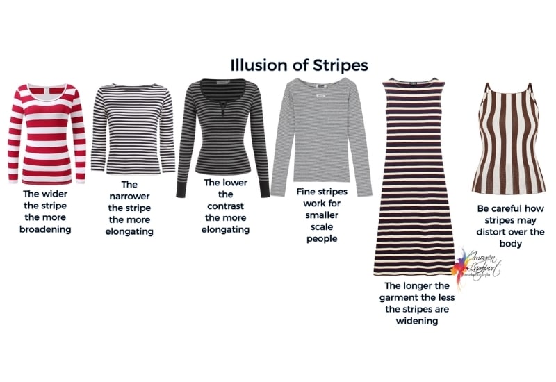 Longer garments are easier. A long striped dress is a vertical object with horizontal detail. A short striped top is a horizontal object with horizontal detail. The garment shape is a line too.
Watch the fit. Stripes are ruthlessly honest. Across a full bust they will bow and go wonky, and a fine striped roll neck will either bunch into random lines or ring your neck like a bullseye. If the stripe goes crooked, the garment does not fit.
Put your horizontals where you want breadth. Narrow shoulders, a small bust, a flat seat. A horizontal in the right place creates balance, and balance is far more flattering than shrinking.
Your Two-Second Changing Room Test
Stand back from the mirror, further than feels natural, and ask one question.
Where did my eye go first, and did it stop there?
If it stopped somewhere you would rather it did not, the stripe is a fence, and it is in the wrong place. If it travelled upwards towards your face, you have a ladder and you can buy the thing.
That is it. No rules to memorise, no direction to fear. Once you understand that you are simply managing where the eye travels, you stop being at the mercy of a garment and start being the one running the illusion.
Want to know exactly where your own horizontals and verticals should sit? That’s mapped out for every shape in my Body Shape Bibles, and covered in depth inside 7 Steps to Style.
Further reading:
How to Wear Horizontal Stripes Without Looking Wide
Is That Stripe Slimming or Widening? Discover the Rules of Stripes
How You Can Use Verticals To Look Taller and Slimmer
E is for Elongation
Which are More Slimming, Horizontal or Vertical Lines?



Thank you for this very informative article! As a math/science person, I really enjoy all of the different parameters that you mention in the studies you sight. Simple rules are not always simple or correct. I have not been a fan of stripes in general, but I love diagonal stripes. Now I know that there might be a reason for that.
Do you also love a triangle – and find them more interesting than a square? I definitely find triangles more interesting as they can be made into a wider variety of shapes with all those diagonal lines! Thanks for reading Louise – I appreciate you being here