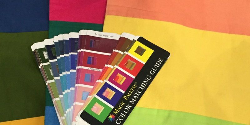
I recently found this Colour Matching Guide and think it’s a nifty tool to help you find the value of a colour. In fact, using it will make you an expert in finding the value of a colour and then putting together the right value contrast for you.
How to Use the Colour Matching Guide to Find the Value of a Colour
Watch how easy it is to use in this short video.
As I shared in this post about how the easiest way of thinking about value contrast is that it’s like a set of stairs. This tool will help you walk up and down (or jump if that’s right for you) the value contrast scale.
You may want to find the value for each colour in your colour swatch, and then you can quickly and easily figure out the value contrast of any outfit you’re putting together. You’ll know if it’s the right value for you or if it’s too low or high.
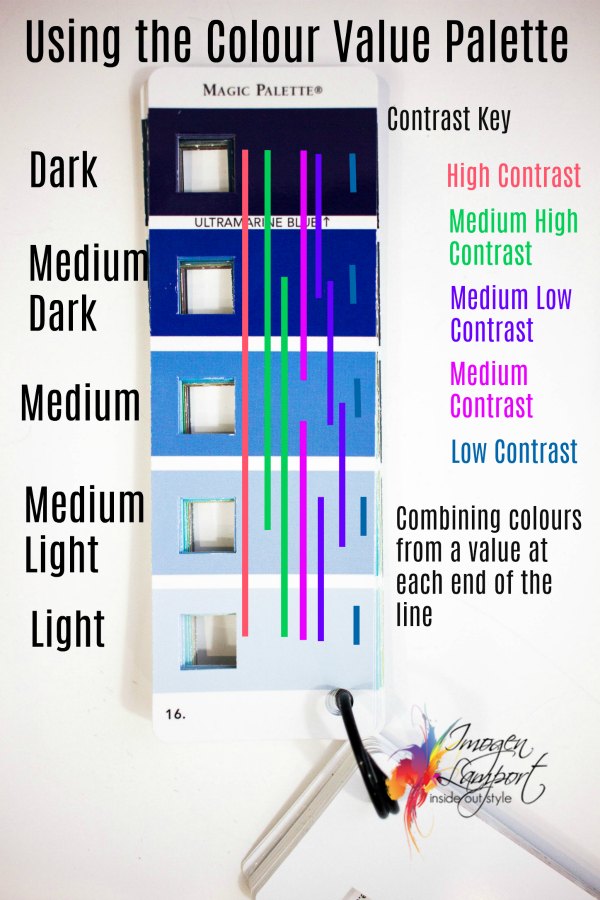
- If you are a low contrast – stick to colours on the same level – blue lines
- If you are medium low contrast – move only one level away – purple lines
- If you are medium contrast – Jump over a level either up or down to create the right value contrast – pink lines
- If you are medium high contrast – combine colours that are either a light with a medium dark, or dark with medium light – green lines
- If you are high contrast – choose colour combinations from the top and bottom of the scale – red line
Get your colour matching palette here now!










Great find Imogen, but Amazon won’t post it to Australia. Do you know of anywhere else it can be purchased from?
I’ve not seen it anywhere else – so sorry!
Julie, check ebay. I see it posted here in US. Maybe some sellers will ship to you.
This is great, Imogen!
I’ve been using a full color wond to choose paint colors for years. I know there must be an old one hanging around the garage someplace…. going to dig it out today. Thank you for this wonderful tool to help organize my new wardrobe items. Something you said today really helps me achieve my goal of a seasonless wardrobe, medium with light for warm months, medium with a darker tone for winter. You are the best…..it takes repitition for the light bulb to go on….thank you soooo much!
Your faithful fan,
Pat
Amazing! Thank you so much for always being on the look out for tools that will make it easier for us. Great idea!
I am thinking of even cutting little boxes into my color swatch . I still have difficulty figuring out if something is a match to my colors or not.
By the way, I know you did wardrobe organization videos , but I would love to have more , particularly about how to hang colors and neutrals, tops and bottoms and then some items are good for 2-3 seasons…
Imogen, thanks for the information. I love the frame of your glasses. Can you tell me the name of the designer/maker? Does it come in different colors? Thanks Doris
Hi Doris, they are by Prodesign – they are about 4 years old now!
Hi, Imogen,
How does this work in concert with color contrast? I am a medium value contrast, so I understand from this post that this means to go up or down one level when pairing two colors (or one color and a neutral?). My color contrast is medium-high, though, which I understand to mean a recommendation of wearing 2 or more colors (in triads or complementaries) and a light-medium value neutral. How does this tool work in terms of pairing at least two colors and a neutral? For instance, if I would like to wear a hot pink top (am guessing at least medium value — the tool should arrive today!) with a white (am assuming it’s a light value) skirt, am I looking to also wear an accessory in a complementary or triadic med-light value shade? Thanks for any guidance — am a bit overwhelmed!
You can add an accessory in a different colour (triad or complementary) or you can add a 3rd piece in a different colour – though it may be the same value if you have used your neutral to create your ideal value contrast.
Love it! Just got it! I’m finding it very helpful for helping my husband choose colors that don’t overwhelm his pretty skin and light green eyes!! He’s low contrast, so he’s easier for me to figure out, than for me who is high contrast. Thanks again!!!
that’s great Jenny! It’s good to see how his low contrast needs different combinations from your own high contrast!
Like Jenny – I love it! And just got it! My skin value is medium light and my hair and eye value is medium – so medium low contrast. In a year or so my hair value will probably move to low but my eyes will still stay medium value – so medium contrast but leaning towards lighter colours. As wonderfully usual, you have explained value and contrast so clearly. Thank you so much.