Some people feel at odds with the colour palette that flatters. For example, a bold or dramatic personality (loving bright colours) whilst the colours that flatter may be softer and smokier and lack that obvious drama.
Ideally you want to create balance between the inner you, your personality, and the outer you, your appearance and natural colouring.
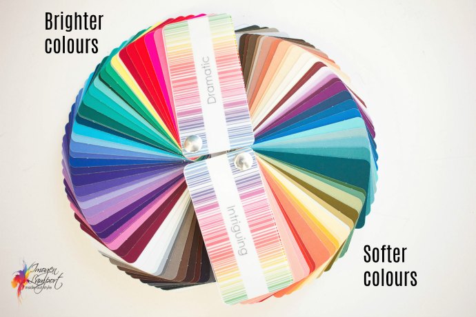
In this video Jill Chivers of 16 Style Types and I discuss how to feel congruent with your personality and colour palette and show you how to manipulate the colours that flatter to express your personality authentically.
The most important factor in understanding how to express your personality using your colours
We mention this post on value contrast being like a set of stairs.
I show you how to create the illusion of boldness or brightness by changing the colour or value contrast by using a higher colour contrast such as a complementary, split complementary or triadic colour scheme.
If you are more dramatic in personality (but not in colouring), you will naturally want to break your colour or style ‘rules’ (aka guidelines) to express yourself fully.
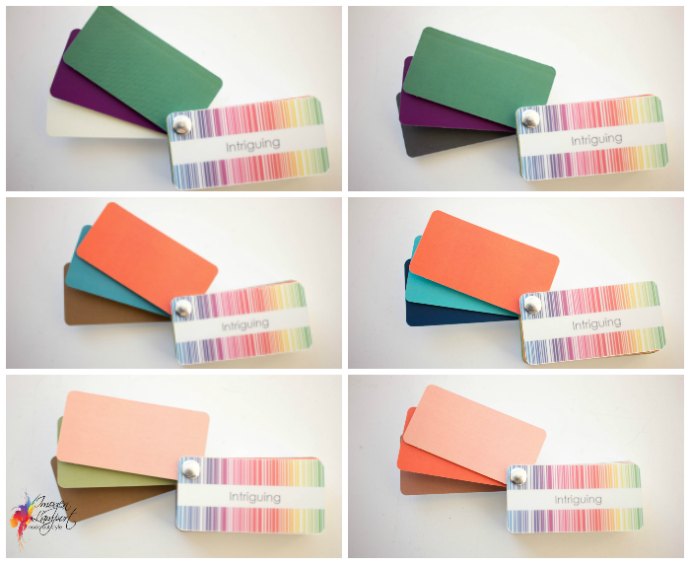
This is particularly useful if you have been used to wearing brighter colours and as your skin, hair and eyes softens and mutes with age, and the bright colours start wearing you (instead of you wearing the colours), it’s good to be able to give yourself the ‘feeling’ of brightness without the colours being too overwhelming and unflattering for you.
We discuss how to add contrast, whether colour or value by adding the higher contrast as an accent in a small element, a piece of jewellery, a hint of cami or a layer that peeks out.
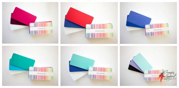
You can also take this concept and do it in reverse if the brighter colours suit your colouring, but you prefer a more subtle look. Instead of wearing a high value contrast, take it down a level by adding in an extra element of colour in a ‘step’ down so that you are blending the colours instead of jumping from a light to dark.
Wearing a more monochromatic palette – such as pink with burgundy, instead of pink and blue, will make that pink look more subtle.
You want to feel like you when wearing your colours as they can work in concert with one another, bringing out your true beauty, and also reflecting your authentic self.
If you’d like to discover your personal colour palette and contrast levels, this is part of my 7 Steps to Style program.
Want to see some real life examples of dressing with the best contrast? Then download my guide here free.










Another great one! I’ve discovered adding brown to black and white softens my neutrals just enough!
Brilliant post. Just what I needed. Love bold colours but have soft colouring.
What a great topic. I was just struggling with this as I try to better plan my wardrobe choices. I understand the principle but still somehow end up missing the mark. I’ve been analyzed and wear the equivalent of Dynamic colors. I’m trying to achieve a more elegant, easy look that matches my more subdued personality.
I’m overall deep value with medium value contrast and low/medium color contrast (somewhat like Zoe Saldana’s depth and contrast). I think an achromatic scheme stepping through black, grey, and white works. My usual neutrals are black and navy. Worn with bright colors those can look like aggressive color blocking. I’m not sure how to tackle something like a palette for a capsule wardrobe. Any other tips for those trying to do the reverse of what the video focuses on??
Go monochromatic, such as pink with burgundy, light and dark blue, shades of green etc.
Very interesting – especially as have just be rediagnosed as a bright spring with aging, after decades of being a dark autumn! Yes, hair has gone lighter, eyes have gone from very dark to bright green. The consultant was as surprised as me, to discover after hours of draping that bright, warm and light is now me. The problem, as you video remarks on, is though love the colours, they are a bit of shock, at least for the moment, also have a lot of dark green in wardrobe already, so am putting some light pinks and corals with the darker shades to begin with at least. I also had slight worries about wearing really bright in my sixties, it can look a bit sad old lady, although I have good skin and do love the colours, so maybe will edge into them gradually?
This post is really relevant to me at present. I have been so used to wearing strong, cool, bright colours but am now trying to adjust to an intriguing pallet with softer, warmer and lighter colours and finding it really quite difficult! You have given me some ideas to help the way I look at and use the colours in my swatch to find new colours and combinations to wear. Thank you!
Great information. I’m working through similar issues at the moment too. I’m a short, fairly quite, introverted sort of person and I’ve also found that by choosing certain colours, I can adjust the way I’m perceived. An example is a burgundy skirt which I paired with a burgundy top for an important meeting I had ( power dressing ) The same skirt with a floral top with a pink in it lightens my mood and makes me feel more approachable. I was analyzed as a winter (but maybe “you could be a summer’) about 25 years ago by someone who was a winter herself. Now in my sixties, and after years of wearing winter, I’ve found out my nephews were terrified of me. I’m sitting comfortably somewhere in the soft summer deep palette, much more approachable. Where do I look to find one of your consultants in the Blue Mountains in Sydney, if I choose to be reassessed.
On a different subject, Imogen I noticed you in reading glasses on a previous video. As a “blended” kinda girl, I find it difficult to find a pair of glasses that don’t take over my whole face. I would be interested in hearing your thoughts. I want modern glasses, but I want to see my face through them, not ones that take over my whole personality.
Hi Keiran, Your colouring would have definitely changed over time. I highly recommend if you want to see someone in person – Sue Mallen (she’s near the Blue Mountains http://www.designed2byou.com.au/contact/) who I trained in colour and style.
Glasses – if the colour works with you the frame will be less noticeable. Styles come down to personality – so if you want something that is more subtle look for a lighter weight frame, rather than heavier, or thicker.