


Those in the Northern Hemisphere are just coming into spring, whilst we in the Southern Hemisphere are in Autumn (or Fall as you North Americans call it). Pantone has just released its predictions for the fashion colours of Fall/Winter 2016 and interestingly, neither “colour of the year” Rose Quartz or Serenity are anywhere to be seen, though Airy Blue and Dusty Cedar are relatives of these colours.

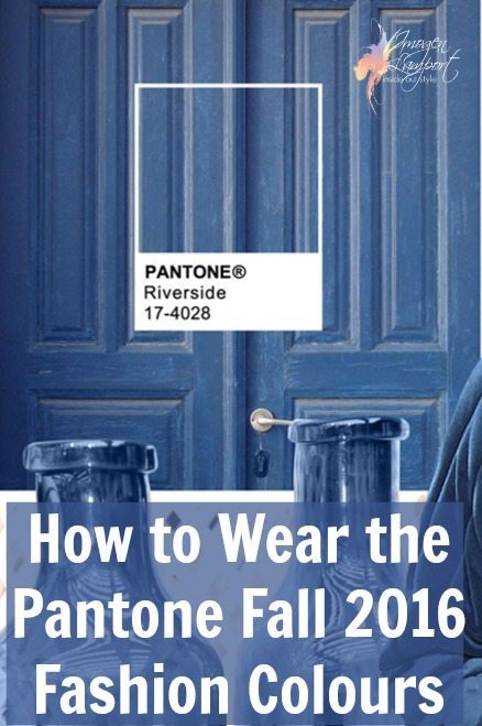
How to Wear the Pantone Fall 2016 Fashion Colours
Firstly, let’s look at who they suit.

Warm Undertone Colours
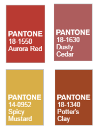
- Aurora Red
- Dusty Cedar
- Spicy Mustard
- Potter’s Clay
Cool Undertone Colours
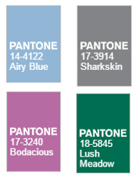 Airy Blue
- Sharkskin
- Lush Meadow
- Bodacious

Universal Colours
 Riverside
- Warm Taupe
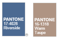
As always there will be a variety of these colours, lighter and darker, brighter and more muted versions. There is always variation in the colours you see in stores. You need to get in close and check them out to see if they work with your palette and flatter your complexion. You will find that Warm Taupe will come in both more cool pinkish beige and warmer yellowish beige colourations.
Again with Riverside we have a lovely denim blue that will work with many palettes. The warmer versions will be slightly more marine navy in their appearance (so having a yellower undertone).
Secondly, let’s see how easily they mix with other colours.


Beautiful post — I love seeing all the colors and how they can be combined!
Great inspiration! Really beautiful colours and wonderful combinations that are totally wearable 🙂
Yes and your yellow skirt will be the height of fashion!
Loved this post. It’s nice to be prepared in this way, for the next time I go shopping.
I do have a question though–I have warm coloring (definite yellow undertone in my Italian-American light olive skin, brown-green-gold hazel eyes, and hair that had been a rich medium brown and is now almost all silvery white…is there ANY shade of yellow I could wear? I’ve heard that yellow is no longer flattering once you let your hair go gray.
I would look for a more light lemon yellow. Really what colours you wear and flatter is more based on your skin than hair. Some people go white and their skin cools down, others stay warmer.
Thank you for the ‘how to wear’ the new Pantone colors. I plan to use the Warm Taupe and Riverside blue extensively, including in combos of the two colors.
Thank you for this! I enjoyed seeing the line-up of the colors first, so I could try to figure out which were warm and which were cool before I scrolled down. I’ve been trying to improve my color-sense with your help, and I got about half right. I’m warm and I knew the spicy mustard and potter’s clay were my colors, and I got the two neutrals or universals right. So I’m getting there.
I love to see the outfits that you put together. This is the first time I’ve commented–I’ve been appreciating your blog so much.
I’m confused — In the last image, the warm side with Potter’s Clay etc. — those pants are men’s pants. Would they fit any particular women’s body type.
Thanks,
Christine
They would suit a straighter body shape such as an H shape
Nice summary.
How about trio rather than triad? I couldn’t see a crime syndicate, ha!
Triad is the technical colour term! No guns allowed!