Pantone Reflecting Pond is one of my favourite colours of 2015 as it’s just so versatile. It’s a warm deep navy so can be worn by everyone as it’s a truly universal colour. Reflecting Pond is a brilliant neutral that should replace black in so many wardrobes as it will flatter your skin and can still be worked back with almost any colour. What more could you want? You can check it out with Marsala here.
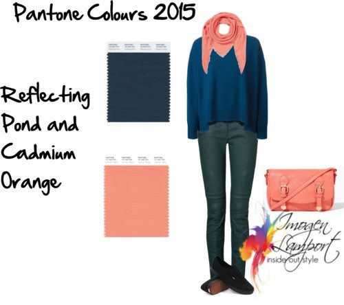
Here it is with Cadmium Orange
It also goes really well as a neutral with Dried Herb and Oak Buff


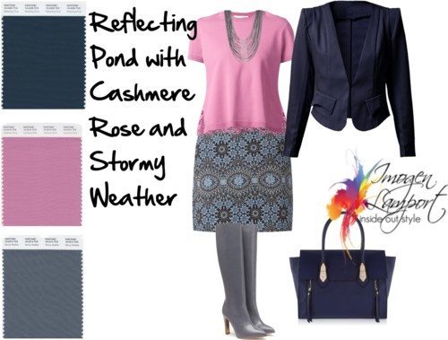
Here it is with Cashmere Rose and Stormy Weather
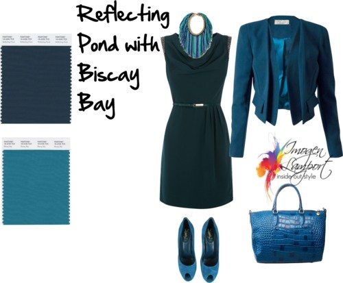
Now this is one of my favourite combinations of the Pantone 2015 fall colours as it’s universally flattering – Reflecting Pond with Biscay Bay (a warm teal blue, also a universal colour). They provide an excellent backdrop for each other, neither competing but creating a beautiful harmonious appearance. You just can’t go wrong.
How about teaming Reflecting Pond with Amethyst Orchid and Biscay Bay? This is another fabulous colour scheme that can work brilliantly for so many people.

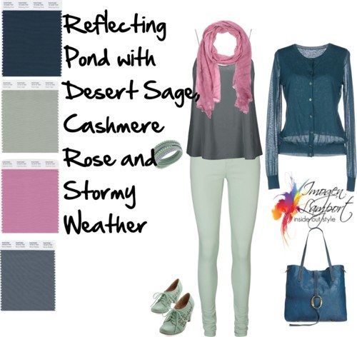
Here I’ve teamed up Desert Sage with the Reflecting Pond and Stormy Weather as well as Cashmere Rose. The Desert Sage and Cashmere Rose work as complementary colours in this colour scheme, the others as neutrals.
Which of the fall 2015 Pantone colours are you most excited about trying out when you see it? Will Pantone Reflecting Pond be making a presence in your wardrobe?








all are nice but amethyst orchid and biscay bay- just gorgeous!
off topic, but could you do a post to clarify what a hot pink vs fuchsia is? I always thought the former is a bright warm pink vs the latter being cool and bright?
(you once said that someone with ruddy cheeks and warm skin will see fuchsia make their redness more flush and obvious, whereas warm colours soothe it all down?)
most bright pink garments I find in shops/online tend to be warm as far as I can tell! what is/ where’s all the fuchsia?
Fuchsia is a slightly more purple hot pink. When I say Warm I mean warm undertone not warm overtone – so there are hot pinks that are warm and some that are cool generally someone who has a very flushed complexion should avoid reds/hot pinks as it will make them look redder.
Reflecting Pond and Biscayne Bay…swoon!! Always have been and always will be my two favorite colors. 🙂
The reliance on the Pantone colors of the season is absurd. Why and how are these determined? To my mind it’s like ‘think pink’. Change the colors and sell more clothing, a purely economic perpetration on the insecure.
Nancy
You are correct but it’s what the clothing mfgrs use so those of us who don’t sew have to find what we can in the shops.
I love this shade of blue, I think its hard to find in winter and will be interested to see what clothing is around in this colour.
so beautiful!
Reflecting Pond is so lovely is has me re-thinking my lifelong antagonistic relationship with navy. This navy is interesting rather than preppy and dull.
I love the Reflecting Pond with Biscay Bay (basically a teal, isn’t it?) I find navy such a difficult colour to buy, though, because there are so many variations of it. Matching navies is not the easiest thing out. Due to health issues, I do most of my shopping on the Internet, which complicates things further. Thankfully, I’m a Winter (based on the Color Me Beautiful system), so I can wear black, but I have a fair skin, so I do think navy would be a bit softer on me.
I would like to try to add Reflecting Pond to my wardrobe this year, but how do I make sure I’m selecting the right colour, online or in the store? As far as I know, clothing manufacturers don’t use the Pantone colour names for their clothes (or do they?). I’m not even sure how true the colour that I’m seeing on my iPad screen is! Any tips or suggestions for me?
I just love it with dried herb and oak buff. Yum!
I love the desert sage, cashmere rose and stormy weather!!!