

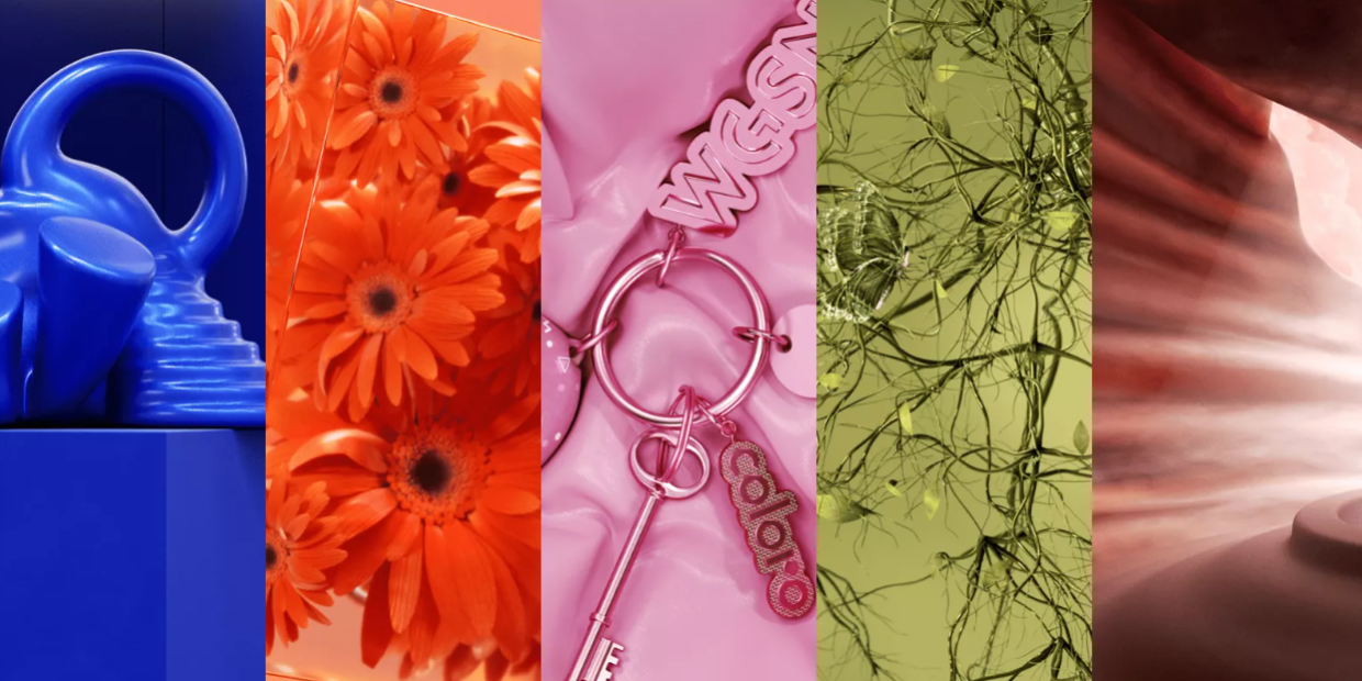




Every year a forecaster unveils a colour and tells us what it says about how the whole world is feeling. Calm. Hope. A fresh start. A few months later the shops fill up with it, and plenty of women buy it without asking the only question that really matters: does this colour actually like me? The colour trends 2027 forecasts are already out, and I’ll admit I’m much happier with the direction than I was last year.
Last December I told Pantone we needed to talk about Cloud Dancer, its 2026 Colour of the Year, which is (let’s be honest) white. White is a neutral, a backdrop, not the main event. So seeing a saturated blue take the headline spot for 2027 made me smile.
Before you rush out and buy everything in blue, though, let’s unpack what these colours are, what the “psychology” attached to them actually means, and how to tell which versions belong in your wardrobe.
The Colour Trends 2027 Forecasters Are Betting On
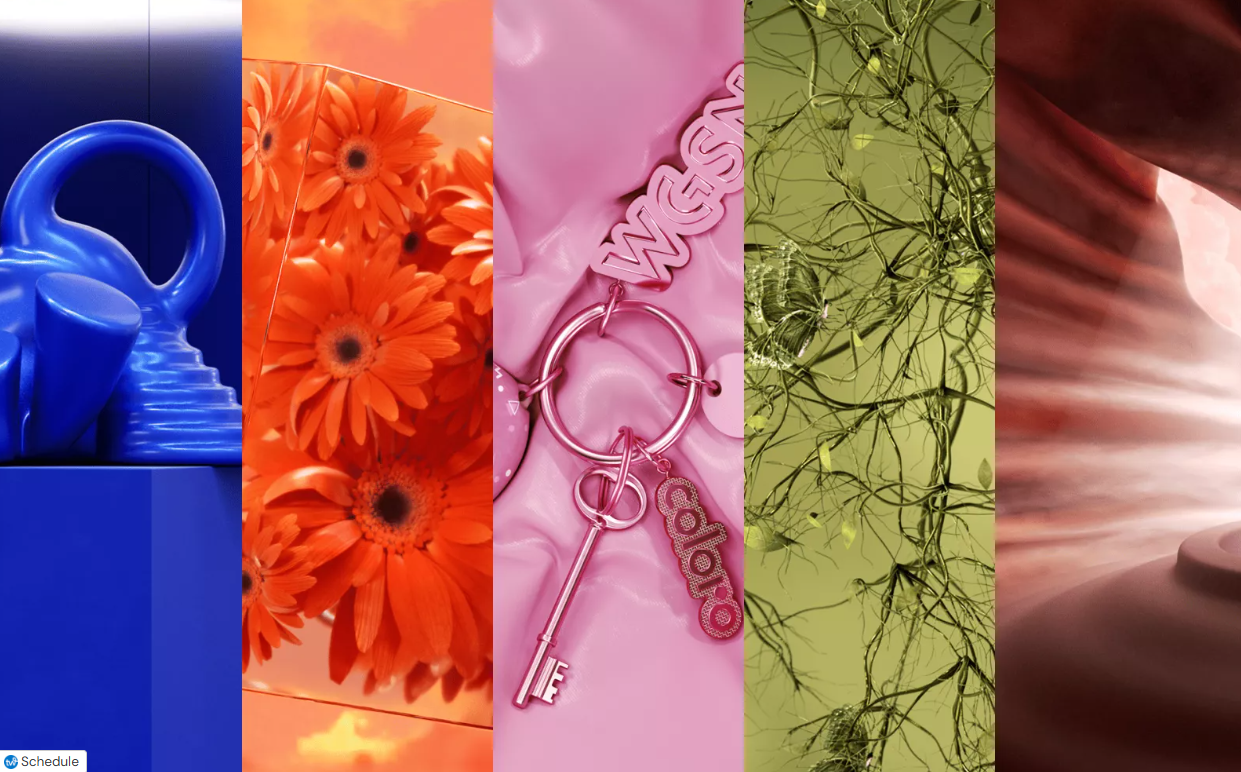
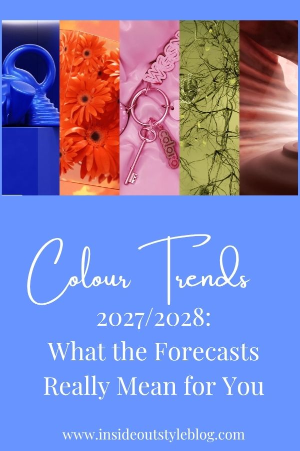
Luminous Blue, Energy Orange, Pop Pink, Meadowland Green and Clay.
The big announcement came from WGSN, a trend forecasting service brands use to plan their ranges years ahead, and its colour partner Coloro. They named Luminous Blue as their Colour of the Year for 2027 (which I’m super happy about as it’s one of my favourite colours, alongside four more key colours for spring/summer 2027: Energy Orange, Pop Pink, Meadowland Green and Clay.

Their autumn/winter 2027/28 palette heads somewhere deeper and quieter, with Russet, Peaceful Lilac, Maize and Deep Green.
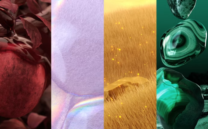
Russet, Peaceful Lilac, Maize, Deep Green
Pantone usually reveals its own pick in December, and don’t expect the two to agree. They rarely, if ever, choose the same colour: for 2026 Pantone went with white while WGSN chose Transformative Teal. Of the two, WGSN’s is the one to watch for what will actually hang on the racks, because brands buy its forecasts to decide what goes into production. Pantone’s pick is more of a cultural and marketing moment. That’s worth remembering about any forecast. Colours are chosen years ahead because that’s how long it takes a shade to travel from a dye house to a clothing rack. By the time you spot it in a shop window, the decision was made long ago, and not with your colouring in mind.
Why Forecasters Give Every Colour a Personality
Read any trend release, and you’ll notice each colour arrives with a little character sketch. WGSN frames 2027 around interconnectedness and pitches its palette as an antidote to a world that feels overwhelming. Pop Pink is cast as joyful and carefree. Peaceful Lilac is presented as a soft refuge from a polarised world. Deep Green is positioned as luxurious, a touch mysterious, and built to last.
These stories are genuinely interesting, and they do tell you something real: what the industry expects anxious shoppers to reach for. It’s the same reason stores are wall-to-wall with black and other “safe” neutrals. Safe choices sell. Designers themselves have long used colour to tell a story on the runway, as we explored in what high fashion teaches us about colour.
What these stories are not is a description of what a colour will do for you. A forecaster’s “joyful pink” is a mood board for the market, not a horoscope for your face.
What Colour Psychology Can (and Can’t) Tell You
The largest review to date, covering 128 years of research and more than 42,000 people in 64 countries, found that we link colours to emotions in remarkably consistent ways. But “linked to” isn’t the same as “makes you feel”. And as Elliot and Maier showed, context can still flip a colour’s meaning. Yellow may mean optimism (we all love the sun on a lovely warm spring day), but how much joy you feel about it depends on where you live. People in rainier countries, further from the equator, link yellow to joy more strongly than people who see the sun every day. The sun is more fun when it’s rare, but it’s not the only association and emotion we ascribe to it.
The credible research paints a more nuanced picture. Psychologists Andrew Elliot and Markus Maier developed what’s called colour-in-context theory, which holds that the same colour can carry quite different meanings depending on where you see it.Red can signal attraction on a date and danger or error on an exam paper. No universal dictionary of colour meanings exists, and anyone selling you one is oversimplifying.
Some effects are real but modest. Researchers Russell Hill and Robert Barton found that in evenly matched Olympic combat sports, competitors wearing red won more often than those wearing blue. A reason to wear red to every meeting? Not quite. The reason that the person wearing red won more frequently? These were sports that were judged on skill by a person (not a scoreboard and a goal), and because red is an advancing colour and blue a receding one, the judges noticed the person wearing red’s moves more frequently as that colour drew attention. It may be that if you’re an introvert and find it hard to get a word in edgewise at a meeting, wearing some red could be a good strategy for you to try out, as you just have to move to gain attention. But if you need to be listening and learning, red is not the colour to wear.
We can say with confidence that colour shapes first impressions. Marketing researchers Lauren Labrecque and George Milne showed how strongly colour shapes the personality people attribute to a brand, and you are no different. Before anyone notices the cut of your jacket or the quality of the fabric, they’ve registered the colour sitting next to your face.
So the meaning that matters most isn’t the one in the press release. It’s the message your face sends when you wear the colour. Do you look vibrant and rested, or tired and washed out?
Look Past the Name to the Properties of Colour
Here’s where trend colours stop being a trap and start being useful. Every colour has properties that determine whether it harmonises with you: undertone (warm or cool), value (how light or dark it is), intensity (how bright or soft it is), and how it contrasts with your hair, eyes, and skin. It’s the thinking behind the science of which colours look best on you, and the reason my Absolute Colour System has 18 palettes rather than 4, 12 or 16 seasons.
Research shows it’s not just the hue that matters. How light and saturated a colour is changes the emotions people connect with it.
Coloro’s codes actually describe these properties, which makes them handy for decoding a trend. Luminous Blue, for instance, is a fairly deep, saturated blue.
Peaceful Lilac sits at the opposite end: light, cool and soft. Russet, Clay and Maize lean warm, while Deep Green is dark and cool. You can predict which of the new colours sit closest to your own colouring before you’ve even touched a swatch.
Russet, Peaceful Lilac, Maize, Deep Green
And here’s the good news. A named trend colour never lands in stores as one exact shade. As I said when Cloud Dancer launched, the industry treats a specific shade as a whole family, so you’ll find warmer and cooler, lighter and darker, brighter and softer versions on the racks. That’s your opportunity. Your job isn’t to wear Luminous Blue. It’s to find your Luminous Blue.
Take the Spicy palette from my Absolute Colour System. It doesn’t hold one blue, it holds eight: Robin Egg, Teal Ocean, Blue Teal, Turkish Blue, Turquoise Azure, Airforce Blue, Junior Navy and Navy River. (Naming every colour across 18 palettes was quite a challenge, I can tell you.) When Luminous Blue hits the racks, a woman with that palette doesn’t need the exact WGSN swatch. She holds each blue she finds against those eight and keeps the one that belongs. Your palette works exactly the same way.
How to Stay Ahead of Colour Trends 2027 Without Losing Yourself
When you meet a trend colour in a store, run it through this quick test before it goes anywhere near the till:
- Undertone: does it share the warmth or coolness of your skin, hair and eyes?
- Value: is it close to your natural lightness or depth, or is it very different from you?
- Intensity: is it as bright (or as soft) as your own colouring can carry?
- Placement: if it fails the first three, is it really worth it? Even if you wear it away from your face, if it’s unrelated to your colouring, it will grab attention. Will you be wearing it next year or in 5 years’ time? There is no point in buying something that is just going to end up as landfill.
If a colour passes, wonderful. Buy it and enjoy feeling current. If it doesn’t, you haven’t missed out. You can nod to the trend through a print that includes it, an accessory, or a neighbouring shade that does suit you, and narrow your palette to what you’ll actually wear so new pieces work with what you already own. Trends come around and go again. Colours that suit you never date.
If you’d love to know exactly which versions of Luminous Blue, Pop Pink or Russet belong in your wardrobe, book an online colour analysis with me and you’ll know before the shops fill up.