


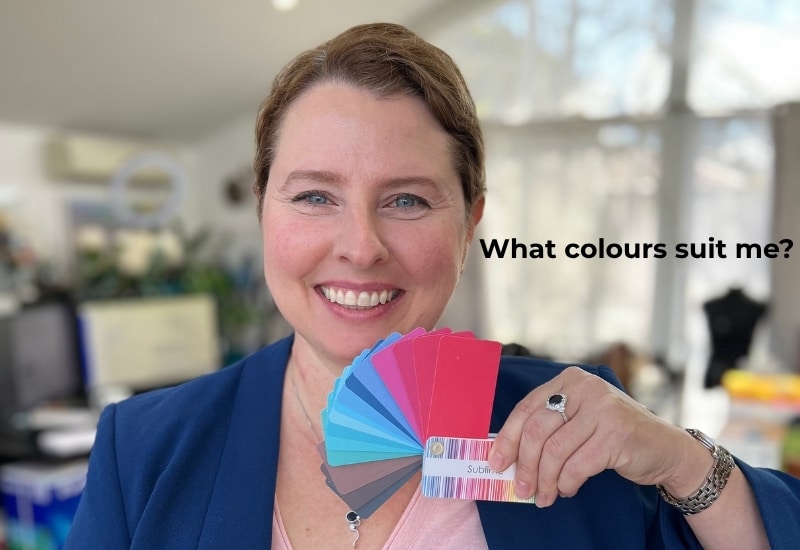
The final of my top 10 most Googled personal style questions is “What colours look best on me?
I’ve been asked this question more times than I can count. In consult rooms, on comment threads, in DMs at 11pm from women standing in front of their wardrobes having what I can only describe as a full existential crisis. “What colours look best on me?” seems like a simple question. It isn’t. But the answer, once you understand it, is genuinely life-changing. Not in a hyperbolic way. In a “I put on this top and suddenly my face looked ten years younger, and I didn’t even need the expensive serum” way.
Let me take you through the actual science, because it’s fascinating, and because knowing the why means you’ll never have to guess again.
1. Your skin is doing something remarkable, and most people ignore it
Here’s the thing, mainstream colour advice gets wrong. It tells you to sort yourself into a season, pick a swatch fan, and buy accordingly. The problem is that human skin is not a flat surface. It’s translucent. Light passes through it, bounces off the underlying tissue, and reflects back out.

What we perceive as “skin colour” is actually the result of three pigments working together: melanin (which creates depth from pale to deep), haemoglobin (the pink-red of blood beneath the surface), and carotenoids (yellow-orange tones from diet and biology).
Research published in the journal Evolution and Human Behaviour by Lefevre and Perrett (2015) found that the perception of health in skin is strongly linked to the colouration created by these pigments, particularly the interplay of redness and yellowness. When clothing colours harmonise with your specific pigment combination, they amplify those healthy signals. When they clash, they work against them.
This is not about being “warm” or “cool” as binary categories. It’s about resonance between your biology and the light properties of colour.
 2. Why colour analysis actually works, and it’s more logical than you think
Colour is a science. Specifically, it’s what happens when light of a particular wavelength hits a surface and reflects back to your eye. Every colour you see, whether it’s the rust of a linen blazer or the teal of a silk blouse, is a specific range of wavelengths bouncing off that fabric and landing on everything nearby, including your face.
This is why what you wear near your face matters so fundamentally. That fabric is not just sitting there being decorative. It is actively reflecting its wavelengths onto your skin, all day, in every room, under every light source. The question is simply whether those wavelengths are working with your skin’s own pigments or against them.
Here is the elegant truth at the heart of colour analysis. The colours that are most harmonious on you are not arbitrary. They are the colours that are already inherent in you, the hues that echo the wavelengths present in your own skin, hair, and eyes. When a colour’s wavelength profile is similar to your own, the reflection creates resonance. Your skin looks even, luminous, and alive. When the wavelengths clash with your pigmentation, the reflected light creates visual noise. Shadows appear where there weren’t any. Redness in broken capillaries and age spots amplifies. Under-eye bags become more prominent. The face looks tired or flat.
This is not mysticism. It is physics applied to the human face. And it is why two women can stand in front of the same rack of clothes, with one of them looking extraordinary in emerald green while the other keeps walking.
3. Please stop looking at your veins
Before we go further, let’s address the internet’s favourite DIY colour test. The one where you look at the veins on your inner wrist and decide whether they’re blue-purple (cool!) or green (warm!). It feels scientific. It isn’t.
The colour your veins appear through the skin is not primarily a reflection of your skin’s undertone. It’s heavily influenced by the thickness and translucency of the skin over them. Thinner skin allows more light to penetrate and scatter, which affects which wavelengths are absorbed and which are reflected back to your eye. The blueness or greenness you see is a product of how light travels through your particular skin thickness, not a reliable readout of your underlying pigment mix.
There’s a reason professional colour analysts don’t use veins as a diagnostic tool. They use draped fabric held against your face in natural light, watching what happens to your skin in real time. Because your face is where the clothing colour actually matters. Your wrist isn’t competing with your outfit. Your face is.
Dark cool colours for darker cool colouring
4. Colour has three separate dimensions, and all three matter
Most people only think about hue, the name of the colour. Red. Blue. Green. But every colour has three distinct properties, and all three interact with your colouring in different ways. Confusing them is where most colour advice falls apart.
Hue is the colour family itself.
Value is how light or dark a colour is. Cream is a light value. Navy is a dark value.
Intensity, sometimes called chroma, is how pure and saturated a colour is versus how muted, smoky, or greyed-down it is. A clear bright red and a dusty muted rose are completely different in intensity, even if they share a similar value. A deep forest green and a clear emerald green sit at similar values but at very different intensities.
These three dimensions are independent of each other. And each one corresponds to something real and measurable about your own colouring. Getting them confused, which almost all simplified colour systems do, is why so many women end up with advice that almost works, but doesn’t quite.
5. Value contrast is about the difference between your features, not about how light or dark you are overall
Value contrast describes how much difference exists between your lightest and darkest natural features, typically the relationship between your skin, your hair, and your eyes.
Someone with deep brown skin, dark eyes, and dark hair has low value contrast between those features, even though each feature is individually a dark value. Someone with very fair skin and very dark hair has high value contrast, because there is a dramatic difference in value between those features. Someone with mid-toned skin, mid-brown hair, and hazel eyes may have low to medium value contrast, because all of their features sit relatively close together on the light-to-dark scale.
This matters enormously for how you wear colour combinations. High value contrast in your own features means you can carry high contrast in your clothing, sharp pairings of light and dark colours, prints that have strong tonal shifts. Low value contrast means those same combinations can look visually jarring against your face. They overwhelm rather than harmonise. The outfit competes with you instead of letting you lead.
Research by Richard Russell at Tufts University on facial contrast found that the degree of contrast between facial features is a strong cue the brain reads as a signal of health and vitality. When your clothing contrast level echoes your natural feature contrast, it reinforces that reading. When it fights against it, something feels off, even if you can’t articulate why.
6. Intensity is entirely separate, and it’s the one most people miss
Your intensity level, or chroma, is about the inherent clarity or mutedness of your natural colouring. And here’s what makes it genuinely tricky: it is completely independent of how light or dark your colouring is, and completely independent of your value contrast.
A person with deep, dark-value colouring can have high intensity or low intensity. A high-intensity version will look vibrant and alive in rich, saturated jewel tones. A lower-intensity version of the same depth will look slightly harsh or overdone in those same colours, and much more harmonious in deeper, smokier, more greyed-down versions of those hues.
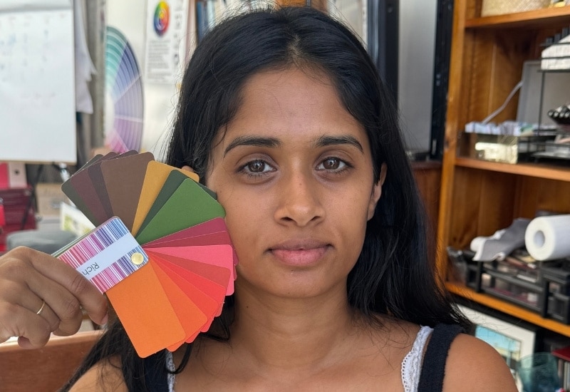
Warm, brighter, dark colours
A person with fair, light-value colouring can also be high or low intensity. If their colouring has inherent clarity and brightness, light brights and clear pastels will suit them beautifully. If their colouring is naturally muted and smoky, those same clear bright colours will look like too much, and the softer, mistier versions of colours will look effortless.
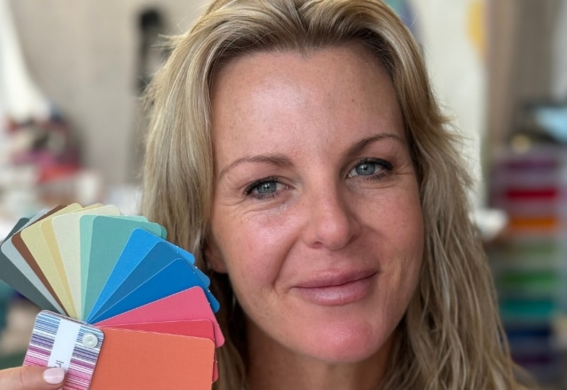
Light soft colours with warm undertones for light colouring and subtle colouring
The reason this matters is that intensity mismatch is the most common cause of that nagging feeling that a colour is “almost right but not quite.” The value might be correct. The undertone might be harmonious. But if a bright, saturated colour sits against naturally muted colouring, it overwhelms. And if a soft, smoky colour sits against naturally clear, bright colouring, it drains.
Research published in PLOS ONE by Stephen et al. (2012) demonstrated that skin with more even, consistent colouration is perceived as healthier. When the intensity of your clothing echoes the inherent clarity or softness of your natural colouring, it visually creates that evenness. When the intensity clashes, it pulls the eye away from the face and onto the fabric instead.
7. The face-framing effect is real, and it’s been measured
Here’s the mechanism underneath all of this. When you wear a colour near your face, it reflects light back onto your skin. If the undertone of the colour harmonises with your skin’s undertone, the reflected light flatters. If it clashes, the reflected light creates the appearance of shadows, sallowness, or redness where you don’t want any.
This is why a woman with pink-toned skin can look radiant in a dusty blue and simultaneously look tired and blotchy in a yellow-green. The colour is activating different properties of her skin tone. She’s not imagining it. The physics is doing it.
And this is also why the vein test fails twice over. Your wrist doesn’t receive reflected light from your collar. Your face does.
 8. Your colours change as you do, and that’s not a flaw, it’s biology
Here is something the colour advice industry rarely tells you. Your palette is not fixed for life. It evolves as your colouring does, and your colouring changes meaningfully across the decades.
Hair is usually the most obvious shift. As melanin production slows with age, hair softens in intensity, lightens in depth and eventually transitions to grey and eventually white. This is not just a change in colour. It’s a simultaneous change in value and intensity. The overall depth of your colouring moves toward lighter values. The value contrast between your hair and skin often softens. And the intensity of your whole picture becomes more muted and gentle.
Skin changes alongside this. Pigmentation shifts, the underlying vascular tone can become more visible, and the overall clarity of the skin evolves. The result is that the colouring you had at twenty is genuinely different from the colouring you carry at fifty, not worse, different, and it deserves a palette that reflects where you actually are now.
This is why dyeing your hair back to the dark shade you had at twenty-two can look harsh at fifty, even if that colour technically suits your undertone. The issue is not the hue. It’s that the intensity and dark value of that hair colour no longer harmonises with the softer, lighter values of your current skin. 
Softer hair colours, whether that’s embracing grey, choosing a lighter value of your natural colour, or simply moving to a version with less intensity, often work beautifully at this life stage precisely because they bring everything back into harmony. They match where your colouring actually is, rather than where it was three decades ago.
Your palette is a living thing. It changes with you. And there is something quietly wonderful about that. Life would
9. So what colours actually look best on you?
Here is the elegant answer.
The colours that look best on you are the ones that harmonise with all three dimensions of your natural colouring. Not just your undertone. Not just whether your hair is a light or dark value. And not just your intensity. All three.
To find them, you need to understand your undertone, the dominant warm or cool quality of your skin’s pigmentation. You need to understand your value (which is the depth of your hair) and value contrast, the degree of difference between the light and dark values of your hair, skin, and eyes. And you need to understand your intensity, whether your natural colouring has inherent clarity and brightness, or a softer, smokier, more muted quality.
When all three are matched, something clicks. The colour seems to lift your face. Your eyes look brighter. Your skin looks clearer. You look more awake without having slept any more than usual.
That’s not a coincidence. That’s colour physics. You’re not just wearing a colour. You’re wearing light that either resonates with your biology or fights it.
The most useful thing you can do today is take a bunch of colours you already own and hold them up to your face in natural light, no makeup, close up to and facing a window. Notice which one makes your skin look even and luminous. Notice which one makes you look like you need a holiday. Trust that feedback completely. What are the colour properties of the ones that work? What are the colour properties of the one that makes you look like you need a nap?
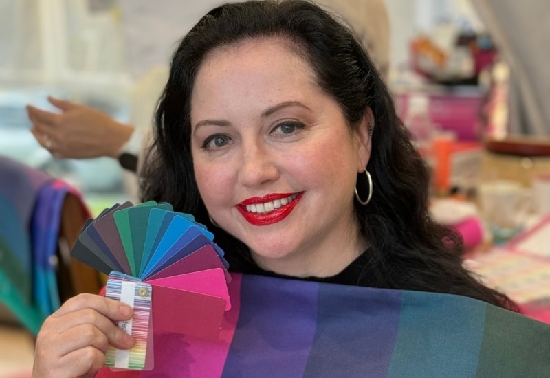
It can be difficult to really figure out your own colour properties as you don’t have the range of colours to test, which is why investing in a personal colour analysis is such a great investment. It will show you your colour properties and the full range of colours that harmonise with your colouring and make you shine.
You can get an online colour analysis with me here – to find which of my scientifically based, 18 palette Absolute Colour System will work best for you, plus discover your signature colours.
Your colours are not a list of fashion must-haves someone else hands you. They’re a discovery you make by understanding how your unique colouring interacts with light. Once you know that, you’ll never make a random colour purchase again.


Your approach to colour has been the only one that has worked for me.
I have always known that I was light & warm. I have never been comfortable with bright warm clear red. I have found it to be too strong for me. As I have aged so my intensity has changed. My hair has gone duller & will one day be grey. I still love brighter colours but now intentionally chose muted & less warm colours (I take my swatch shopping with me always).
Thanks
Thanks so much Carol!
Thank you for this comprehensive blog post!
I was particularly interested in section 8, how our colors can change over time, since that’s what I’ve experienced more pronouncedly over the last couple of months.
In my case, my color palette hasn’t changed in terms of hues and intensity but value. All the medium and darker values that my younger self effortlessly pulled off are too strong for current me. Thankfully, I sew (knit and crochet) all of my clothes and therefore can rework most items into something that looks good again with my lighter, lower contrast colors.
It’s great that you can see that as you are lightening up, that your colours need to as well. Great that you can also make your own or rework to make things work for you!
Imogen, this one post should be required reading for all women. It’s all here. Thanks for explaining it so well.