The Pantone colour forecast for Spring 2015 (first half of 2015) is a muted palette in general. It’s good as in general, there are more people who need more subtlety to the colours that suit, than those who are after the brights. We’ve just had a couple of years where there have been way more bright colours available in stores, than the softer smoky ones, so if your ideal palette is more subdued, then it’s time to look at shopping in 2015 and updating your wardrobe.
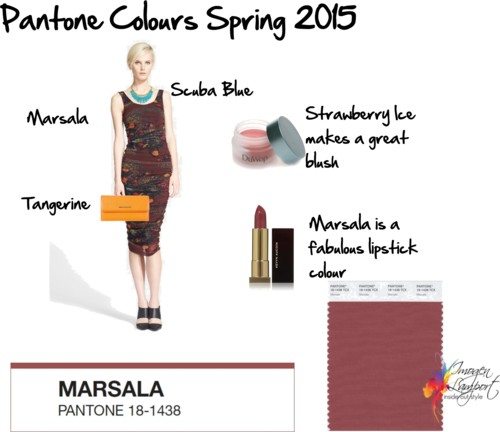
Marsala is considered to be the “colour” of the season. I’m sure it’s a colour that will appear in a number of guises, from a soft oxblood red type of colour through a myriad of reddish brown shades. It will pair back well with Tangerine, Strawberry Ice, Scuaba Blue and Toasted Almond which hit the buttons for those with a warm undertone.
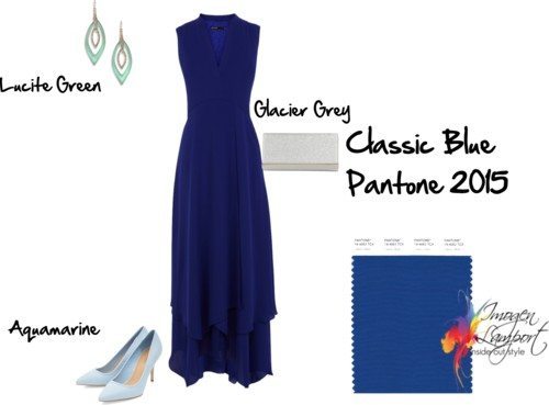
If you have a cool undertone look for Aquamarine, Scuba Blue, Lucite Green, Classic Blue (a great staple for your wardrobe) and Glacier Gray.
Hopefully we’ll see some great crossover versions of:
- Classic Blue
- Glacier Grey
- Scuba Blue
which work for both warm and cool undertones.







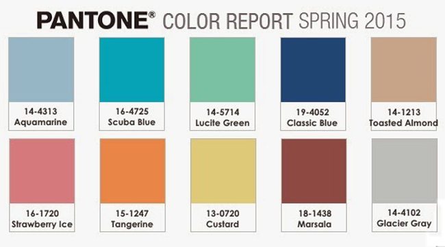


Except for Glacier Grey and Aquamarine (wash me out), all of these colors seems to be colors I personally love to wear, especially Marshala, Toasted Almond and Classic Blue! Red & Pink Lipstick with a soft brownish tone are signature lip colors, like marshala but more of a “medium” tone. (Which is odd, because many people think brown toned lipstick looks horrible on pale skinned blondes, but I love them). The only neutral that never seems to be populare in the store where I live is taupe/rosebeige which is one of my basic colors in my wardrobe along with black and dark blue. and I keep waiting on taupe/rosebeige bottoms coming up, but I can only find grey and khakis. -_-
Oh well, I dont mind dressing goth with all black and navy’es in my wardrobe and I love the suited or high contrasted look with a pop of color. 😉 I prefer cool neutrals and neutrals that blends between cool and warm. Warm and bright neutral make give my face a unflattering orange cast. because I’ve warm pink (or peachy) skintone, not yellow nor cool pink…..or I think Ive a warm undertone, but a pink undertone, because people prefer me in warm colors, but cool toned makeup and dark to medium (not icy) cool clothing looks more flattering, especially face makeup, warm undertoned foundation always ‘oxidize’ on me. After years of trials, although Ive more of a soft-medium-warm colorings, the pink overtone in my skin seems to dominant most warm. Its just icy pastels and super bright cools colors that can make me a little bit pale (but rather looking pale than looking orange to be honnest—). :S
it should be pink OVERtone.
I have yet to figure if I’m of warm or cool colouring (I have characteristics of both), but most of these colours seem a little meh. Perhaps it’s a reflection of being in the cold part of the northern hemisphere, but I always look forward to spring’s arrival so we can ditch the black and grey that take over retail stores/people for winter clothing.
Maybe you suit brighter colours Jen and that’s why these softer colours don’t appeal
I am v glad that the brights are out. Not only do more people get to choose from colours that actually suit them, as you said Imogen, but I, who suit bright colours, can heave a sigh of relief and not feel a subconscious need to have to add to my already overflowing collection of clothes. The last few years has seen me in many a shop: ‘oh but when am I gonna find such a lovely bright purple/green/cobalt blue jumper again?’. Far too many potential perfect outfits in my far too small (space-wise) wardrobe, not enough days/occasions in the year to actually wear them!
I’m glad to see the more toned-down palette as well. I can get away with many of the cool brights, particularly royal blue, but they don’t suit my personality. I would much rather play up a muted color than try to play down a bright one. I’m also tired of the fact that all of my dresses are black, navy, or royal blue. (Three of them! I finally just stopped buying dresses.) Hopefully petite manufacturers will buy a few bolts of these new colors, as most of them will look nice on me!
My husband, on the other hand, has been having a grand time. “Very Blue,” as he calls it, is his favorite color. It suits his outgoing personality, and it makes his blue eyes pop. (My eyes have teal in them; his have clear blue.). He’ll be sorry to see it go, so I’d better stock up on a few extra shirts now!
Ah, the colours of the year….sigh. They are all such lovely colours, but most of them will not work for me. Classic Blue will work, although not a favourite colour of mine. Glacier Grey, if only it were a tiny bit deeper, maybe in smallish amounts. The only other possibility for me is Scuba Blue, although to my eye it looks far to warm. Think I’ll restrict my buying the next few seasons
Thanks Imogen for introducing me to such a methodical (and hence comprehensible) guide to style. You’ve given me heaps of examples of maths in action useful for teaching. Also for introducing a colour reference (here Pantone) – again a logical way of defining colours to a global worldwide community 🙂
Well… Scrolling right on the Pantone link that Imogen gaves us … Reveals … Some lovely complex (even natural) greens as well as a smokier grey (is that what Jane is wistful for?) … Plus a dirty peach and an unexpected lavender – I was expecting a blackberry friend to Marsala.
Anyway, I have just discovered that acid suits me (it’s a pretty highly saturated yet slightly olive-er shade (ie with some black) of a yellow-green, a bit stronger than sportscraft’s recent “zest”). Do you think this can be added in as a cousin between the yellow and the lighter green in this new palette? I was finding it works super well with toasted almond or a khaki similar to the darker green shown here, or with the blues or smoky grey… So this suggests its at least a good friend to the palette, perhaps? If I am feeling brave perhaps I could pair the acid with Marsala too? Is that a complementary pair?
Am curious about how “averages” between colours on the palette go — do they tend to match?
Curiouser and curiouser 🙂
High contrast person crying rivers over here . . . might be the year of the thrift shop, or perhaps all the unsold brights will be at realistic price points now. My wardrobe is already full of scuba, classic blue and glacier grey — the colors I wear for WINTER. Any shopping advice will be helpful!
There will always be more than just the forecasted colours in store!