


Blogger Karen left this comment on What to Wear When Dating
Do you think different cultures see colors representing different things than we normally find in the western world?
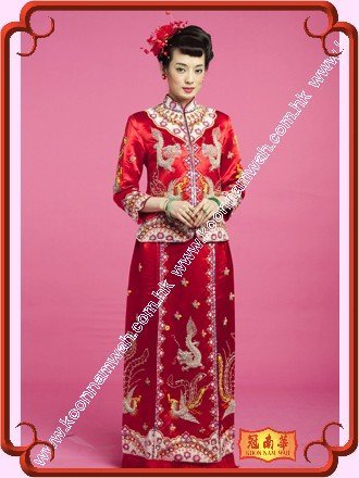
Brides in China wear red for luck. In the US they might look like tarts or very aggressive women in red satin and lace. In China,white doesn’t mean purity, but death. Yikes!
Care to comment?

To start with, colour can be read on a number of levels.
1. Physiological reactions
2. Natural associations
3. Cultural associations
4. Psychological reactions
Let’s look at a couple of colours – red and green to see how each of these effects changes the way we view the colour.

So to start what are the physiological effects of colour?
Scientists have proven that red raises our blood pressure and stimulates us. Whilst green, especially that true green of foliage is calming to our nervous system.
Many hospitals paint their walls green as it has been shown to help the healing process and keep anxious patients more calm.
What are the natural associations?
Red – fire, blood, stuff that we may need to react to quickly, so it’s important we are awake and focused around red.
Did you know that sporting teams that have red uniforms are more likely to win? And men who see women in red feel more amorous toward them (raises their blood pressure!).
Green – trees, grass, leaves, when all is well in the world we are surrounded by lots of lovely green in nature, our crops are growing, the weather is fine, it’s not either snowing or drought.
Then we have cultural associations:
Red – in China red is considered a lucky colour, so to ensure that the marriage is good, they choose this colour.
If a western bride were to wear red, she would be considered a slapper – the Scarlet Letter A was worn by adulteresses, not a colour that the ‘pure virgin bride’ would want to be associated with.
Yet red is associated with Valentines Day, and is the colour of the roses we choose to give our love, it incites passion.

Green is associated in the US with money (the greenback), in Ireland with luck, in Australia with a political party and in Pakistan it’s a colour of national pride as green is the colour of their flag.
Psychological associations also influence, so red is colour of power, many politicians choose to wear red ties to show their dominance.
Green with envy is a common phrase, probably dating back to Shakespeare (though there seems to be many different historical opinion on its etymology), but green being associated with the look many get when they are sick, then it is another way of saying ‘sick with envy’.
Green rooms are used in TV studios, to calm the guests before they go on.
So when I go to buy a loaf of bread in the supermarket and there are many loaves displayed in their different coloured wrapping, which do I choose?
The one in red that gets my attention first and makes me feel hungry?
The one in green that must be the freshest and most ‘natural’?
Marketers use all these known associations with colours when choosing colour palettes to brand their products, when you consider how we are surrounded by colours, have you thought about how the colours you wear are affecting those you come into contact with each day? Do you choose colours to have specific effects?

Watch the colours of the ties of your politicians, you will notice that blue and red are very common. Blue is a colour associated with the conservative side of politics, whilst red is associated with the left. Blue also calms us, makes us feel safe and secure, and says ‘trust me, I wouldn’t lie to you’.
Colour is complex but so important, why don’t you see if you notice if people respond to you differently when wearing different colours?


I would also like to listening to some opinions on this one . I've noticed that 'aceptable' color palets even in daily life diverge from country to country.
In certain places you know someone is a tourist because of the colors they wear(especially men).
I'll wait for some more input.
I've noticed that there is not often (in North America anyway) much green clothing around. You can always find red, but have to be on alert for green.
When I spent a month in India I was continually dazzled by colour, especially the pinks and oranges. When I had a layover in Germany en route home (in late winter), I was back among the navy and gray, such a shock.
Reading all this, and the comments, and giving it a thought myself, I believe we dress according to the amount of sunshine we have. Dark clothes when it is dark. People in warm countries usually have more colorful clothing. When it gets really hot, lighter shades are preferred. Countries that have white snow + sunshine, and people choose bright colors again. Some religions demand people to wear black, but this is an exception. I think that if I came to hot Australia with my wardrobe I wear here, I would be quite invisible. And tourists from warmer climates are recognizable here too. In short; I think, that the amount of sun offered, rules out color choices.
Sorry- read…OUR color choices. Have a Merry Christmas Imogen! By the way, how does Santa Claus get there, when you have no snow? I believe we have 50 cm powder snow as I write and more on the way!
I had a little book, a dry read, called The Colorist, I believe. His theory was that people tended to match the colors of their city/surroundings. More red in London because of the post boxes, I guess. Of course, he didn't say how those post boxes were chosen to be red in the first place. Chicken and egg.
Another book, by mother and daughter in Paris, said they mostly wore black and grey and matched their city/weather. Same idea but didn't explain summer too well. But I suppose grey buildings are grey buildings.
I think it's a lot to do with light as well. When I arrived in Philadelphia for school with my Southern California wardrobe people stared at me. When I arrived home with my more muted eastern wardrobe, that didn't make any sense, either. People used to categorize San Francisco in northern California as an eastern city for its degree of formality (in business dress) and subdued blues and greys.
It was on a visit to family friends on Long Island, NY,in the 60's when the mother took me out shopping and I spotted a hot pink, funnel neck, assymetrically buttoned mini coat on a mannequin perched up high. I bought the coat. It was the greatest thing I ever saw. I wore it to visit relatives in Brooklyn, NY, and my cousin and I were walking in the neighborhood, on our way to Manhattan, and he said, not unkindly, "People are staring at you." I was startled and he explained, "No one dresses like that here." That was one great coat and they were staring in Manhattan, too. Sometimes there's nowhere to wear the clothes of our dreams. (But I do it anyway)
Color is the most fascinating subject. Sometimes I think we occidetal culture is scared of the body. Some cultures are not afraid of color,Continents I should say: Africa, India… The Andean culture is one too ( Peru, Bolivia, Equador, nortern Argentina…)Color is energy. They are not either afraid of shapes, woman are usually not so skinny…In the arid imensity of the Andes you can spot a person miles away cause she'll wear fuchsia with turquoise and apple green. This cuture is SO in love with the strengh of color that they included the fluo colors to their traditional clothes clothes as it appeared on the market, so did they with shinny fabrics. Comparing to this, our urban culture makes so suttle choices, woman have to be thin, and wear suttle textures and harmonies… I was once in a bolivian city where I had a shock seeing thin young ladies dressing in the traditional bolivian codes with an elegance that you could not anymore relate to folklore if you had done before. Their had their hair braided, impeccable lace skirts, heels, and looked so modern and chic in their way. I'll try to find a picture to share it…
Color is vital. For years I would design white suits and jackets for myself and couldn't understand why they looked horrible, when this wasn't the case with colored jackets. Finally I realized my ruddy complextion and strawberry blond hair did not do well with white no matter how well it was designed. Same design in cream or off-white was gorgeous on me. Ever since, I've been a huge fan of watching colors, not only for me, but for my clients.
My partner and I went to Venice a couple of months ago. I had packed with care – core solid staple items in navy and brown, with brighter accents. Since I had just been analysed as a clear spring I chose them with care (and enthusiasm).
It was fascinating to see the Italian women there – even the teenagers. Everything was shades of deep grey, black, muted, dark. We tourists stood out like sore thumbs. Oh, I know I looked good. It was just that, in comparison, I looked like a bright crude child in a group of grownups.
When we got back to the UK I looked around and realised that in fact, even being as bright and clear as I could be, I was still fairly subdued in a culture that had adopted purple and yellow-green for their winter coats.
But then, of course, there must be comparatively few Summer and Spring Italians. Also, I think we Brits tend to wear brighter colours because the sky is grey for about 3/4 of the year. We have to get some colour SOMEHOW!