


What are the differences between London and New York Pantone Forecasts?
- London has a cooler, brighter red in Flame Scarlet as compared to New York’s Grenadine.
- London’s Primrose Pink is a more muted pink than New York’s highly tinted Ballet Slipper.
- London’s Toast is a slightly cooler beige than New York’s Butterum
- London’s Royal Lilac is more violet than the New York Tawny Port, which is a warm burgundy
- London’s Golden Olive is more muted than New York’s Golden Lime
- London’s Blue Bell is cool and light while New York includes a mid-blue shade of Marina
- London’s Copper Tan is a great warm peach shade that will suit many with a warm complexion while New York’s Autumn Maple is a stronger toasted warm colour which will be more limited to those with distinctly warm complexions.
- London’s palette includes a warm yellow in Lemon Curry. New York a cool green in Shaded Spruce.
- London’s Otter is a welcome return to brown in the wardrobe for those with a cool undertone.
- New York includes Neutral Grey which will work for those who find that grey is a good neutral for them given that it’s not particularly warm or cool in its undertone.
- They both include the fabulous universal neutral of Navy Peony, a fabulous option for both warm and cool alike.
London Autumn Colour Forecast 2017

London 2017 Pantone Autumn Fashion Colour Forecast
New York Fall 2017 Colour Forecast
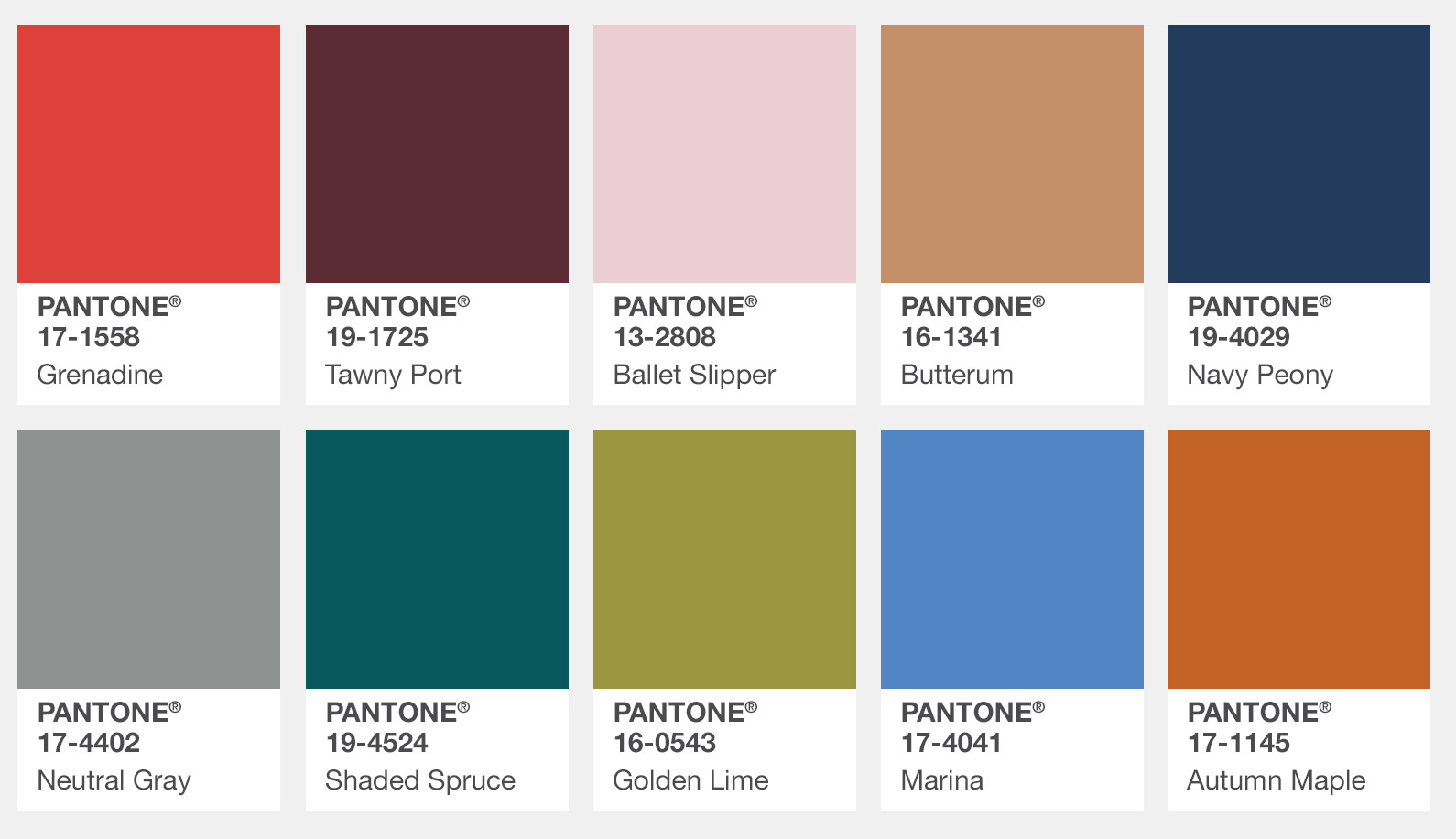
Pantone New York Autumn/Fall 2017 colour fashion forecast
How to Mix the Pantone Fall 2017 Colours
There are a selection of both warm and cool colours in both palettes that have been popularised on the runways of New York and London’s fashion weeks recently.
To give you an idea of how to mix them I’ve created a few outfits to inspire you to have fun with colour this autumn and winter.
Colours from London Autumn/Winter 2017 Fashion Week
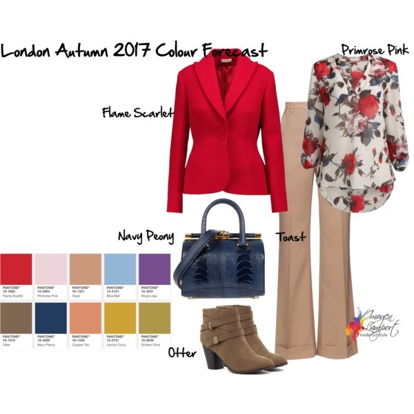
Cool Flame Scarlet worked back with Otter, Navy Peony and Toast.
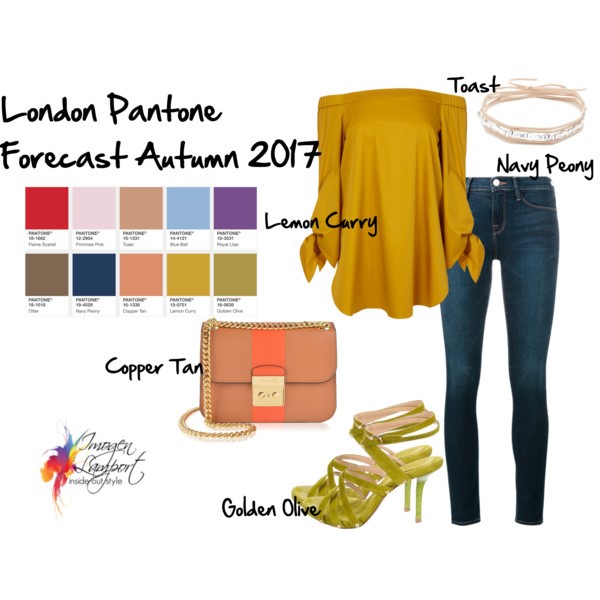
Warm Lemon Curry and Golden Olive paired with Navy Peony and Copper Tan with a touch of Toast.

Cool Primrose Pink and Blue Bell paired with neutral Toast and a touch of Royal Lilac

New York Fall/Winter Colours 2017

Cool Shaded Spruce plays well with Ballet Slipper, Marina, Neutral Grey and Butterum
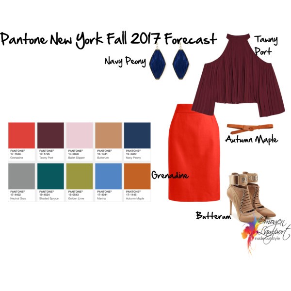
Dare to pair Tawny Port with warm Grenadine, set off with Autumn Maple, Navy Peony and Butterum
Which of the Pantone Autumn/Winter colours are you hoping to see in stores and which will enter your wardrobe this year?


Thank you, really interesting, glad to see some colours suitable for me (soft summer).
How interesting! I never dreamed there were different forecasts for different regions.
I thought it interesting that they split out the colors betweeen New York and London. I don’t remember them doing that before! I also miss Leatrice’s enthusiastically complete commentaries…
Thank for a fantastic blog. I have learned so much. So far I understand that turqoise and teal are universal colours, that can be used by both warm and cool persons. I would love, if you would consider to write a post about universal colours in general.
And you have of course already done such a post? I just found it.
Would never have thought of wearing tawny port with bright coral/red grenadine. Not sure I could carry this off but thank you for putting outfits together that look WOW & challenge your readers.
Is Toast a camel color, Imogen? It’s great to have the examples!
Yes Toast is in the camel range of colours
Imogen, how do the Pantone colours work across the Northern and Southern Hemispheres? Are the Fall/Winter 2017 colours for the Southern Hemisphere the same as the Spring/Summer 2017 colours for the Northern Hemisphere?
I have wondered about this for awhile, so I hope you are able to clarify how this works and when and where each set of Pantone colours applies.
We tend to get a mix of the Autumn/Winter in our Spring/Summer and vice versa – but I think they follow the Pantone colours less here than North America as there are colours we expect to see that never ever turn up here.
I have been loving the Pantone palette for fall/winter, but not so much the violet for 2018. These outfit ideas and color combinations are inspired. Gorgeous!