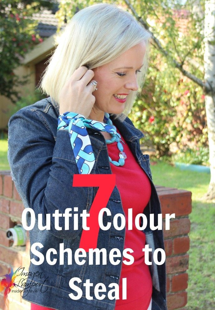
There are lots of great colour schemes you can put together in your outfits to create interest and excitement in your outfit.
So many people tell me they don’t know how to mix colours, and really it’s not hard. There are a few key tips to consider.
- Mix colours of similar intensity
- Mix colours of similar value
- Mix colours with the same undertone (warm or cool)
- Add your value contrast with a neutral
- Use colour schemes to create pleasing colour combinations
Neutral Plus 1 Colour


This is the easiest scheme and can be worn by all. It can seem dull if you have triadic or complementary colour contrast though (and then I’d think about adding an alternate coloured necklace to bring in the pop of extra colour you need).
2 Neutrals plus 1 Colour
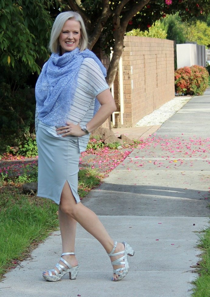
This is another easy scheme to create. Just make sure your two neutrals are either warm undertone or cool undertone (rather than a mix of the two).
Monochromatic
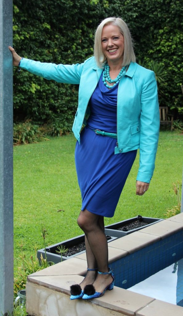
Monochromatic means shades of the same colour (mono meaning 1 and chromatic meaning the presence of a rainbow colour, not black, white or grey). Here there is a dominant colour (cobalt) which is about 2/3 of my outfit and then the secondary colour (turquoise) is around 1/3 of my total outfit.
Achromatic
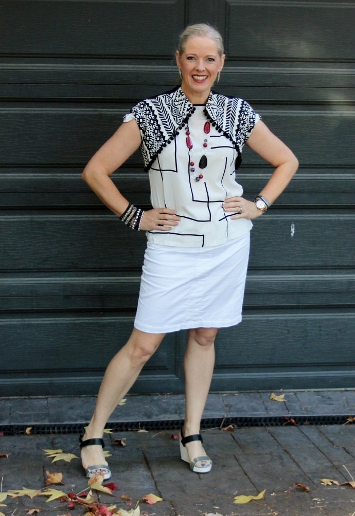
Even though black and white is a high value contrast (and I’m medium value) I can get away with wearing black and white when I do it like this.
- Keep the vast majority of the outfit light (as I’m dominantly light in value).
- The contrast with black is only in small proportions – fine lines not too heavy.
- Wear darker eye makeup to up the contrast of my face.
- Wear a bold lipstick colour – again to help increase the contrast on my face.
Analogous
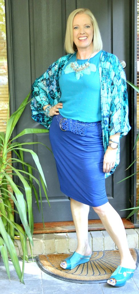
Analogous means 2-3 colours that sit next to each other on the colour wheel. Here I’m working with blues through teals to greens.
Triadic
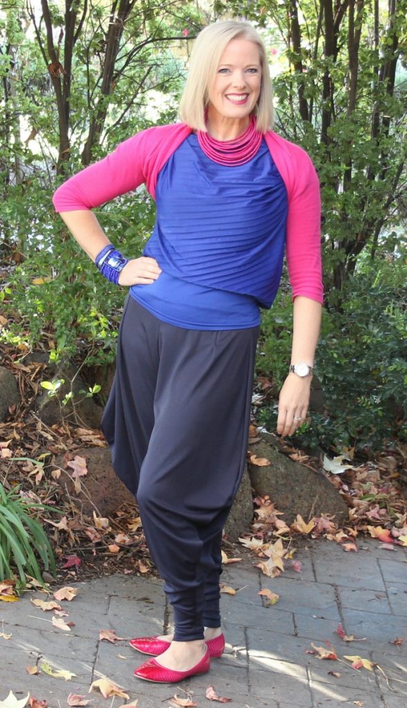
Here pink and blue (remember that pink is just “light red”) work as 2 parts of a triad.
When wearing 2 colours think about the proportions of each colour, keeping them uneven rather than even.
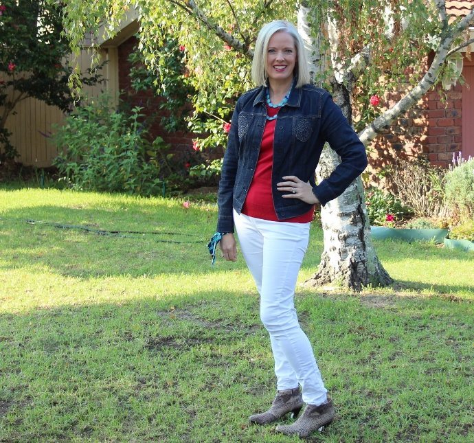
Or go back to the traditional red, white and blue – which is again 2 parts of a triad along with a neutral.
Split Complementary
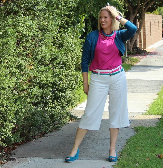
Complementary schemes can seem too bold sometimes (red and green scream Christmas), but the split complementary, which is one off the opposite is an easier way to create a colour scheme. Here I’m doing blue-green (teal) and pink (remember, almost red) which creates a really bright and exciting colour scheme.
It can help to have a larger proportion of a base neutral such as these white culottes and then the colours in smaller percentages of the outfit so that you are not overwhelmed by too many colours, particularly if you don’t have high colour contrast.
Click here to download this post as a PDF to keep and print out.
Read more on how to mix and match colours here.









I am curious as to what your color palette is now that you are blonde. I am wondering whether if my hair becomes a bit lighter, my Elegant palette will change into Sophisticated or whether I can always wear elegant colors but maybe lighten them slightly.
Thanks.
I’m currently Refined moving to Sublime as I’m softening down. If you go lighter you won’t move to Sophisticated (which is the same depth as Elegant, just more smokey) you will move to Sublime or if you go grey to Serene. But a little lighter and much lighter are different from each other. a little lighter won’t have you in a light group.
This is such a helpful response, Imogen. It really answers so many questions for me. I am about to take photos for my signature colors for the 7 Steps course.
Thanks so much!
what a lovely post!
1. when you put turquoise next to blue though – I wouldn’t have thought that was monochromatic, the two colours seem so different, almost seems analogous to me!
2. who needs to wear one neutral plus a colour? and who needs to wear two neutrals plus a colour?
3. one my favourite colour combinations – or at least I think it looks v pretty, turquoise/teal/greeny-blue plus purple/violet. just love it. as for red, I find anything other than blue or navy to be a bit clashing with it (I know it’s not in theory, but I still find it a bit too much), normally I only wear red with black and white, ie neutrals… then again having neutral hair and skin and blue/grey/green eyes – I assume that strictly speaking best thing for me is to go for two neutrals (to create contrast) and one colour (on account of my eyes)?
many thanks in advance!
Hi Susie
They seem more different because of the value contrast and yes one is a more warm blue than the other – but really they are still shades of blue.
Someone who is neutral and with 1 colour can wear either 1 neutral and a colour or 2 neutrals plus a colour.
It’s easy to create value contrast with neutrals rather than the colours.
so if I am a neutral plus 1 colour with high value contrast (+cool + bright), I can either wear 1 colour plus 2 neutrals – most simply black and white
or only white plus e.g. dark green (dark colour to create the high contrast)
or only black plus e.g. turqouise (light colour to create the high contrast)?
I think there is the added nuance of my darker hair (it’s a lot and long and I almost always wear it down) meaning that the dark colour/neutral should be a bigger proportion of my outfit too… yes?
Yes the larger the proportion on you (dark hair) then wearing a larger proportion of dark colour/neutral will look better.
Some brilliant looks you have created!
I think my favourite is your Achromatic look.
x Kirsty
Thanks so much Kirsty! I just wish people would stop calling black and white monochromatic!
Awesome post, Imogen!
This helps me so much; I’ve been struggling with “neutral plus 2 colors”. Great real life examples.
Thanks Ruth – glad that this has helped
Oh this explains why I was able to pull off a recent outfit with cream jeans, coral top, and blue cardigan. The neutral took up the most “space” and I was wearing a split complementary combination of colors. The proportions of color were small enough it didn’t overwhelm me even though I’m better in a neutral plus color.
No need to stick with really strict rules!
This was so informative and helpful! I love the way you describe, visually. Thanks for sharing with us on My refined Style. Have a great weekend!
Cheers,
Jennifer
http://awellstyledlife.com
Does the necklace create a focal point even if it has a cooler, darker or smokier tone compared to the shirt?